Isochrones and responsibility of visualization
January 2, 2026
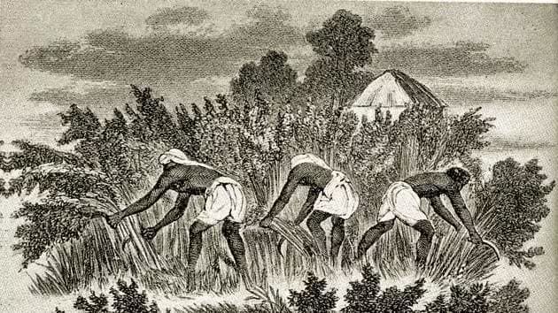
On December 31, 2025, gig workers from Swiggy, Zepto, and Blinkit organized a nationwide strike. I don’t know how successful it was, but in my bubble, the sentiment seemed unanimous that these were fair demands. No one actually needs noodles delivered in ten minutes, especially not if the cost is an underpaid worker driving a moped through traffic 12-13 hours a day to earn a meagre wage (relative to the hours/energy being put in). It felt long overdue.
But looking at the reaction from corporate leadership and the tech community the very next day, you would think we were living on two different planets.
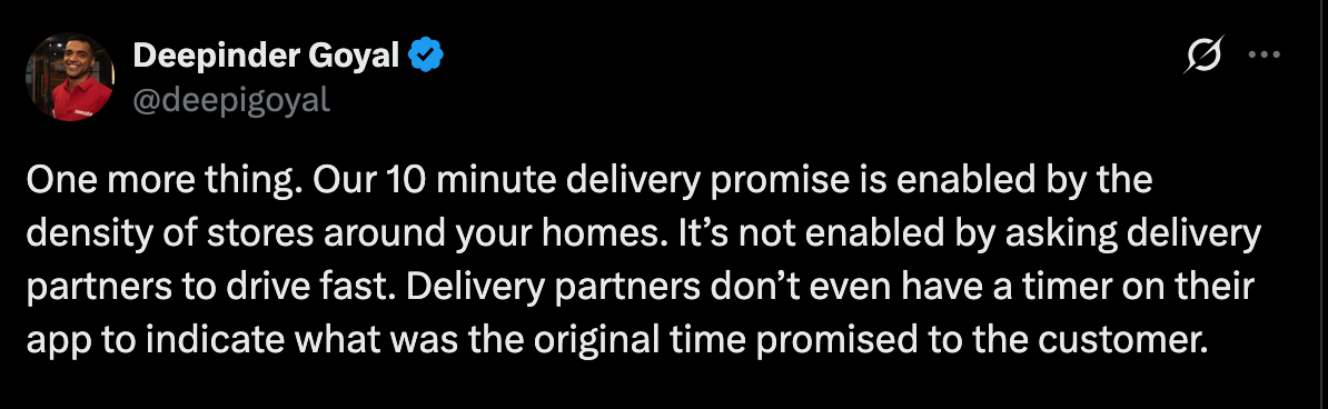
A day after the strike, Zomato CEO Deepinder Goyal took to Twitter (allegedly X) to post what can only be described as a victory lap. He boasted about record orders (Non-Twitter link) and thanked local police for suppressing “miscreants.” In another confusing post, he talked about how the problem was not with the system, but that we could see the system (Non-Twitter link). He further argued that the 10-minute delivery promise is achievable simply because of “density”.
A day later, darkstoremap.in dropped. It is a visually impressive project that maps the coverage of dark stores across Bangalore using isochrones. The isochrones visualize exactly how far a rider can travel in ten minutes based on road networks and average speeds. I don’t believe this project was made in bad faith. However, the conclusion likely to be drawn from it will be that the CEO is right: the stores are dense, the distances are short, and therefore, the 10-minute promise is just a matter of logistics and that the workers are complaining for no reason. If anything, they should be grateful that they earn whatever they do.
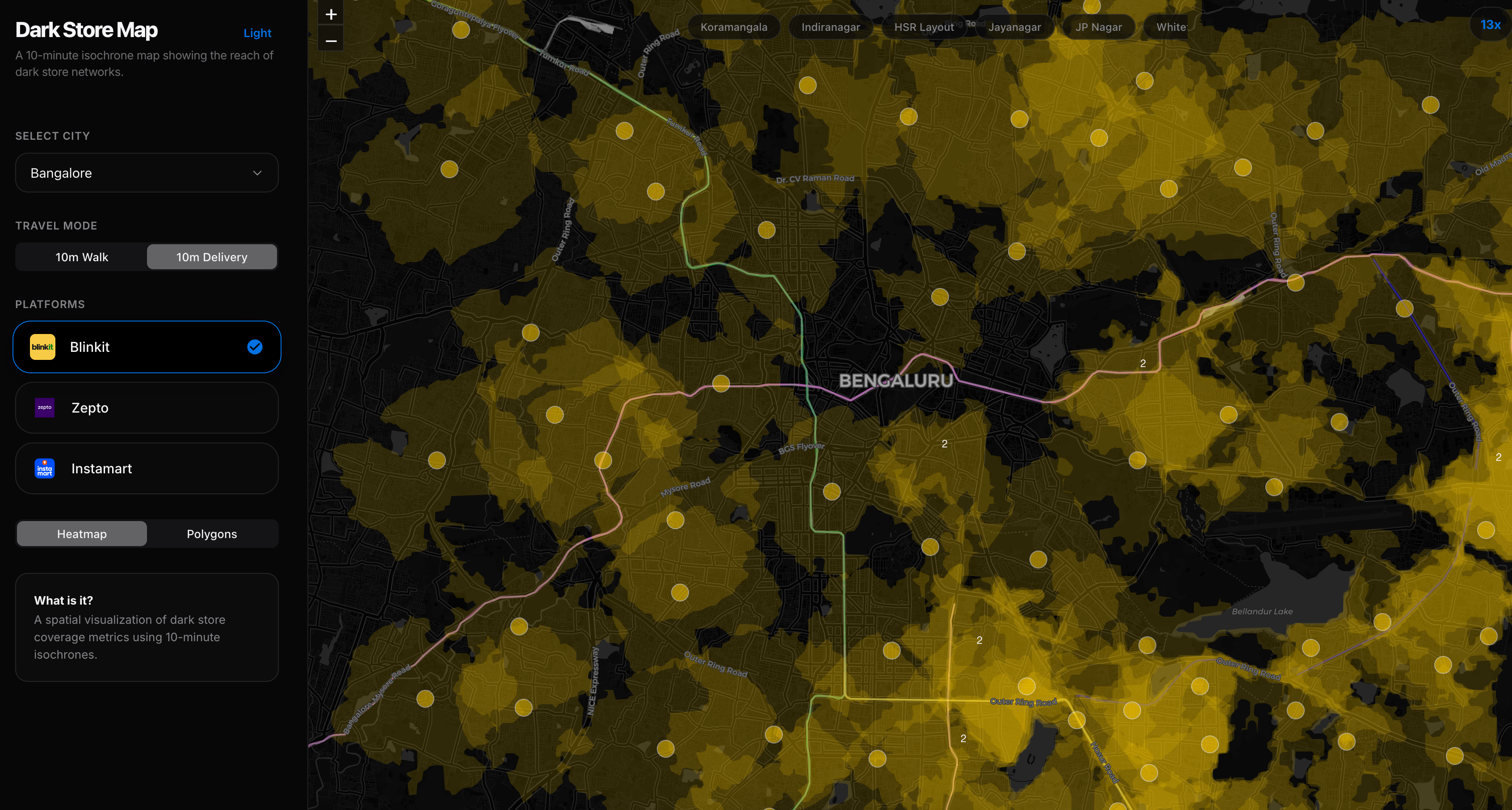
It is discomforting to me to see such technical skill used to provide an argument for a system that actively exploits the very people making things work. Isochrones are based on sterile street-network data, not the ground realities these people face. “Drive time” is a small, quantifiable part of this entire thing. It is probably the only thing you can calculate and visualize and share from a distance when you’ve not experienced the job yourself.
Update: As a friend pointed out, this probably uses an OpenStreetMaps based API to calculate isochrones, most likely ignoring actual traffic times and penalties those have on the driving time. This is under ideal conditions, but Bangalore traffic is notoriously bad in all parts of the city. Which is why you see a lot of these riders driving on the footpaths to cut through it. It also has no way to account for the conditions of roads which affects driving time. Since this is not open-source, it is not possible to review what logic was used to draw these polygons.
So if your visualization proves the system works with just the one metric, but ignores how it works at the cost of the worker, what is the point?
What about the reality of warehouses without toilets, or the people working 14-hour shifts without real safety nets in a daily job where protections like health insurance (which these companies claim are given) are a “gamified” reward unlocked only after hitting delivery targets, or the mental toll of being penalized because of algorithms they can’t understand, where the so-called “freedom” of gig work is a system that reduces pay or reduces future orders for anyone not working a minimum number of hours? I can find many more articles. Should we ignore all this because isochrones overlap? Right on cue, people are using this to dismiss the protesters’ demands or tagging the Zomato CEO to look how this proves his point.


It is now easier and easier to create such projects, and in our tech circles, we feel the urgent need to “create something fast.” Data visualization has become “content”, no longer relegated to dashboards or news reports, but material for social media engagement. It allows the maker and the consumer to feel that they have engaged with something intellectual. We saw this recently with a popular Indian account that shared a matrix visualization of which caste marriages are ‘recommended’ or ‘prohibited.’ What does that do? It gives a “data-driven”, sanitized appearance to regressive social hierarchies, making them palatable to online audiences. This kind of content ends up circulating in WhatsApp groups to lend a pseudo-intellectual credibility to talking points that are already problematic.
One of the easiest things to do is critique something viral, but this trap of simplification is hard to avoid. Not to the same degree perhaps, but I am not absolved of this either. Our BLR Water Log map was interpreted by many as being a “flood risk” map, which it categorically was not meant to be. Implying that is dangerous, and in our attempt at simplification of an important topic, we ended up possibly misleading people. It does not matter that we wrote our website’s copy to avoid saying “flood” or clarified it endlessly in the comments, the image stuck.
Those of us who build, code, and visualize cannot afford to be naive about what we release into the world. We shouldn’t just make stuff for the heck of making stuff and we need to be keenly aware of the context in which our work might be used. Deepinder Goyal is right that the system attracts people, but he is wrong about why. No amount of data visualization or logistics changes the fact that his ‘delivery partners’ are humans working in conditions that would be outlawed in any Western country, and not icons moving happily within an isochrone.
I simply ask that we consider the broader contexts our work sits within and examine what we might be leaving out. Even good-faith attempts can go wrong. Once a visualization escapes your control, it must stand on its own, and you will not be there to add footnotes or correct the record.