
Creating Embroidered Charts with R and ImageMagick
December 29, 2025
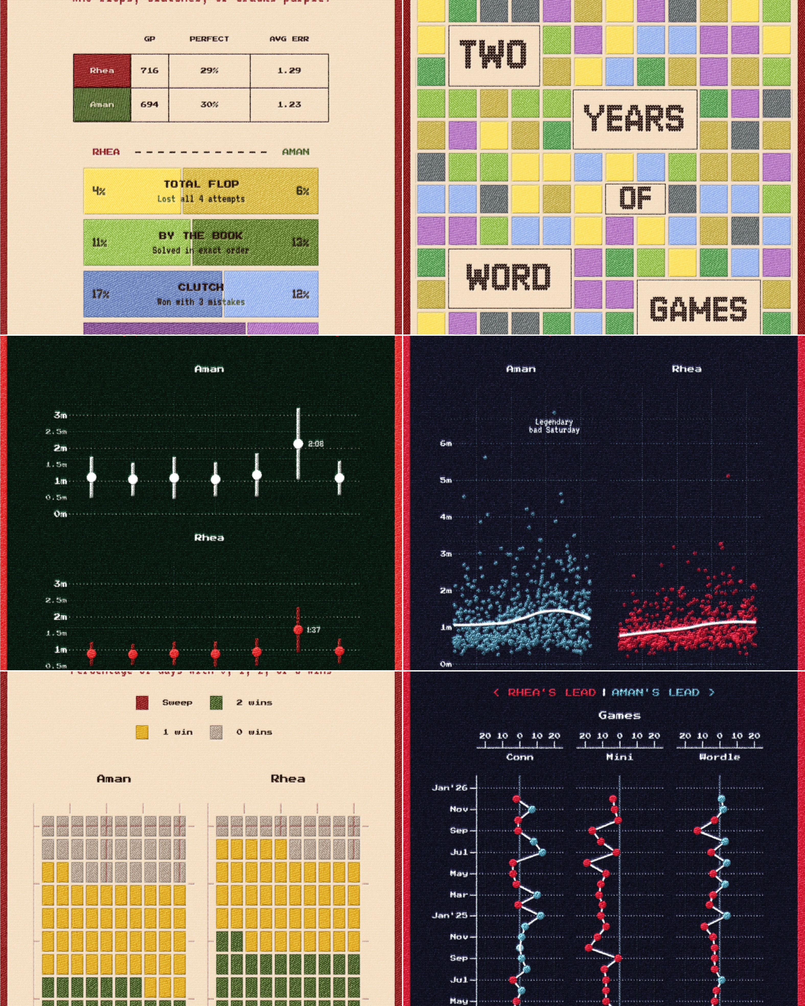
In my last post, I analysed mine and Rhea's NYT word games for the last two years. Since the analysis is pretty simple (just summaries and aggregates), the time saved by not having to do more in-depth work can be used to think of more interesting ways to show the data.
To make my digital work more fun to create and enjoy, I love mimicking real-life objects, textures, and analogies. My latest gimmick this time was trying to make the charts look like they were embroidered into cloth. Since I was already feeling very Christmasy and cozy, an embroidery style felt like the good side-quest to set off on. I’m certainly not the first to try this and if I could actually embroider, I might have just done that! I love this memorable Reuters piece, which features graphics styled as cloth patches. Inspired by that, I wanted to push myself to replicate the look as accurately as possible strictly using code.
After many hours, I managed to achieve the look entirely within R and ggplot and heavy use of the ImageMagick library. In this post, I’ll break down the process. It requires some familiarity with CLI tools and code, but that barrier is lower than ever and if you wish you can easily paste this post into an LLM to tailor the code to your specific needs.
Why ImageMagick?
Why go through the trouble of coding this when there is Photoshop? There seem to be no shortage of ‘embroidery actions and filters’ available for free. All of these may be good options, and no one method is better than the other, but for me the answer is always reproducibility. If I built this in Photoshop, every time I updated the dataset or caught a typo in my ggplot code, I would have to re-export the image, open it in Photoshop, and manually rerun an action or apply some filter. That is a recipe for frustration and as far as possible, the “art” part of this should be programmatic too. If the data changes, I don’t want to repeat a manual post-processing pipeline I also refuse to use generative AI for anything to do with image generation. Nano Banana Pro can probably do the same thing with a prompt, but I don’t care for that. .
You can think of ImageMagick as “headless Photoshop.” It is a powerful command-line tool that lets you manipulate images using text commands instead of a mouse. By writing a script (or a recipe), we can manipulate an image with blurs, color changes, transforms, crops and much much more. In this case, our image being manipulated is a chart made in ggplot, when that data changes, we just re-run the script.
I won’t go into how to download ImageMagick for your OS, but it is pretty straightforward and searchable.
All commands follow this common structure: magick [input] [actions] [output]. Here are some sample commands:
# Convert from jpg to pngmagick input.jpg output.png# Resize image to new dimensionsmagick input.jpg -resize 800x600 output.jpg# Make an image graymagick input.jpg -colorspace gray output.jpgYou get the idea. Take one image, do something to it and then save it as another image. You can even combine operations, like maybe taking an image and blurring it and then applying a ‘posterize’ effect:
magick simpson.jpg -blur 0x4 -posterize 8 cant-see-simpson.jpg
The -blur 0x4 applies a Gaussian blur with a radius of 4 pixels, and -posterize 8 reduces the image to 8 distinct colour levels, giving it that look. This is the same thing that Photoshop’s Posterize filter does as well. One thing to note is that the order of operations matters here; we blur first, then posterize the blurred result.
My pipeline for the stitched look works on the same principle with more steps. I don’t claim, or at the moment want, to know the inner workings of every single magick command there is. I think assistance with long strings of complex arguments and operator sequences is something I will always delegate to LLMs. However, not knowing what to ask will not take you very far. My Photoshop brain helped me a lot here, as we will see.
Running ImageMagick from R
Since we’re building this pipeline in R, we need a way to execute shell commands from within our R scripts. There is the excellent {magick} package for R, which provides an interface over ImageMagick commands but the coverage isn’t full which is why I’ve not used it here. We’ll be relying on the original ImageMagick package but we can use the system() function for running it within R. You pass it a string containing the command you want to run and it executes it as if you typed it in your terminal:
# Run a simple ImageMagick command from Rsystem("magick input.png -blur 0x4 output.png")This is great because it means we can generate a plot with ggplot, save it, run ImageMagick commands on that saved image, and continue with more R code, all in one script, all automated. When we get to the final function at the end, you’ll see how we build up a full ImageMagick command as a string and execute it with system().
Part 1: Just the Plot
Everything starts in ggplot. Before I add any texture, I need a clean base plot that is ready for the change in style. I created three themes for the charts in that post, which allow me to change them whenever I want and have useful “defaults.” We do not want to constantly think about fonts, accent colours, and grid lines.
Fonts matter a lot and I’ve used three different fonts to sell the effect. JDR SweatKnitted is a knitted typeface for the big titles, Press Start 2P handles the axis labels, and VT323 acts as a subtitle font. I don’t know why these “retro” fonts go so well with the knitted aesthetic but to my sensibilities they were going together well, you can swap them out for whatever you want. Here is what my theme looked like:
# Define a palettepal <- list( bg = "#1A1A2E", text = "#E8E8E8", accent = "#C41E3A", grid = "#4A5A6E", shapes = c("#C41E3A", "#2E8B57", "#FFD700", "#4A90A4"))# Create the themetheme_midnight <- function(base_size = 32) { theme_minimal(base_size = base_size) + theme( plot.background = element_rect( fill = midnight_pal$bg, color = midnight_pal$accent, linewidth = 8 ), plot.title = element_text( family = "JDR SweatKnitted", color = midnight_pal$text, size = rel(3.0) ), plot.subtitle = element_text( family = "VT323", color = midnight_pal$accent ), axis.text = element_text( family = "Press Start 2P", color = midnight_pal$text ) # ... more styling )}Another secret to adding more personality into your charts, if the occasion calls for it, are dingbats! They sound funny but are an incredibly low-effort high-reward addition that give you an immediate improvement. Dingbats are fonts that consist of symbols, icons, and shapes rather than normal alphanumeric characters. So when you type A, instead of seeing the letter ‘A’, you might see an icon that the designer assigned to the letter A.
In my plots, I use this dingbat font to create the snowflake borders There is also a Dr. Who dingbat if you need one. you see on the top and bottom of plots. This isn’t anything fancy, it’s just a function that samples random letters from that font and pastes them in a row at the top and bottom of the plot. I really like using cowplot for this kind of “drawing on top of charts” work because it lets me place stuff arbitrarily on the plot canvas; shapes, annotations, labels, etc. that are not attached or relative to any data.
ggdraw(plot) + lapply(1:2, function(i) { set <- list(LETTERS, letters)[[i]] # LETTERS is built into R y_pos <- c(0.97, 0.03)[i] txt <- paste(sample(set, n_horiz, T), collapse = " ") draw_label(txt, 0.5, y_pos, vjust = (i == 1), fontfamily = "dingbat_font", color = color, size = size) })This code loops twice (once for the top border, once for the bottom). On each iteration, it picks either uppercase or lowercase letters, sets the vertical position (0.97 for near the top, 0.03 for near the bottom), then samples random letters and draws them as a label using the dingbat font. Since the font turns letters into snowflakes, each plot gets a slightly different snowflake pattern.
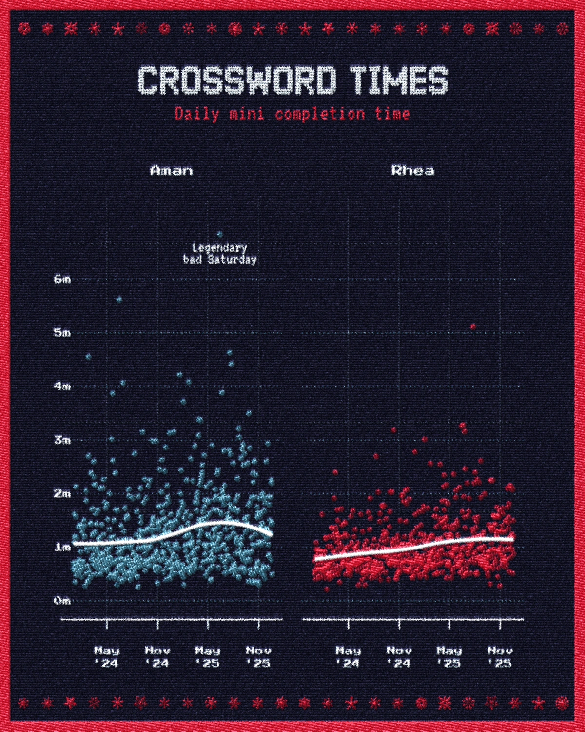
Do your analysis, create a basic chart with ggplot with all the niceties you want, titles, subtitles, center this move that, blah blah and when you are ready, plug in your theme. This is the start! My raw plots look like this:
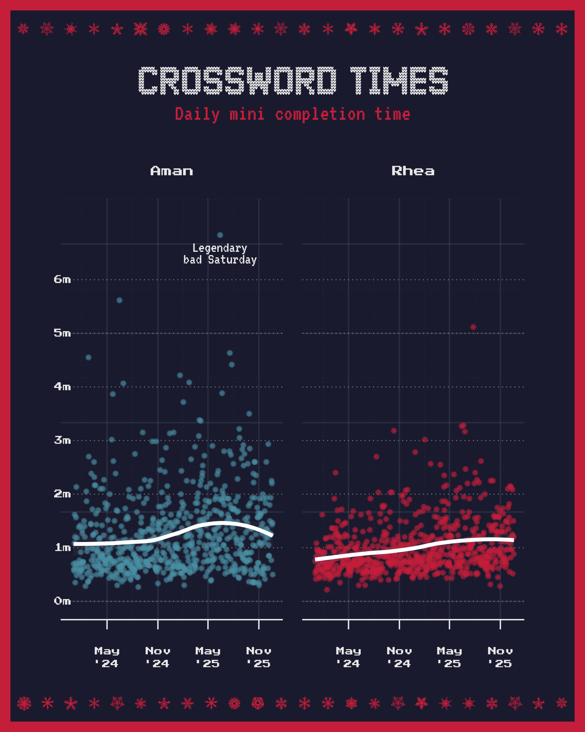
It looks festive enough but it is still clearly just a digital image. The edges are too perfect, the colors too flat. ONWARDS!
Part 2: embroidery.sh
This is where things get interesting (and where we leave R for a bit) and here, I am standing on the shoulders of giants. The core effect comes from a brilliant bash script by Fred Weinhaus called embroidery.sh. This is essentially a pre-written ImageMagick script that only requires you to provide an input image which it processes and outputs.
The script reduces the image to a limited palette of colours and then generates a unique thread pattern for each one. It fills those colours and simulates the angle of the stitching for different color regions, adding bevels and shadows to create a gentle raised thread look. I set the pattern to linear to simulate straight stitches and kept the thread thickness at a medium level.
You can download the script from his website and look at all the various examples on the page. Once downloaded, you run the script by providing it arguments about the settings you want.
./embroidery.sh \ -n 8 \ # Number of colors to use -p linear \ # Weave pattern (linear vs crosshatch) -t 3 \ # Thread thickness -g 0 \ # Gray limit (0 = no gray clamping) input.png \ output.pngThat’s all it takes! Right out the door, this already looks fun to me (see below). There is a very distinct feel to this that evokes the stitched feel we wanted but I think this looks a little too clean and flat. Real thread would be a little fuzzier, not as cleanly separated by color, would look a little more “raised” in places. This isn’t quite there yet.
PS: Never accept the defaults. The defaults work in some cases, but I have always found that if you don’t just accept what some software has given you and spend a little while longer tinkering, you’ll be happier with what you make.
In this particular case, I know that I wanted to break the neatness of the above image. Before code or programming, I have spent a long time working with Blender and Photoshop to try creating realistic textures in my 3D scenes or editing some artwork to give it a vintage handmade look so the process feels a little intuitive to me. In Photoshop I would be:
- Applying noise or something filter to slightly jitter the pixels and “fray” the edges of individual color sections.
- Overlaying some existing textures with blend modes to merge separate layers of noise and blurs. Blend modes are awesome!
Overlay,Soft Light,Hard Lightetc. can be used to modify the image over itself. - Using a lighting effect like ‘Bevel and Emboss’ to create highlights and shadows based on a light source, making the threads look raised rather than flat.
- Tweaking the curves or levels to play with the colors.
Listing it out, that doesn’t seem too complicated does it? You could probably learn more about each of these things and follow some tutorials to learn how to do it in Photoshop. Since ImageMagick is “headless” Photoshop, and you already know what to do, you can begin implementing this process using not a GUI but ImageMagick commands. I read docs for this, but also use Claude to help me out with constructing these commands.
Part 3: Post-processing the base image
Here is what each stage of post-processing looks like, zoomed into a section of the plot. You can see the effect come together from the flat embroidery of Step 2 to the slightly exaggerated last frame where we make the patchwork stitches look raised.
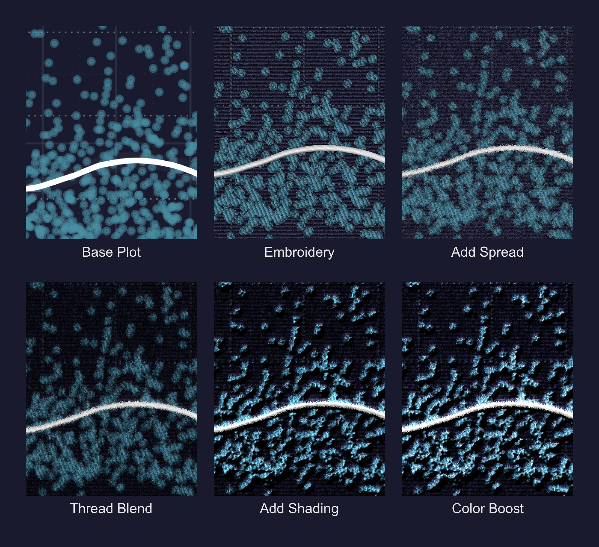
We’ll go through them one by one.
I start with the -spread command in ImageMagick, which randomly displaces pixels by a small amount—think of it as giving each pixel a tiny random nudge. The 2 parameter means each pixel can move up to 2 pixels away from its original position.
magick step2_embroidery.png -spread 2 step3_spread.pngLooking at the output in Step 3, you can see that the edges aren’t sharp lines anymore. They bleed into the background and a little into one another.
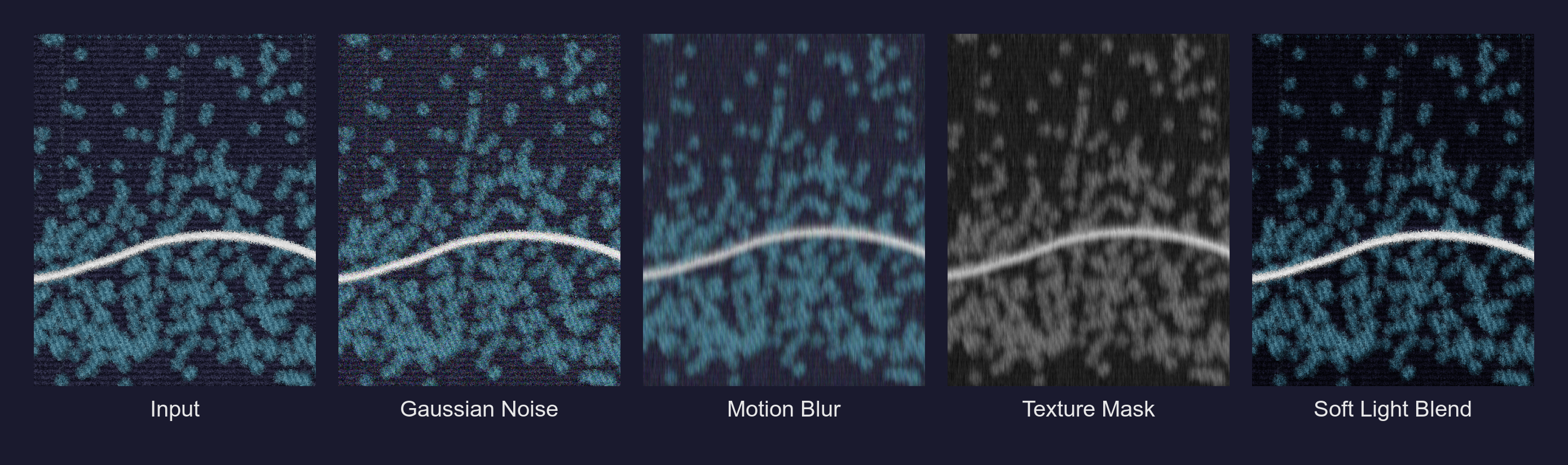
Next, I needed to try and create the texture of the fabric itself. Even if there isn’t embroidery in a specific spot (the flat background, for example), the cloth itself has a weave. I simulated this by generating random Gaussian noise and then blurring it in a single vertical direction. This creates faint vertical streaks that run down the entire image. When I blend this back onto the main image using SoftLight, it makes the background feel like it has a vertical grain/ridges.
magick step3_spread.png \ \( \ +clone \ +noise Gaussian \ -motion-blur 0x8+90 \ -colorspace Gray \ -auto-level \ \) \ -compose SoftLight \ -composite \ step4_noise_blend.pngThis command is doing several things inside the parentheses:
+clonecopies the current image so we can work on a separate layer+noise Gaussianadds random noise to that copy-motion-blur 0x8+90blurs that noise vertically (the90is the angle in degrees)-colorspace Grayremoves colour information-auto-levelstretches the brightness range to use the full spectrum-compose SoftLight -compositeblends this texture back onto our original using Photoshop’s Soft Light blend mode
You can see each of these steps in the frames below. We add some grain, blur it a lot, remove any colours that would make it harder to blend it back and then overlay the grayscale texture over the original image.
I think this already looks much more interesting than the flat embroidery image we started off with. Grain and blend modes make everything better. At the moment it looks a little too dark but we’ll fix it in the end.
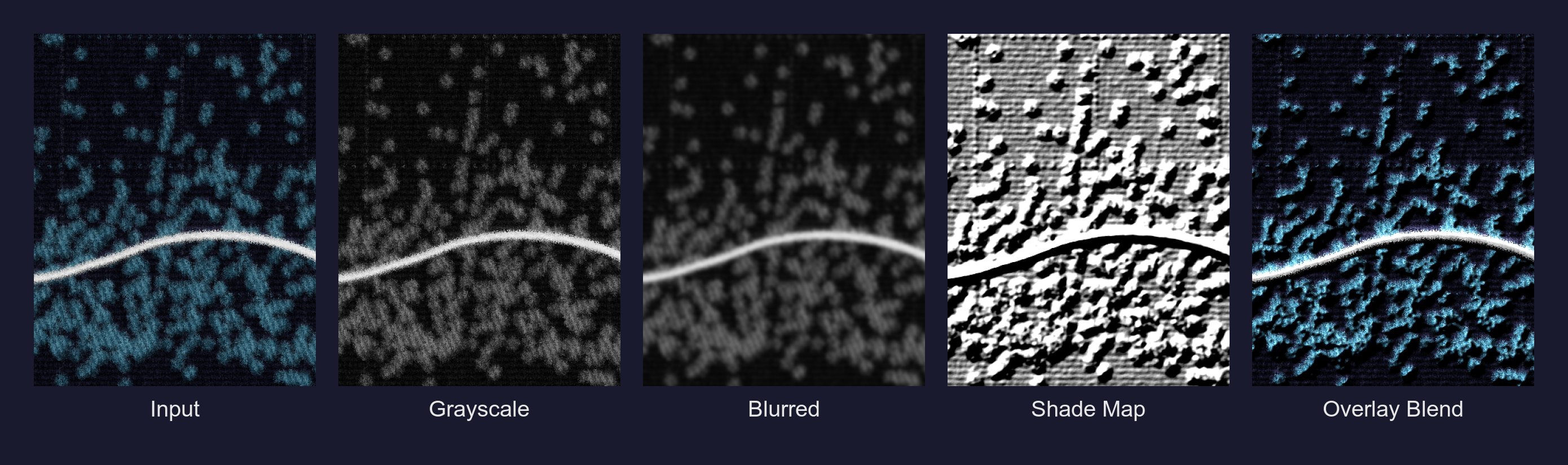
We still have one last thing to do which is giving our fabric and the things ‘embroidered’ onto it a gentle 3D, tactile look. In Photoshop, you’d do this with bevel and emboss filters. In ImageMagick, we have shade maps.
Once again, we take the input from the previous step, turn it grayscale and blur it a little. The reason for this constant blurring and grayscaling is that we don’t want to accentuate uncessary details like minute shapes or make things look out of whack when we blend images on top of each other; having it grayscale and slightly out of focus makes that blending job simpler. Grayscale is also what we use for depth maps when working in 3D software! Whites means the objects are closer (or higher) and blacks push the objects back (lower).
I then used the -shade operator to generate a 3D elevation map of the image, pretending there is a light source coming from the top-left (120 degrees). If you’ve used QGIS to process DEMs or Blender before, these terms may be familiar to you. This creates highlights on the “ridges” of the noise and shadows in the valleys. By overlaying this heavily contrast-stretched grayscale map, the flat image pops with highlights and shadows.
magick step4_noise_blend.png \ \( \ +clone \ -colorspace Gray \ -blur 0x2 \ -shade 120x55 \ -auto-level \ -contrast-stretch 5%x5% \ \) \ -compose Overlay \ -composite \ step5_shading.pngBreaking down the new operators:
-shade 120x55creates 3D shading by simulating a light source. The120is the azimuth angle (direction of light) and55is the elevation angle.-contrast-stretch 5%x5%boosts the contrast by clipping the extreme 5% of values at both ends, making highlights brighter and shadows darker.- We create the shade map and use
Overlayto blend this new 3D scene into our plot.
Here is how that lighting map gets constructed, from the grayscale conversion to the final blend.
Look at that last frame, it looks 3D now!! All this texturing and shading tends to wash out the colors a bit and so the final step is a simple color boost. I bump the brightness up to 115% and the saturation to 105%. It’s a small tweak, but it brings the life back into the image.
magick step5_shading.png -modulate 115,105,100 step6_final.pngThe three numbers in -modulate control brightness, saturation, and hue respectively, all as percentages of the original. So 115,105,100 means 115% brightness, 105% saturation, and no hue change.
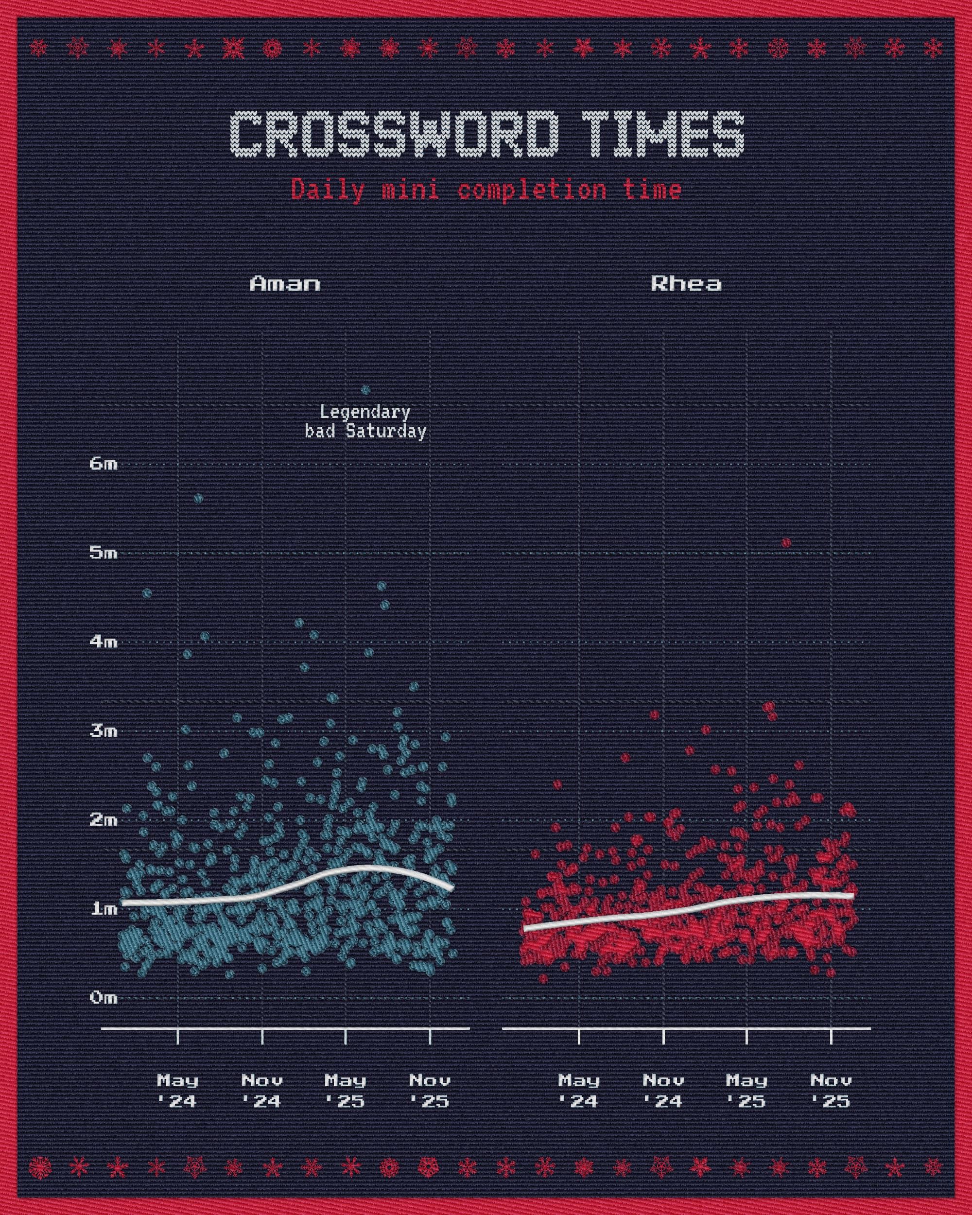
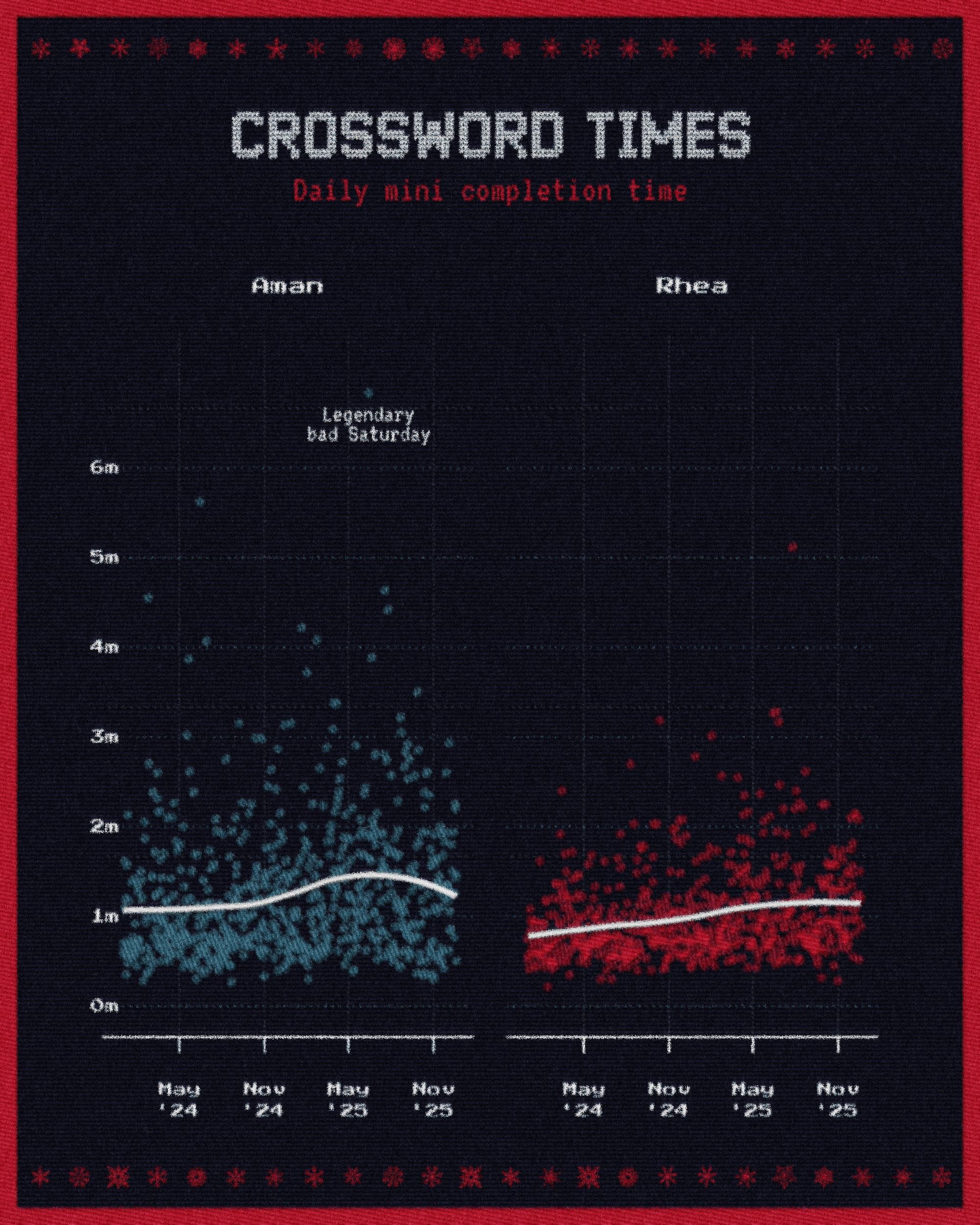
And that’s it! It seems like a mess of commands, but I think the result is worth it. When you put it all together in the next section, you won’t even have to worry about it more than just tweaking a few values. Here’s what our nice chart looks like now.
Final Function
Here’s a complete R function that wraps up the entire pipeline, including the embroidery.sh script and the post-processing steps.
apply_embroidery_effect <- function(input_file, output_file, numcolors = 8) { # Step 1: Run the embroidery script temp_emb <- tempfile(fileext = ".png") system2( "bash", args = c( "./embroidery.sh", "-n", as.character(numcolors), "-p", "linear", "-t", "3", "-g", "0", input_file, temp_emb ) ) # Step 2: Apply sweater texture post-processing magick_args <- c( temp_emb, "-spread 2", "\\( +clone +noise Gaussian -motion-blur 0x8+90 -colorspace Gray -auto-level \\)", "-compose SoftLight -composite", "\\( +clone -colorspace Gray -blur 0x2 -shade 120x55 -auto-level -contrast-stretch 5%x5% \\)", "-compose Overlay -composite", "-modulate 115,105,100", output_file ) system(paste("magick", paste(magick_args, collapse = " "))) # Clean up temp file unlink(temp_emb)}To use this in your workflow, save your ggplot chart with ggsave() and then pass it through apply_embroidery_effect(). The entire pipeline becomes reproducible! When your data changes, you just re-run the script and everything regenerates.
One important thing to note here is that you are working with a strictly limited palette of colours. Since the embroidery.sh script quantizes your color palette into a limited set of colours, don’t use color as a form of encoding your data. Gradients are out of the window. I recommend going through this excellent post by Nicola Rennie to see how she discusses monochrome dataviz and alternate encoding methods (shapes, textures, size etc.). You can use the same principles here. Secondly, these plots need to be of large size for a good quality look. I export these in 300 DPI in a 2000x2500 picture size. Adjust your font sizes accordingly.
Update: Lucas Melin wrote a neat Python implementation for this, how cool! Check it out. Code is available here.
The main takeaway for me is that existing knowledge of image editing translates directly to programmatic pipelines. I can’t memorize ImageMagick flags, although I am a lot more familiar with these specific ones now. But to start off with, I knew what I wanted from years of Photoshop work of learning when to blur this, blend that, add shading etc. and used LLMs to help construct the actual commands. Understanding what to ask for is the hard part, I think the syntax is just details.
I think this is worth experimenting with more, I’ve never thought about treating ggplot charts as an image-editing exercise and this opens up whole new possibilities for exploration. At some point I would like to be able to render ggplot graphics on PBR textures for authentic displacement and texture effects too.
The code (pushed as-is without cleanup) for my original post is available in this repository, feel free to adapt it to your needs.
This work is licensed under CC BY-SA 4.0. You are free to share and adapt this content with attribution.
Cite: Aman Bhargava (2025). Creating Embroidered Charts with R and ImageMagick. Retrieved from https://aman.bh/blog/2025/creating-embroidered-charts-with-r-and-imagemagick


