Visualizing Pretty Buildings in QGIS
May 16, 2023
I made some maps the other day just to expore the Microsoft Building Footprints dataset and they turned out pretty nice. Here’s a short rundown of how you can do this too.
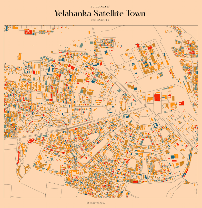
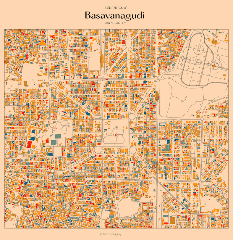
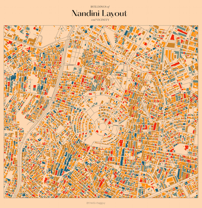
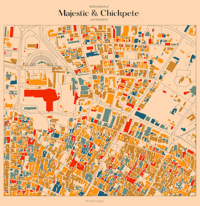
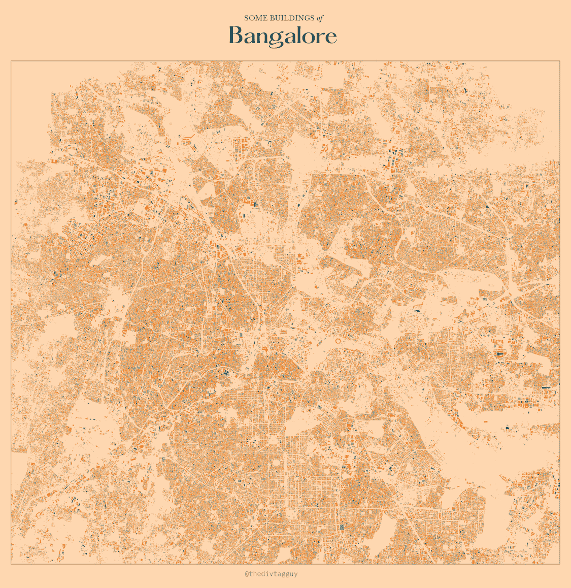
Microsoft Building Footprints
Microsoft Building Footprints is a dataset of building footprints from around the world. It’s available for free and its probably the most comprehensive dataset of building footprints out there. You can read more about it here or explore it interactively here.
Accessing the data
All the data is available to download for free, but it’s a bit of a hassle to download and process it. Since the size of the dataset is so large, it’s not possible to download it at once so instead, you have to download the data for a specific region and zoom level, using something called a quadkey. You don’t have to worry about what a quadkey is, you can just think of it as a unique identifier the region you’re interested in.
I’ve made it easier for you to locate the quadkey you want (this was stupidly complicated for me for some reason, so having a map makes it easier to know what exactly I want). The highlighted regions in the map below shows the coverage of the dataset. You can click on any region to get the quadkey for that region, and then replace the quadkey in the code below with the one you’re interested in.
Once you’ve selected your quadkey, replace it in the Python script below and run, and you’ll have a GeoJSON file with all the building footprints for that region.
# Import necessary libraries
import pandas as pd
import geopandas as gpd
from shapely.geometry import shape

# Set region and quadkey
region = 'India'
quadkey = 123303312 # Replace with quadkey of your choice

# Load dataset links from URL
dataset_links = pd.read_csv("https://minedbuildings.blob.core.windows.net/global-buildings/dataset-links.csv")

# Select tile based on region and quadkey
selectedTile = dataset_links[(dataset_links.Location == region) & (dataset_links.QuadKey == quadkey)]

# Iterate through selected tile and convert data to GeoJSON format
for _, row in selectedTile.iterrows():
    # Load data from URL and convert geometry to Shapely format
    df = pd.read_json(row.Url, lines=True)
    df['geometry'] = df['geometry'].apply(shape)

    # Convert to GeoDataFrame and write to file
    gdf = gpd.GeoDataFrame(df, crs=4326)
    gdf.to_file(f"{row.QuadKey}.geojson", driver="GeoJSON")
It will take a while to download, so be patient! Have a drink of water or something.
Cleaning up the data
Now that we have the data, we can visualize it using QGIS. If you’re unfamiliar with QGIS, it’s a free and open source GIS software that’s available for Windows, Mac and Linux. It’s a great tool for visualizing and analyzing geospatial data.
I have a starter course on getting familiar with QGIS if these things are new to you. You can check it out here, and then come back to make these sweet, sweet maps.
Once you import the GeoJSON, the first thing you need to do is clip it to your region of interest. I’ve written how to do this in my course, the only thing you need from your end is a shapefile of your region of interest. You can even just select Canvas Extent if you want to clip it to the extent of your viewport.
Generating categories
We need create some categories for the buildings. This is because the dataset doesn’t have any information about anything so it isn’t possible to color it according to something.
The simplest way to do this is to create a new column in the attribute table and assign a number to each building. You can do this by going to Layer > Open Attribute Table and then clicking on the Toggle Editing button. Once you’re in editing mode, click on the Add Field button and add a new column called id. In the expression box, type $id and click OK. This will assign a unique ID to each building.
Now that we have something to build on for each building, we can use it to create categories.
If your column creation didn’t work because of an error saying your geometry is invalid, you can try to fix it by going to Processing Toolbox > Fix Geometries... and then saving the file as a shapefile.
Now go to the layer properties and in the Symbology tab, select Categorized.
Visualizing the data
We can’t just categorize the buildings by id, there are wayyyyy too many of them.
Instead, we’ll write a small expression to classifying it into 5 categories based on the id value. Click on the ε button next to the Category field and to open the Expression Editor.
There are many, many, many ways to do this. What I did was to just assign colors based on whether the id was divisible by 5, 12, 7 or 2. You can change the expression to suit your needs, but here’s what I used.
CASEWHEN id % 5 = 0 THEN '#D90206' -- redWHEN id % 12 = 0 THEN '#F6A800' -- yellowWHEN id % 7= 0 THEN '#009E3D' -- greenWHEN id % 2 = 0 THEN '#0057A4' -- blueELSE '#FFFFFF' -- whiteENDThis expression will assign a color to each building based on the id value. The % operator is the modulo operator, which returns the remainder of the division of the first number by the second number. So, for example, id % 5 = 0 will return true if the id is divisible by 5.
Once you’ve added the expression, click OK and you’ll see the buildings colored based on the id value.
That is all there is to it, really. You can now do a bunch of things:
- Add roads or waterways to the map, by importing them from OpenStreetMap or Natural Earth.
- Play around with the colors and the expression to get different results.
- Create a print layout. Add a heading, some text, and a legend. You can also add a map of the region to show where the buildings are located.
Butttttt, that is for you to figure out. Have fun.
