
Mapping The New Residents in Hurricane Milton's Path
October 12, 2024
This is a small behind-the-scenes look at how we went about mapping the population and housing growth that fell in the path of Hurricane Milton.
For the past few weeks, I’ve been shilling R and tidyverse to my friend Vivek. Some of that has recently started paying off because it introduced him to the tidycensus package, which we used last week to quickly do a small article as Hurricane Milton was about to make landfall. Vivek put a message in our Signal group asking if I was interested in visualizing the population and housing group in Florida, specifically around those areas that the hurricane was bound to hit. Of course I said yes. Any chance to make something with a fellow enthusiast must be snatched.
The last time I had worked on a hurricane-based visualization was during my internship at Reuters. We did a breaking news piece on Hurricane Ian and I made one of the maps that tracked the hurricane’s path over a population density layer.
I also really liked the premise of what he was suggesting: a lot of the neighborhoods that would face the hurricane had come up within the last decade. Imagine moving into a new house 5 years ago, only to have 15 feet of storm surge inundate everything and wash away everything you owned. There might be a chance that these houses survived, obviously, but it was still worth illustrating the magnitude of change that had happened along this area.
Within an evening, he had analyzed the data in R and generated shapefiles of census tracts with all the data that I needed to execute my end of the deal baked in. I don’t remember going from a conversation to execution so fast in recent memory.
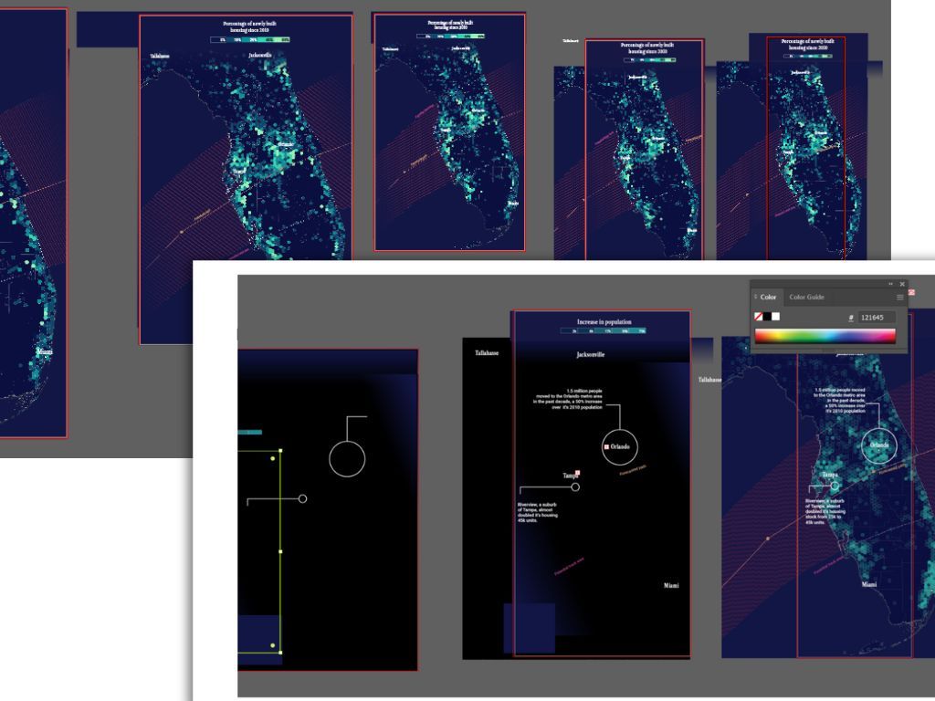
The maps
This was to be a static page, so I had to find a way to summarize the data so that smaller urban areas in Florida, around where most of the explosive growth has happened, could still be visible (otherwise only the largest visible areas on the choropleth would be what the reader saw). I’d been wanting to make a hex map, so this was my chance.
What I did was generate points for each county and then aggregate them into a hexagonal grid. So each hex might be an aggregation of the tracts that it contains, or if the tract is big enough, then it is, well, just that.
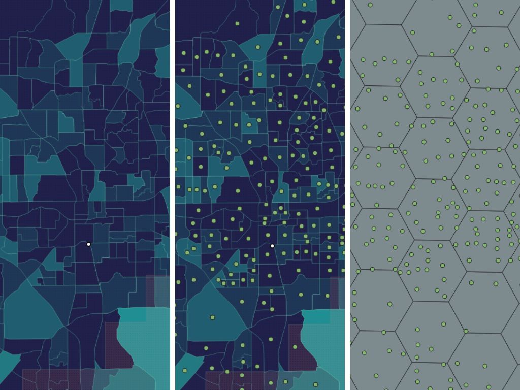
Simple enough, nothing too complicated! While aggregating the points, you can also choose to do something like sum up a variable, calculate medians, and so on. For my purposes, I only cared about the increase in total population and housing units, and I summed these variables up. I also knew where to find the data I’d need for the hurricane tracks (I also maintain an open spreadsheet of datasets I use often, originally made by my friend Manas) and adding that layer of information was quite easy.
This needed to be done pretty fast, and I didn’t have time to look at a lot of style references. For me, that is usually the longest part of the process—finding the perfect color scheme that is not in the defaults. There was no idea that jumped out to me this time and I started off with a preset color scale from colorbrewer. While moving around layers, I accidentally flipped some blend mode on a polygon to find that the otherwise-boring standard color scheme had become inverted and looked much more interesting. Good accidents! I’ve done this in Photoshop all the time (stacking blend modes) but never thought about applying the same design ideas to QGIS.
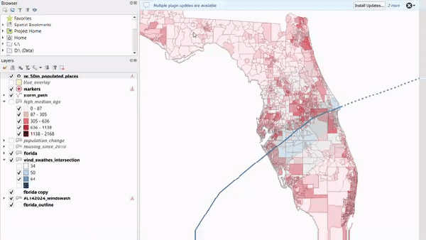
Unfortunately, by the time we got to publishing the article, Milton had crossed Florida and was well on its way into the Atlantic. This was unlucky because I had already spent a lotttttt of time styling the cone of uncertainty and creating artboards for it in ai2html. Now that the hurricane was past, there was no uncertainty! I needed to show something else.
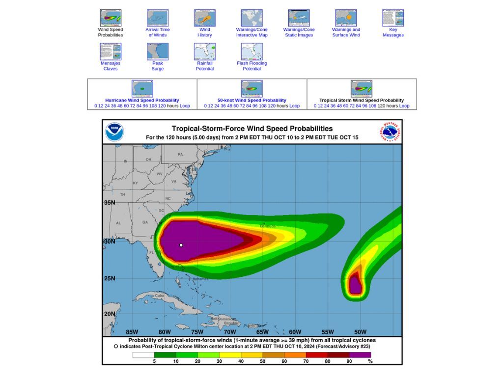
Apart from great GIS products, the National Hurricane Center also publishes graphics for such events, which are regularly updated (and form the base for a lot of the nicer visualizations you see on hurricane trackers that Bloomberg and NYT publish). The most relevant of these seemed the wind probabilities product. This layer shows you the extents of where there was a high probability of hurricane-like and tropical storm winds. It illustrated the same basic point we were trying to convey: that these were areas that most likely suffered the most damage and which had also seen incredible growth.
So I quickly ran through the routine again: download, style, export, label in Illustrator, export using ai2html (or, in my case, ai2svelte). Here’s what that looks like.
If this is your first time hearing about ai2html, here’s a TL/DR of what this does. All the text (labels, legends, and so on) is added in Illustrator as text layers. Each screen gets its own artboard, so for each breakpoint I lay out separate maps. Why not just use an image and resize it in the browser? Text doesn’t scale! Labels that look fine on desktop might become miniscule on desktop or become blurry and illegible. This keeps things looking nice since it exports a Svelte component that has the map as a background image and the text positioned correctly over it as HTML. No blurriness. While it sounds like a lot of work, this actually makes life a lot easier as you develop and design such graphics iteratively. Once labels are placed and artboards made, you can keep running the script from right within Illustrator and write the output to the correct folder. Since the output is a Svelte component, the page just reloads with your updated file! It’s like having a GUI for your HTML.
Within an hour of finalizing these graphics, we had also set up a small microsite, and Vivek streamlined how we’d have it be on a separate Netlify domain but show up as a subdirectory on our main site (I’ve been using this hack for years now; I’ll write about it soon). But if you’re interested, all that you need is in the Github repo.
And that’s pretty much it! You can check out the final story here.
Diagram chasing
So what ‘site’ do I refer to above? Vivek and I have been toying with the idea of having our own dataviz/data exploration blog for a few months now. We’ve decided to call it Diagram Chasing, and we now have a website where you can see all the projects we have published and are going to work on.
I’m excited about the idea of what this space can become for me. More to come soon!