Aman Bhargava Bangalore India Data Visualization Designer & Developer aman@diagramchasing.fun

Things I've made for myself and others

Fresh
How Bangalore Uses the Metro

How Bangalore Uses the Metro

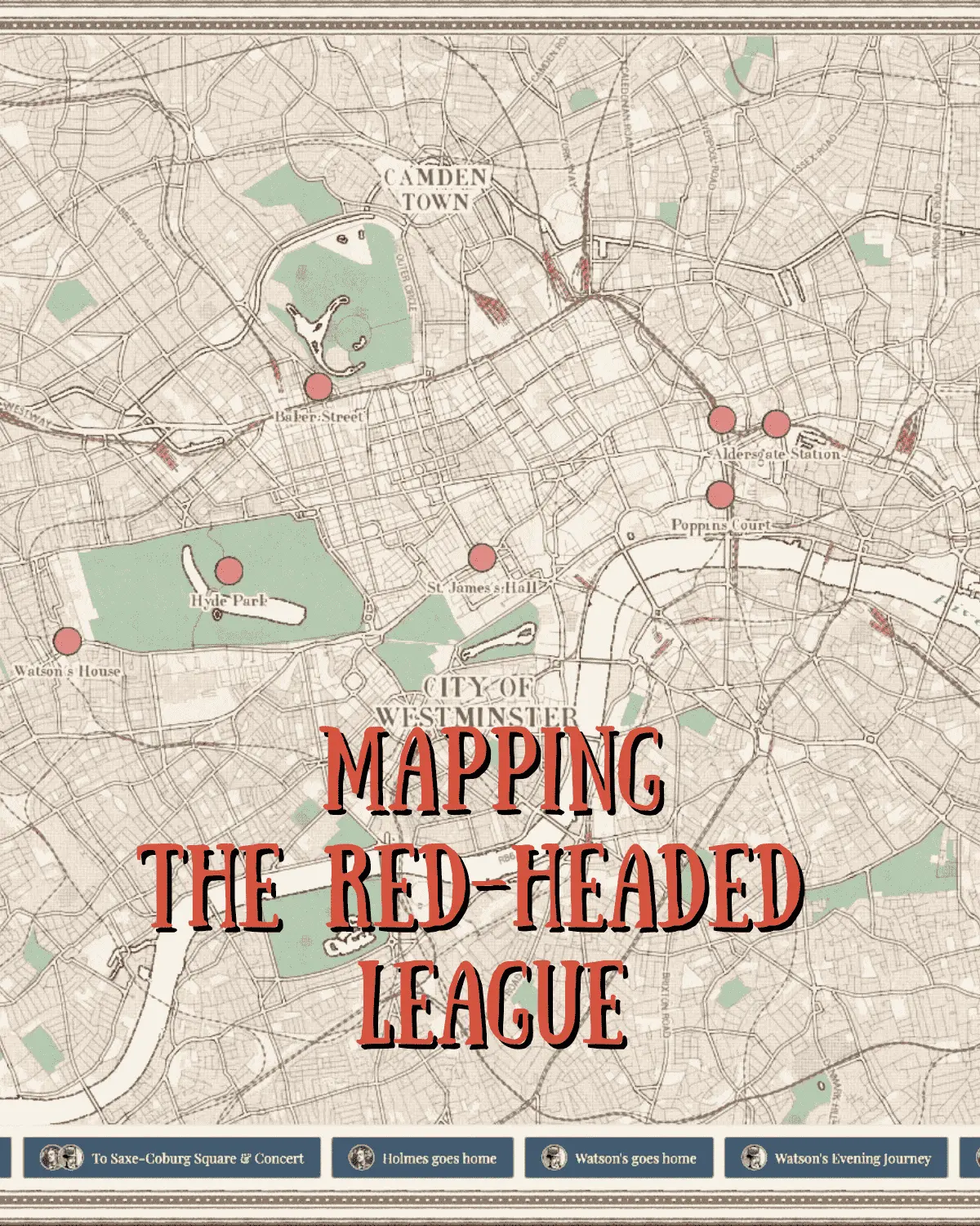
We filed an RTI request with Bangalore's metro authority asking how many people traveled on the metro and got a file with 1.2M rows of data on ridership. Where has the new Yellow Line impacted the city the most? Or what are the most popular metro trips in the city?

CBFC Watch

CBFC Watch

CBFC Watch is an independent research project dedicated to exploring film censorship actions in India. It is the first public, searchable database of censorship information for nearly 18,000 films released between 2017 and 2025.

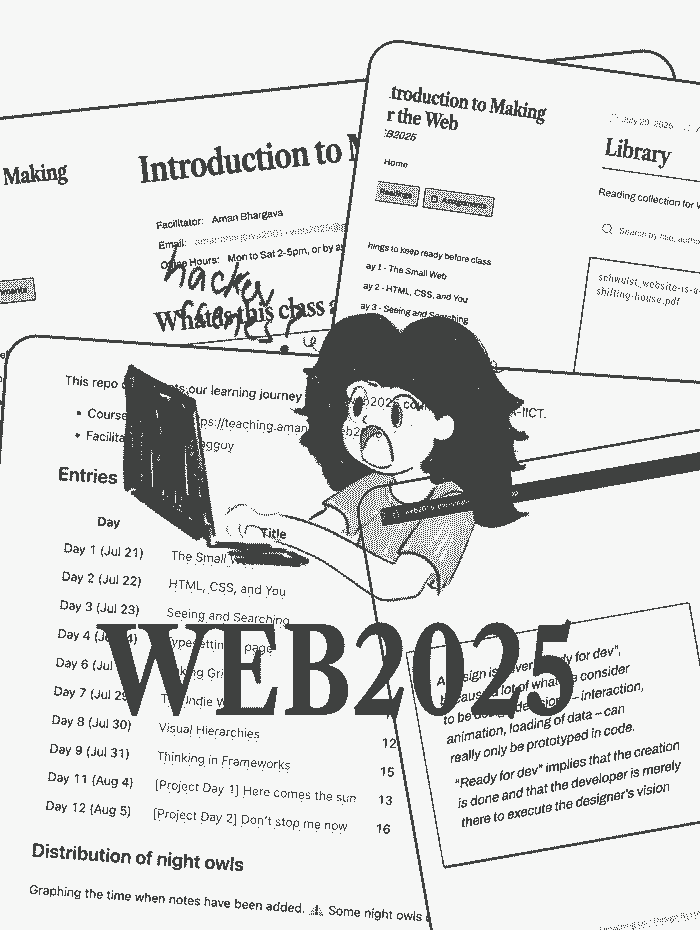
WEB2025 - Course

WEB2025 - Course

Student showcase for my open-source course module on web design taught at DA-IICT. Including links to student submissions and all course material.
India Time Use Explorer

India Time Use Explorer

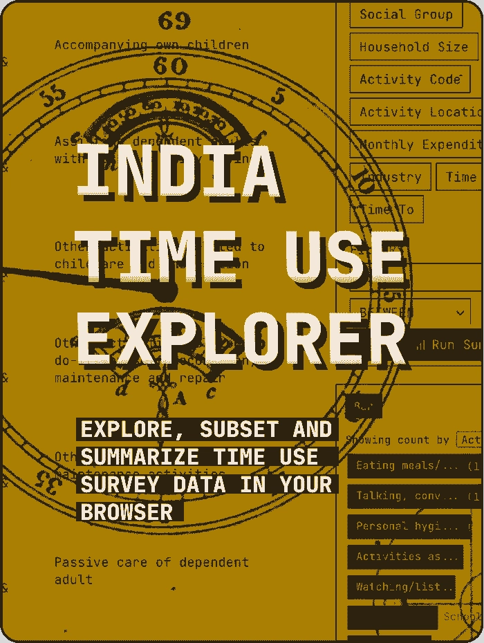
A tool to explore the National Time Use Survey data. Run complex SQL queries to answer questions on how different demographic groups in India spend their time; no coding knowledge required. Fully static, client-side explorer for over 10 million rows of data
Royal Thief - Mini Multiplayer Game

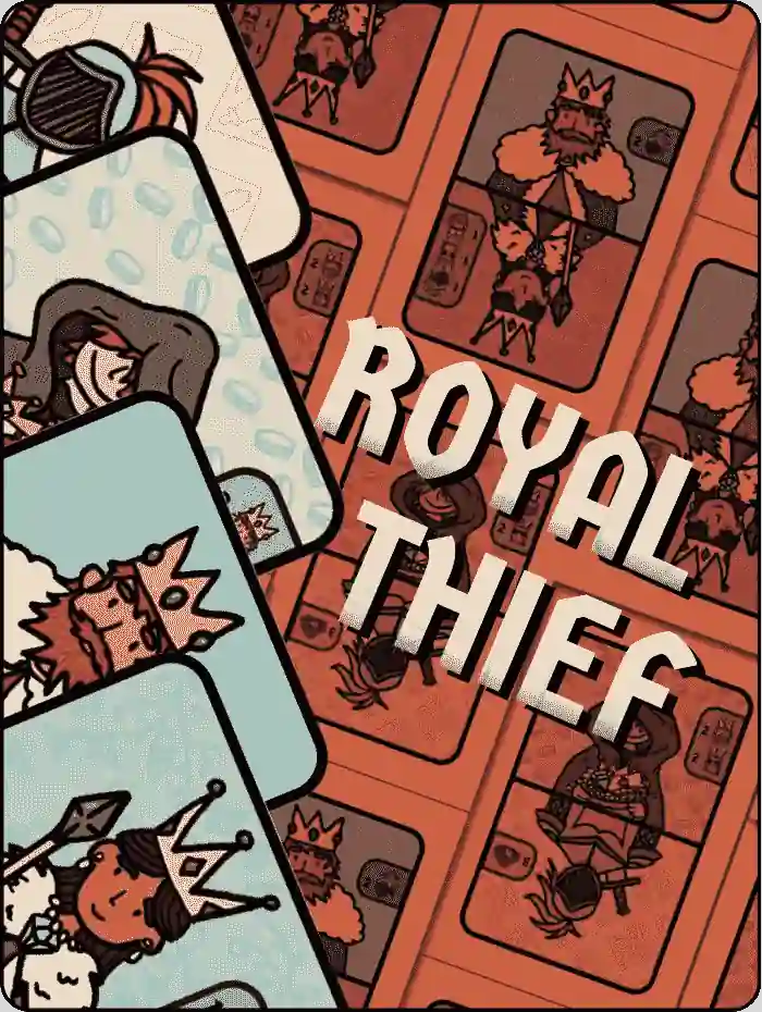
Royal Thief - Mini Multiplayer Game

AI Research collaborations
Rest of World

AI Research collaborations

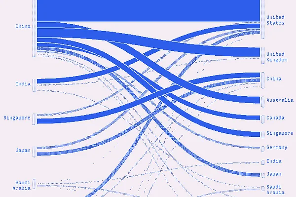
A set of data visualizations for a Rest of World story on how countries collaborate for AI research.
Votes in a Name

Votes in a Name

I looked at data from Indian elections to find similar-sounding candidates and analyze some of the different ways they show up. We then tried turning those similarity scores back into visuals which you can play around with. Illustrations by Reechik Banerjee

BLR Water Log

BLR Water Log

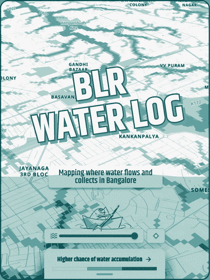
Natural drains crisscross Bangalore and are often the places which are the first to flood. We mapped where these are.
Diagram Chasing

Diagram Chasing

I started a data-viz blog with my friend Vivek to explore our many and varied interests, giving us a space to work on them. We have a public ideas page that tracks what we're working on. Published without a strict schedule.
International Math Olympiad

International Math Olympiad

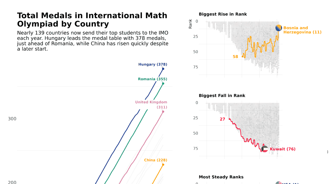
This week's dataset was on every country's scores and medals in the International Math Olympiad. I wanted to visualize both overall medal count and how rankings have fluctuated over the years. The small multiples are actually bump charts! Perhaps a little overwhelming, but I enjoyed using the {patchwork} package.
Shakespeare Dialogue

Shakespeare Dialogue

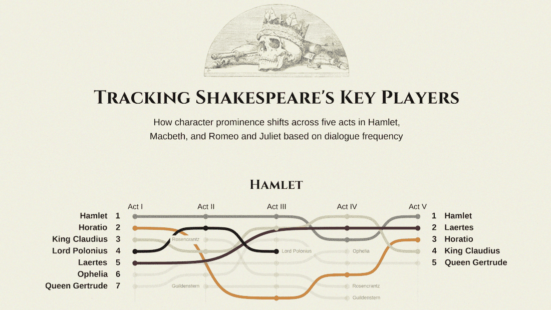
After a long time away from Tidytuesday, I made a fairly straightforward graphic showing how the 'prominence' of characters changes as the three plays go from Act I to Act V. Represented with a bump chart, the characters are ranked by how much dialogue they have in that particular act and scene.
Journeys of Resilience

Journeys of Resilience

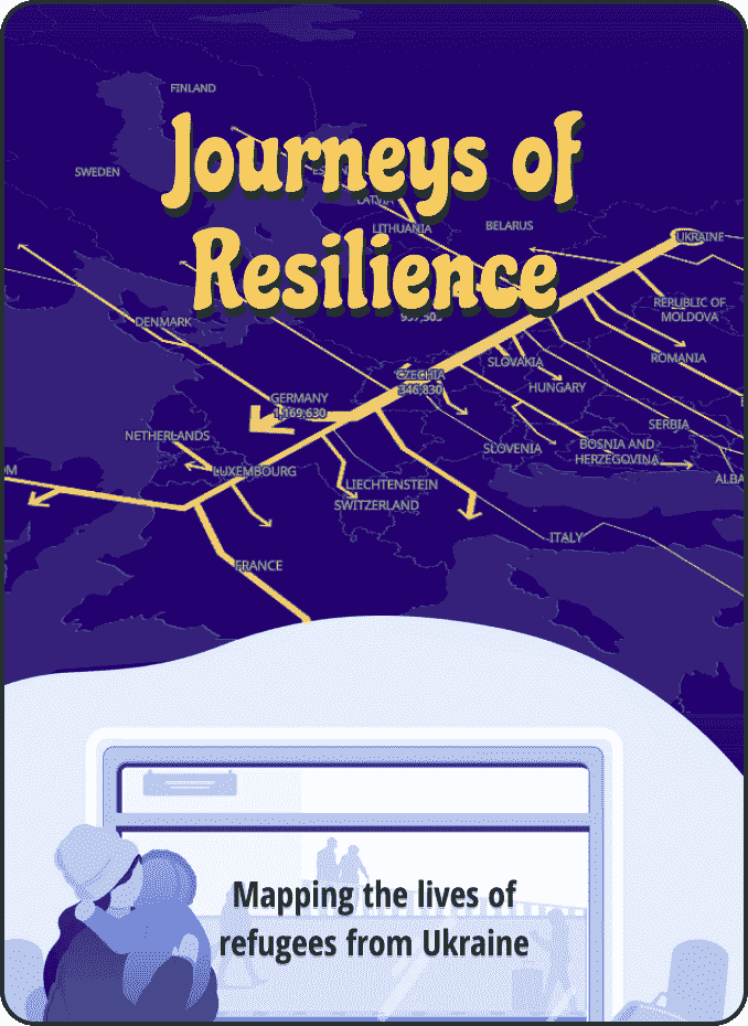
An interactive story on the lives of Ukrainian refugees visualizing data based on comprehensive surveys conducted by the UN International Organization for Migration (IOM). Developed at Revisual Labs with Divya Ribeiro and Surbhi Bhatia.
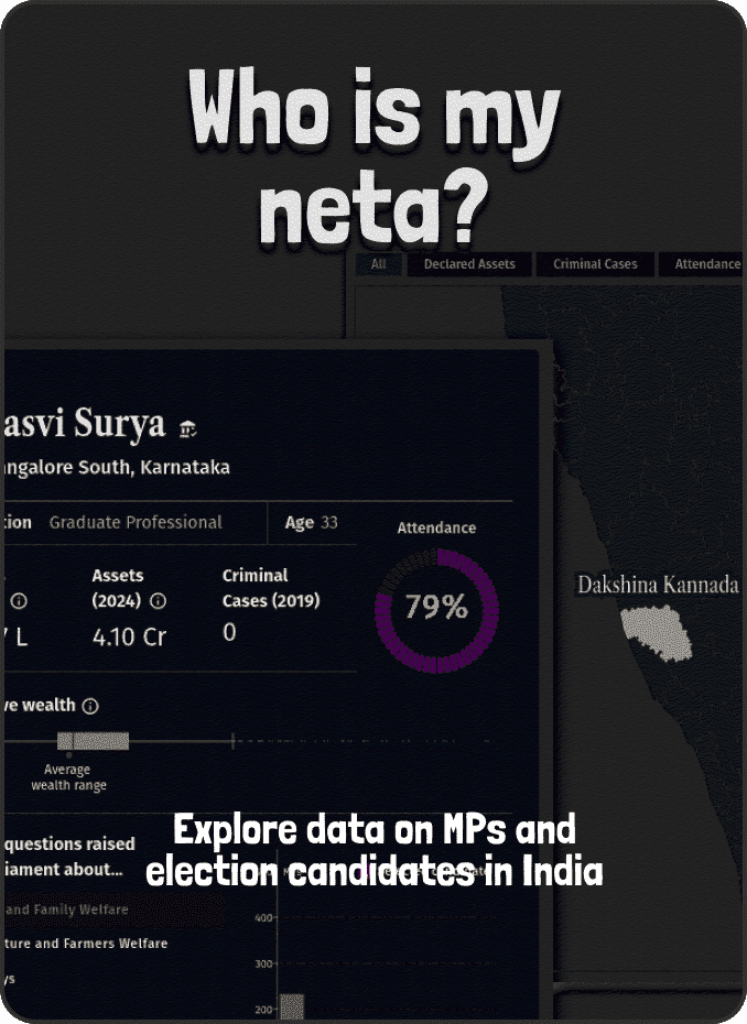
Who is my neta?

Who is my neta?

Explore data on MPs and election candidates in India
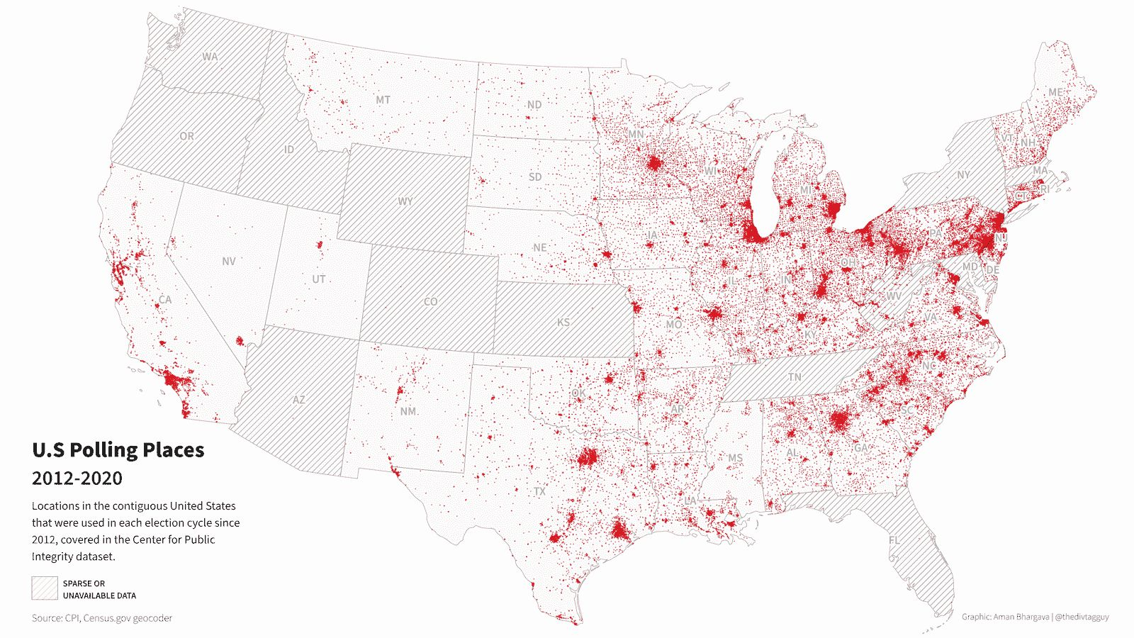
U.S Polling Places

U.S Polling Places

I mapped addresses of U.S polling places and plotted their locations (probably a population map lol). Geocoding was an interesting challenge; I found out that the Census website provides a nice generous_API. Processed in R but mapped in QGIS (whoops)._A pretty simple visualization for this week, but getting geocoding to work was fun. It took around 4 hours to run through the full dataset in batches of 9999 addresses each.\n
NYT Word Games Dashboard

NYT Word Games Dashboard

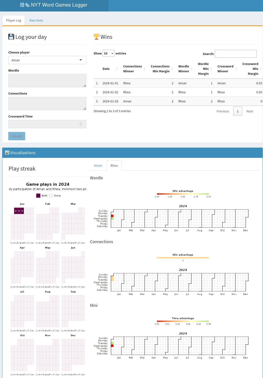
My friend and I are hyper-competitive with our NYT word games, this year we want to see who is *actually* better. Using this week's #tidytuesday prompt to create a Shiny dashboard that tracks our daily plays, wins and win margins for the rest of the year. The game is on
Doctor Who

Doctor Who

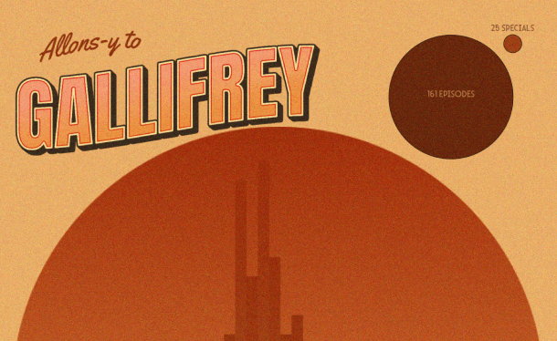
It's tidytuesday week 48 and we looked at Doctor Who. I made a little nerd postcard from Gallifrey. I think I got the shape pretty close? eh?? Added the unstylized versions at the bottom. Except the title graphic, everything done in R.
R ladies chapters

R ladies chapters

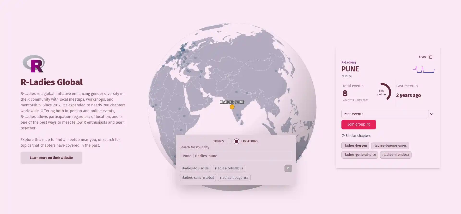
For #tidytuesday week 47, we looked at @RLadiesGlobal chapters, and I probably overdid things. Tbh, I just wanted to use the OpenAI embeddings API to cluster similar chapters but one thing led to another and well yeah, I made a dashboard. You can search by topic or locations. All the processing for the data was done in R and the website is (obviously) built with Sveltekit. I used the OpenAI APIs to extract keywords for tagging and to 'recommend' chapters based on the kind of events they host. It cost me ~$0.90.
Diwali sales

Diwali sales

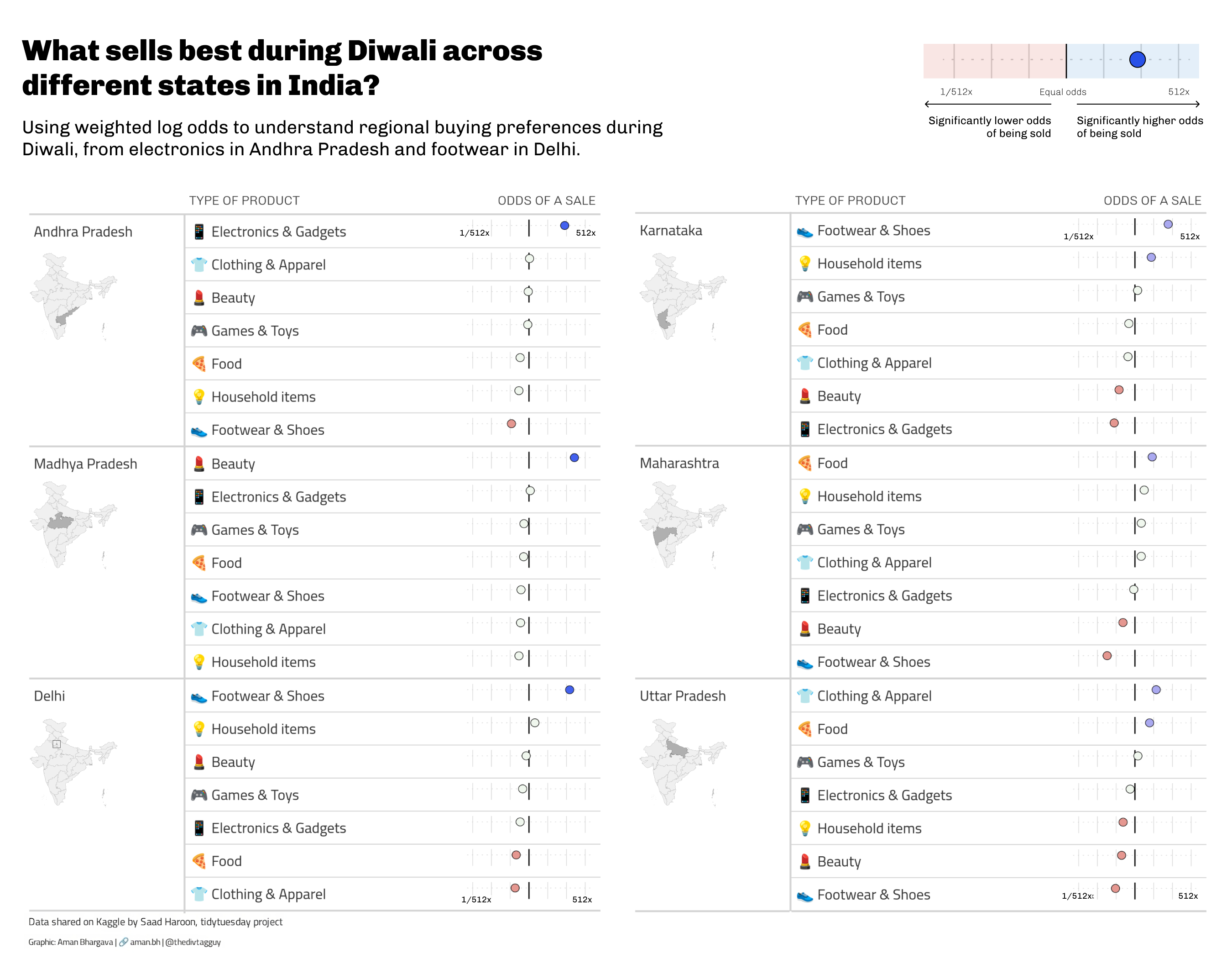
For #Tidytuesday week 46, I used weighted log odds to see what kind of products are potentially more 'popular' during Diwali season. Made in r + Figma
U.S elections

U.S elections

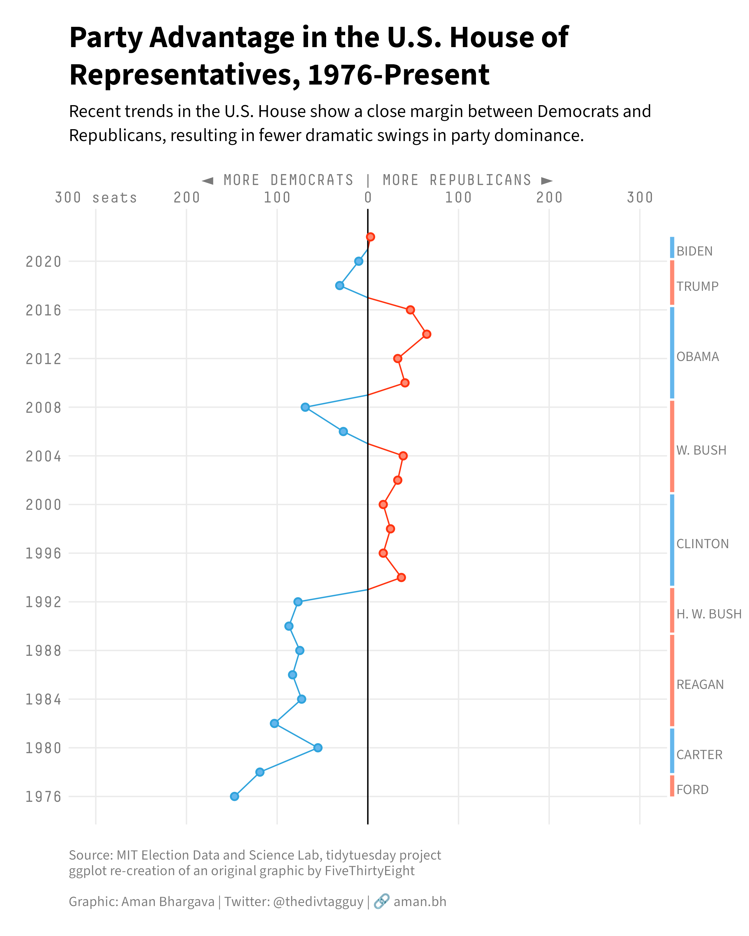
For tidytuesday week 45, I accepted that the US election system is beyond my understanding lol. Made a couple of things, but settled on trying to recreate an old @FiveThirtyEight analysis and graphic.
Taylor Swift

Taylor Swift

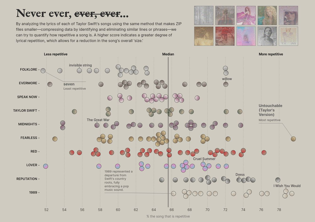
I analyzed repetition of lyrics in Taylor Swift songs. If you take away similar phrases and words from the 1989 album, how many songs can be reduced by at least 60%? All of them! The repetitions make them catchy as heck.
Deforestation in Brazil
Unearthed

Deforestation in Brazil

Contributed a small animated and interactive visualization showing the loss of native vegetation in an area in Brazil.
UN IOM Regional Data Hub Portal
UN IOM

UN IOM Regional Data Hub Portal

Sewage spills near you
Unearthed

Sewage spills near you

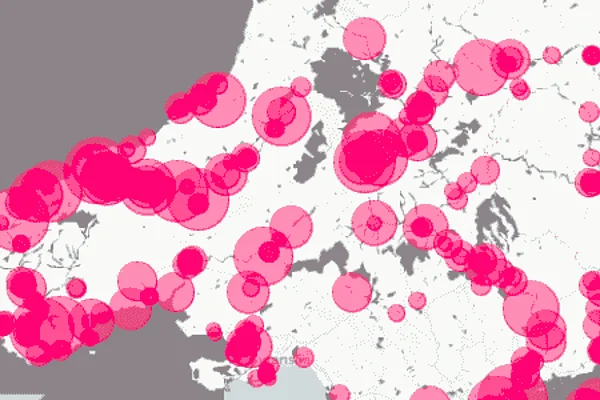
An interactive tool that lets UK residents see the extent of sewage spills near their postcode
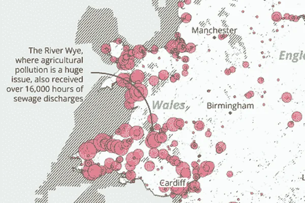
Sewage spills in the UK
Unearthed

Sewage spills in the UK

Mapping sewage spills across the UK for an Unearthed investigation
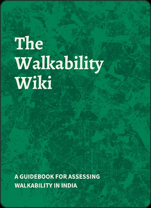
The Walkability Wiki

The Walkability Wiki

My thesis, which resulted in what I call cookbook of qualitative & quantitative methods for assessing walkability in India cities.
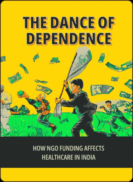
Dance of Dependence

Dance of Dependence

For an assignment in college, I tried to explore the history of NGO funding in India, focusing on the impact of private funding on healthcare sector activities.
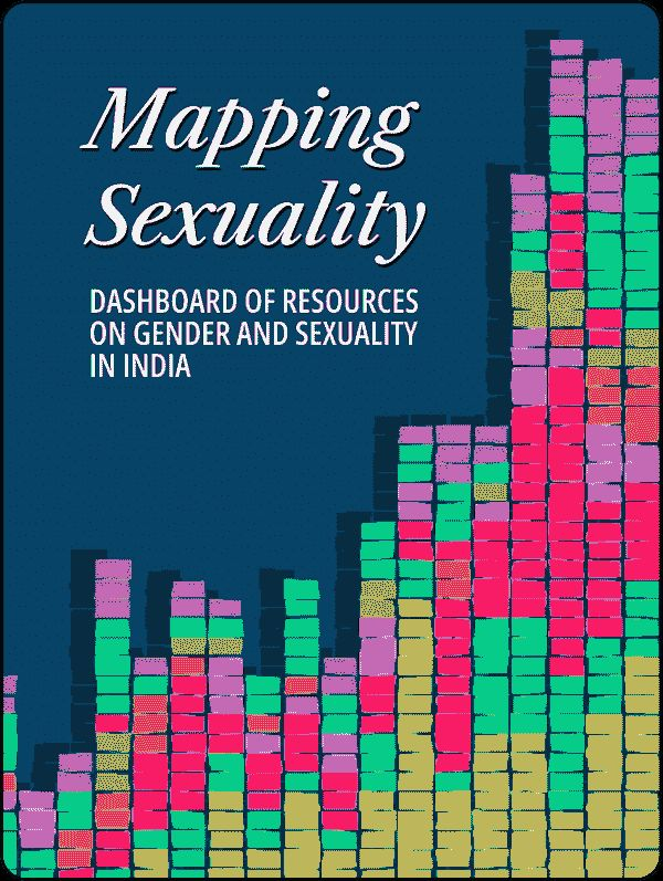
Mapping Sexuality
Ashoka University

Mapping Sexuality

Three hours of horror
Reuters

Three hours of horror

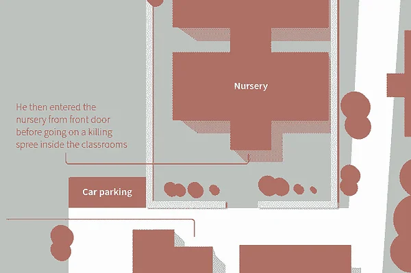
Worked remotely with on-ground reporters to help illustrate visuals for a tragic incident in Thailand
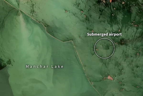
Submerged Cities
Reuters

Submerged Cities

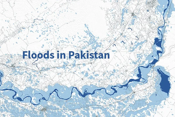
Following up on the 2022 Pakistan floods with striking visuals that show how key regions went underwater.
Floods in Pakistan
Reuters

Floods in Pakistan

Visualizing the extent of the 2022 floods in Pakistan
Europe's driest summer
Reuters

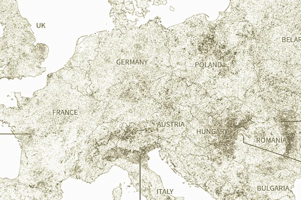
Europe's driest summer

A story on the heatwave and resulting drought in Europe, with Samuel Granados.
Earthquake devastates Afghanistan
Reuters

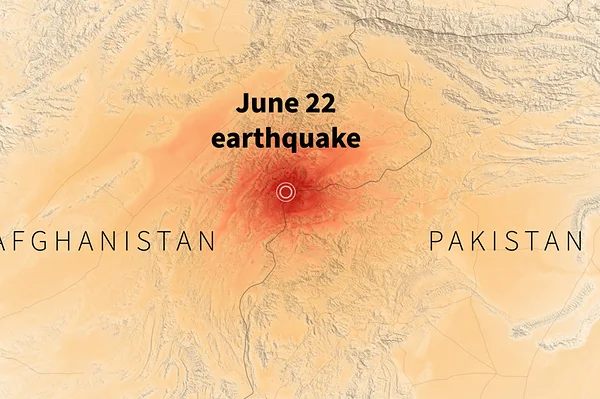
Earthquake devastates Afghanistan

First byline at Reuters Graphics (and my first breaking news story!). I analyzed historical earthquake data with ggplot

The People in the Food Apps

The People in the Food Apps

Srishti Archive

Srishti Archive

A full-fledged project archival system for I developed for students at Srishti Institute of Art, Design and Technology.
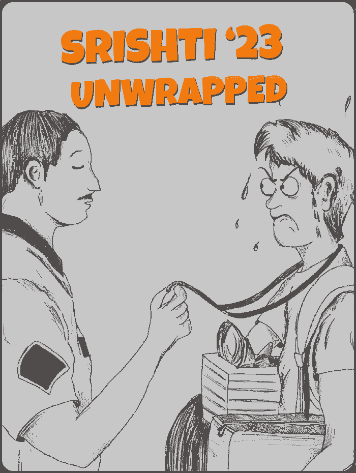
Srishti ''23 Unwrapped

Srishti ''23 Unwrapped

A fun project where I analyzed Whatsapp chat for my college group. I wanted to experiment with text analysis and R.

News Manifesto Explainer Video

News Manifesto Explainer Video

I designed and animated an explainer video for my news manifesto project.

The Yelli Pages

The Yelli Pages

Co-founded and ran a newsletter at Srishti. To this day, probably Srishti's only such publication. We had a readership of nearly 300 people, including students and faculty.

A Critical News Consumer's Starter Manifesto

A Critical News Consumer's Starter Manifesto

How do different Indian news channels tweet? My first data storytelling microsite, a remanant of the era when the Twitter API was a thing. Might be broken now.

You're a Wizard - Emails from Harry Potter Fans

You're a Wizard - Emails from Harry Potter Fans

A few of the hundreds of emails I've received over the last 5 years from children around the world who believe that the website I made would really take them to Hogwarts. Sorry guys.
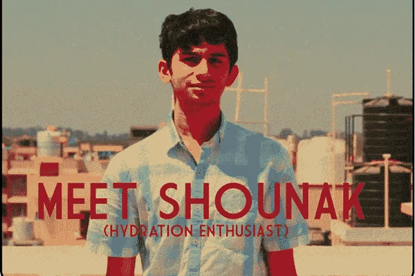
The Bottle Noose Advertisement

The Bottle Noose Advertisement

This isn't professional work, I was just told to make an advertisement for a useless product. Even though its rather juvenile, this video is something I'm very proud of. Starring my friend Shounak Karmalkar.