THE DEFINITE, ILLUSTRATED & ANNOTATED ANTHOLOGY OF MY VARIED PASTIMES


Notes Feed
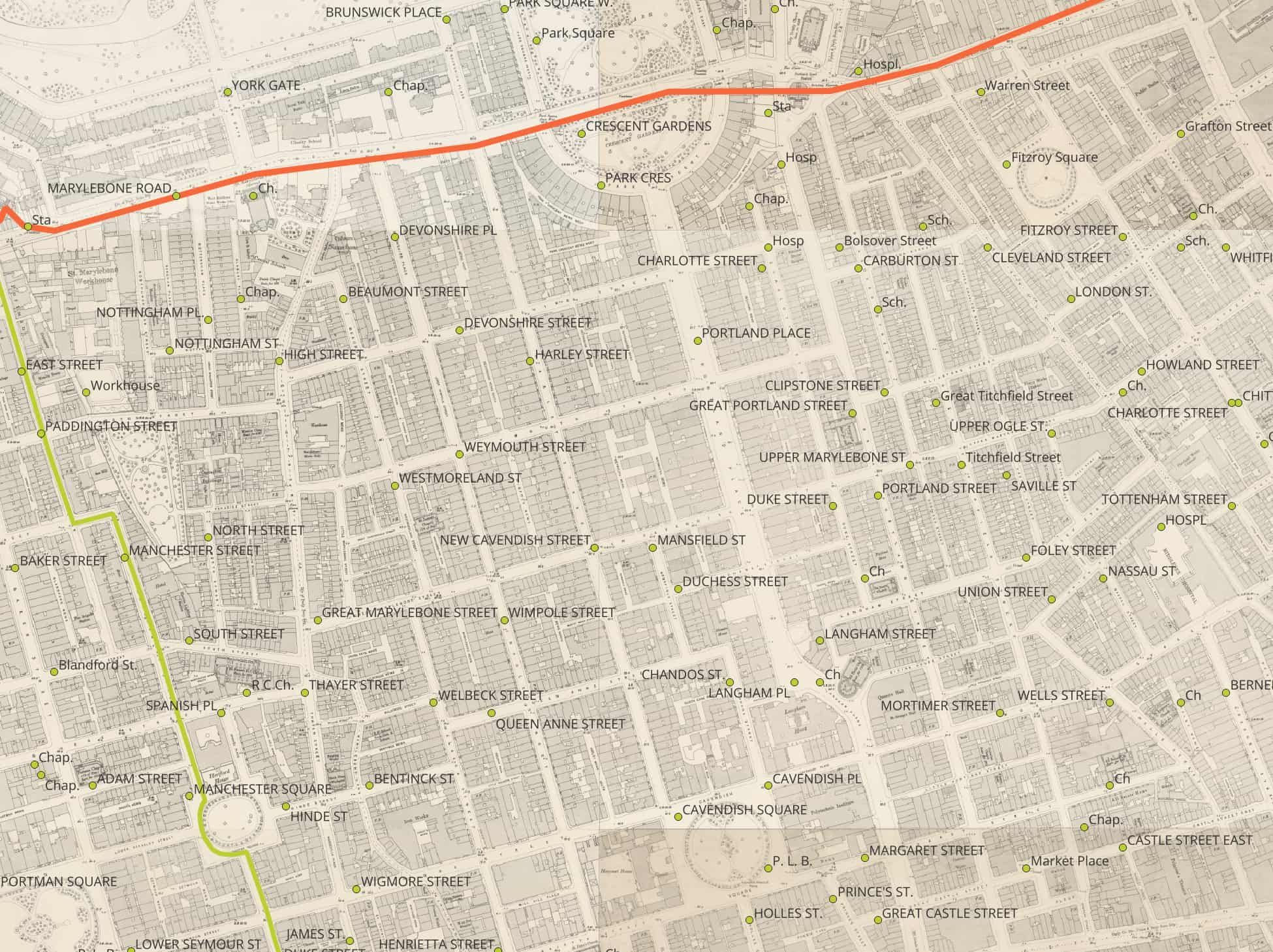
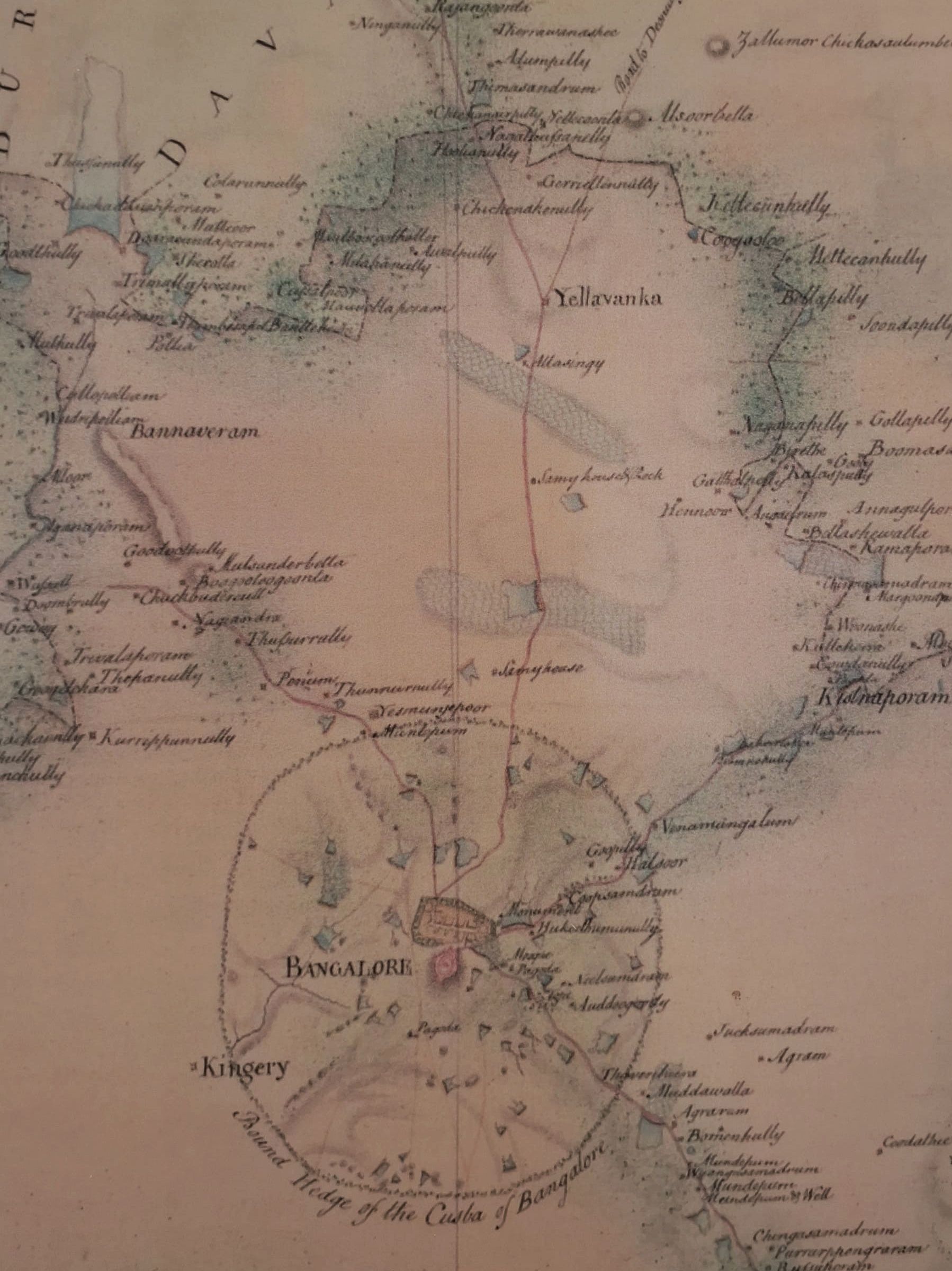
I think it is absolutely incredible that I can import vector labels of place names from the 19th century into QGIS. I can barely get geospatial data for India in 2025 where I want it, but 19th century data? Right on man. GB1900 has got you covered.
The GB1900 project was a crowd-sourced initiative to create a gazetteer, released under an open licence, by transcribing and geolocating all the place names on the second edition County Series of six inch to one mile (i.e. 1:10,560) maps of Great Britain, published by Ordnance Survey between 1888 and 1914, and thus out of copyright.
You can view this in your browser at the National Library of Scotland website, it also supports queries to find places that start or end with a phrase (maybe you’re searching for all “mews” in London?).
109,193 entries end with a space followed by “Road”, “Street”, “Lane”, “Rd.” or “St.”[3] The abridged gazetteer includes 1,617 entries for “Manor House”, 1,496 for “Manor Farm”, and 454 for “High Street”.
I couldn’t find a better way to import this into QGIS, so if you’re interested, you’ll need to add a new WFS connection and set the URL as https://geoserver.nls.uk/geoserver/wfs which loads a lot of layers. I was interested in London so I found the layer with all point details for names in gb1900_21_December but there are many more you can discover.
Why would this be of interest? Don’t we already have better, ‘new’ data? Maybe you wanted to find 10,000 miles of old, forgotten footpaths or maintain an archive of names for future developments.
I’ve sometimes fallen into the trap of thinking that complementing a creative person for their work is less sophisticated or desired than discussion or debate about it but very often the best thing you can say to them is hell yeah and that doesn’t make you dumb it just makes you nice
It goes into that weird thing that genuine appreciation is somehow considered less intellectual than criticism but everybody is getting trained to be such a cynical unfeeling asshole nowadays that I find the smartest people often are the “hell yeah cool song/drawing/story/video” people
I’ve forgotten this sometimes but being able to discover something you like, curate it, and make time to enjoy it is intelligence, connecting with art is intelligence, empathy is intelligence, the way of the dullard is to find nothing meaningful in art except for a way to seem snidely clever
Important thing to remember for me as I head into 2026. Some of the discussions in groups I am part of inevitably devolve to debate, which is stimulating at times, but I think it is harder to not be reflexively so nitpicky. I just want to be able to say “Hell yeah” without arguing points of a case.
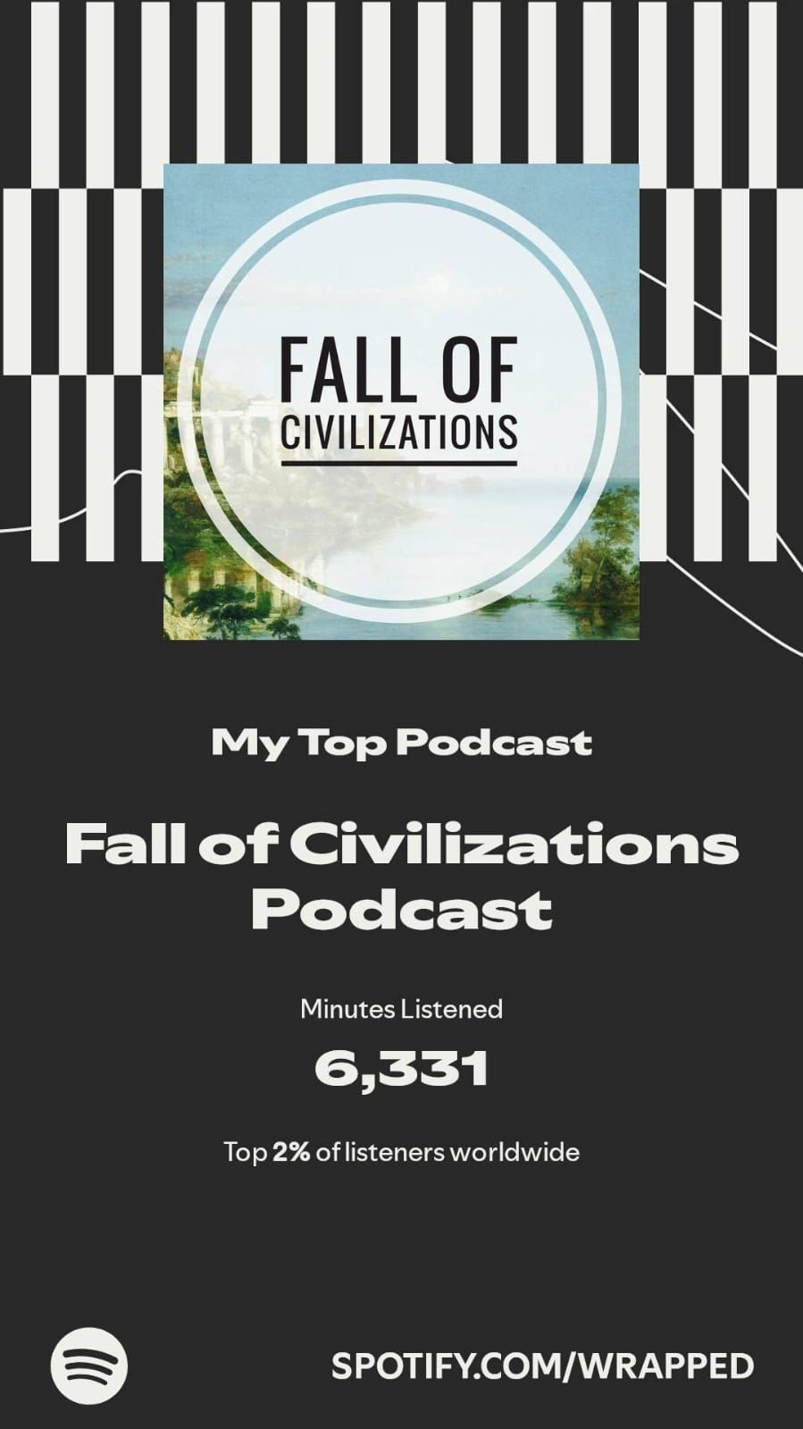
Surprise surprise, Fall of Civilizations is my top podcast this year. This says around 6.3k minutes listened to on Spotify, but my guesstimate would be at least double that since I switched to AntennaPod halfway through the year when I realized the “wherever” that hosts often say in “wherever you get your podcasts” is possible because podcasts are RSS feeds.
FoC has been a great companion this year. I think it is genuinely incredible that such a fine production gives to itself the label of a “podcast”. The sound design from the Mongols episode still gets to me on my 4th listen. The episodes on Carthage and Egypt make me feel both sad and hopeful. Sad because it puts into perspective how young the modern experiment I am a part of (idk how to describe what I mean by it, but largely the 20th and 21st century) is in the scales of time; how do we know where we’re going? Are we going the right way? Who knows, because compared to Egypt, we’re just a flash in the dark so far. On every re-listen, I love waiting for the prologue to end so I can listen to the piano notes chime in while Paul ends the introduction. Last week I found out that the Youtube channel also has beautiful videos to go with some of the episodes.
It has made me more appreciative of geography. Rarely does one find it being emphasized upon when learning about history. For example, the episode on the Aztecs begins with a vivid description of the Yucatán Peninsula and the the Chicxulub crater, 66 million years ago before it takes us to the people we’ll be hearing about. Same with most of the others. How wonderful it would be if we could make geography interesting this way? I hate how it was taught to me in school.
For Christmas this year, I bought myself a signed copy of his book. One of the projects on my checklist is visualizing the timelines of the places he has covered in the episodes, maybe I’ll do it sometime in 2026 as I read the book. Very thankful to have this podcast. I’ve been spoilt because no other history podcast comes close, in my opinion.
PS: I’ve not done any analysis yet, but I think Paul’s favorite word is “resplendent” when he is describing any of the civilizations at their peak :P A great word that I’ve now begun to associate with his voice.
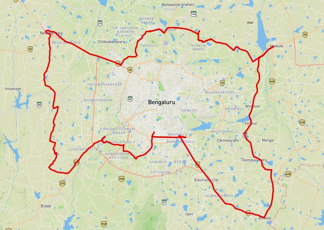
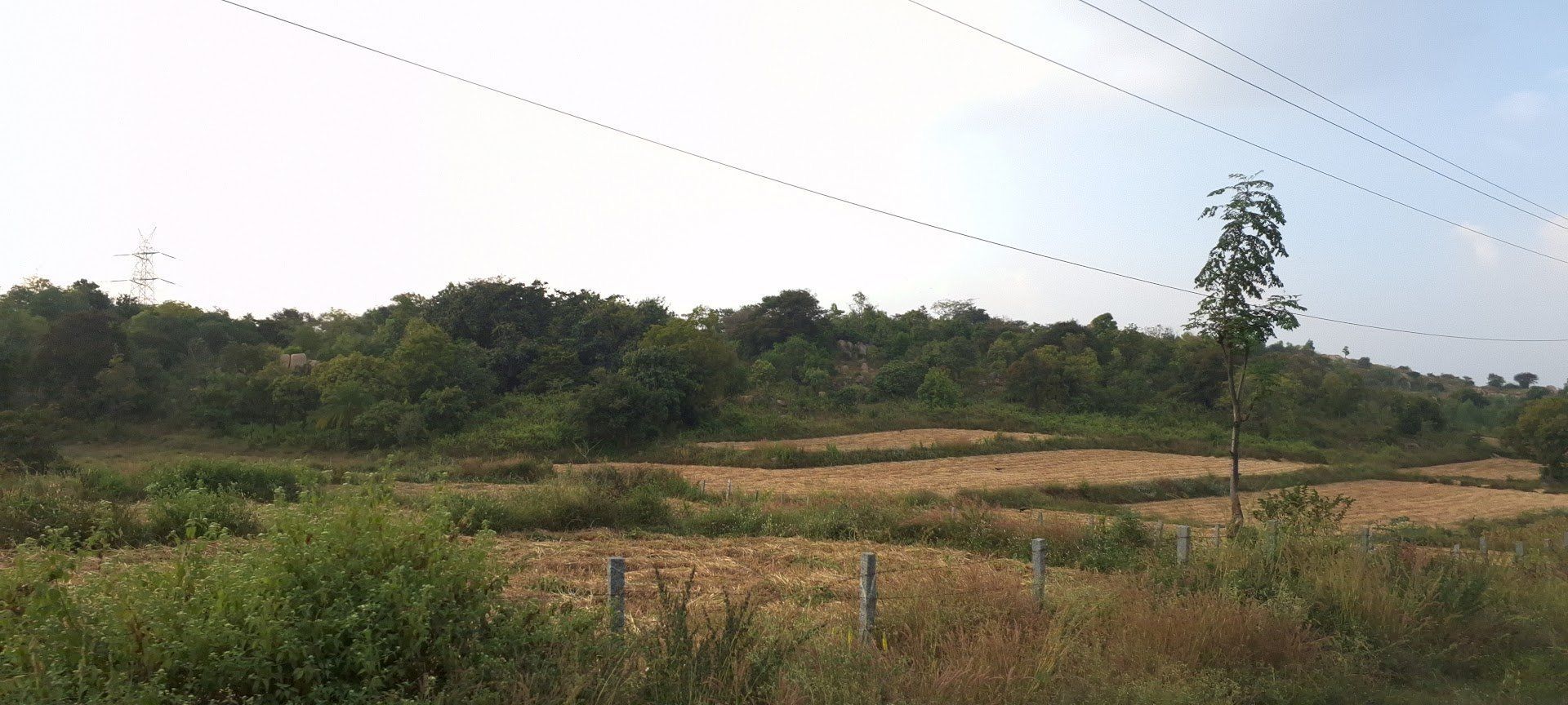
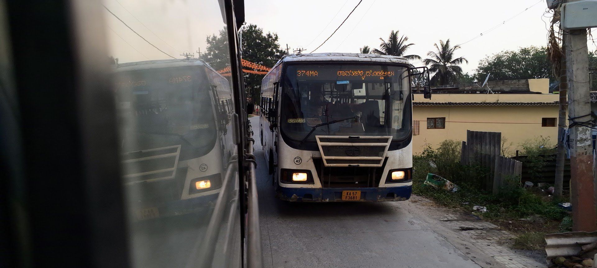
Last week for no particular reason, I took a 200 kilometer journey around Bangalore using only BMTC buses. It was quite a lot of fun. I had not planned the trip in any way, I just knew that I just wanted to go around the periphery. I went from from Jayanagar to Attibele, from there to Hoskote, Hoskote to Yelahanka where I stopped for some rest and lunch. From Yelli, I decided to go to the town of Nelamangala which I had not planned to because it was much farther out. From there, I went a long way around to Kengeri, passing the big old banyan tree of Dodda Alada Mara, which is apparently more than 400 years old (and certainly looks like it). Since I was riding terminal to terminal, I always got my favorite right-side corner last seat.
I had taken the AC bus pass so this cost me a total of Rs. 160, along with some tolls that I had to pay, but I didn’t use AC buses a lot. The entire trip took around 10 hours. There was no particular reason for doing this, I think it’s part of my propaganda to use buses for leisure more than just for necessity. I am excited about doing this more and seeing more of the city, I think the peripheries are really beautiful (the west is a lot more beautiful than the east).
I might just do a competition with a few other bus nerds to see what is the largest distance we can hit in a day. The current record is 200 kilometers.
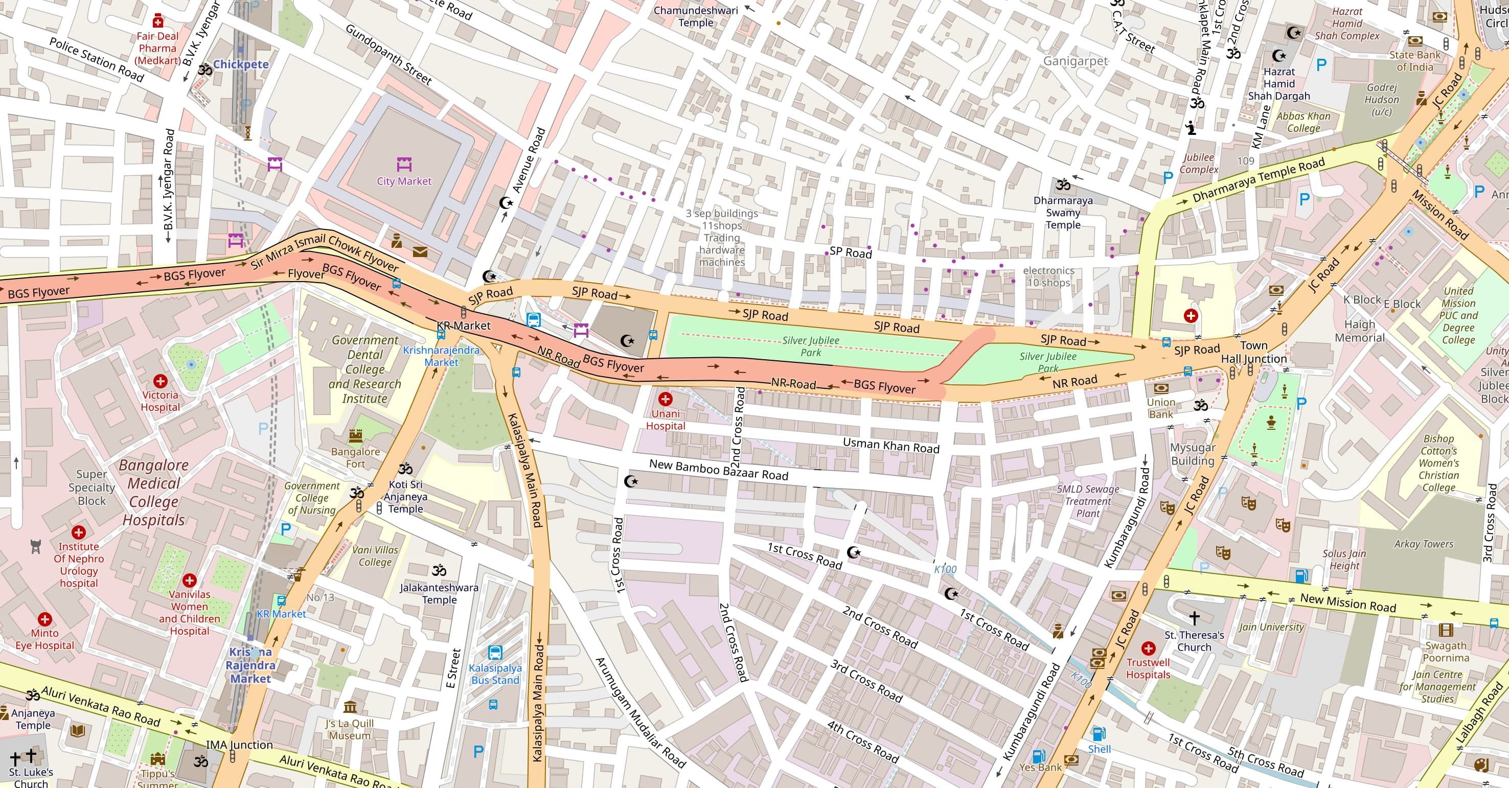
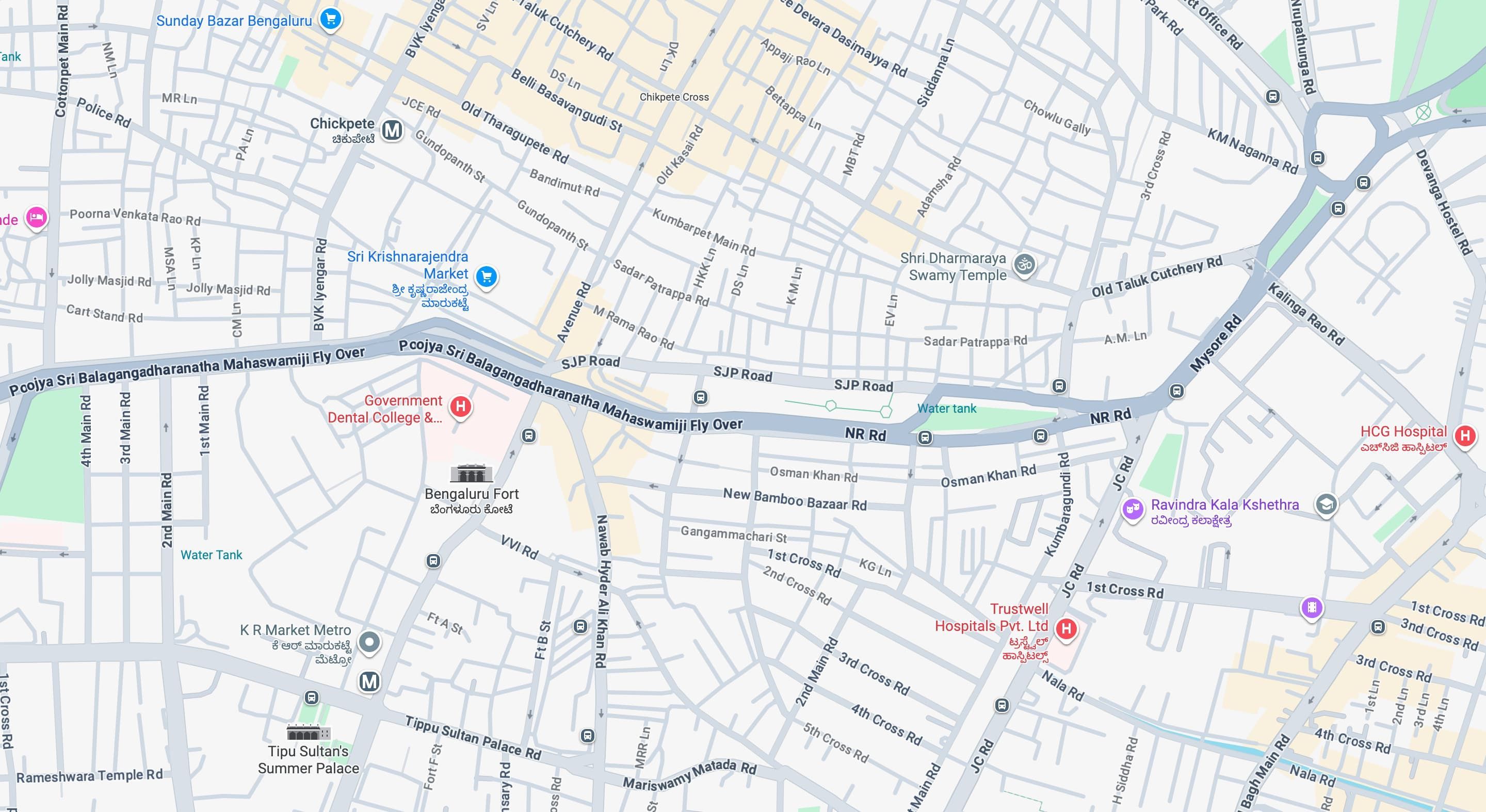
Which map looks more inviting? One is Google Maps, the other is OpenStreetMaps on OSMAnd. You choose.
Over the past few decades, childhood mobility in the West has dropped precipitously. You might think that the change has something to do with the emergence of the Internet. But longitudinal data suggests otherwise.
The important point is that kids want to spend time together, in their own space, away from the tiresome grown-ups.
Adult employment patterns and lifestyle changes have also been slowly trending toward car-dependency, which means that kids often end up living far away from their friends. If children want people to play with, the most efficient solution is for their parents to drive them to an organized sport or other structured activity.
I wish the children of today had a forest. But they don’t. They’re making do with what history has handed them.
We can complain about their screen time, lament the anxious generation, scoff at how ‘unnatural’ this brave new world has become. Simultaneously, though, we should do our best to understand why kids are behaving this way. There’s no point in whining about the impulses endowed to them by several hundred thousand years of evolution. Don’t hate the player; hate the game. And if you really hate the game, make a better one.
Based on an analysis of the history and current state of migration flow mapping, drawn from very diverse sources – scientific, artistic, activist – and from different geographical contexts at various scales, we propose to analyze some of the main technical, ethical, institutional and political challenges of the cartographic representation of international migrations.
From a critical perspective, we will analyze both the role of mapping in the production of knowledge and understanding in the field of migration, and its potential for social and political transformation.
One of our regular clients at Revisual Labs has been the UN International Organization for Migration (UN IOM). My very first project at RVL was an IOM project and one of my favorite work projects last year was Journeys of Resilience, a story that traced the movements of Ukrainian refugees as a result of the war. Mapping migration is a consistent theme and this article, originally in French, made me think about some of the choices I’ve been making as well as the standard representations of such a fundamentally human and qualitative subject. Sometimes in dataviz, you kind of go by the “industry defaults” for certain topics. Nearly every story in NYT or Reuters and in other outlets has the same kind of map for migrations, one of which might have big arrows showing the direction of movement from one place to other and while you’re making your own map, you go with these defaults in mind. Those defaults may not be bad, but it is worth thinking reflecting on some of those decisions in a larger context, which is what this article offers. Your browser should be able to translate the original text for you.
Update: There is an English translation of this article here.
Mapping migratory movements necessarily involves " freezing " a system that is embedded in space and time, within a complex social and political context. This is a real challenge because not only do people migrating and/or on the path to exile cross paths, but they also take " breaks ," of varying lengths, settling temporarily in a country or place, staying for a few days, a few weeks, or a few years, and sometimes leaving again.
The complexity of these dynamic routes, which defy geography and migration mapping, must then adapt to often very rapid political and temporal changes. This is why mapping always risks being anachronistic even before the map is finished.
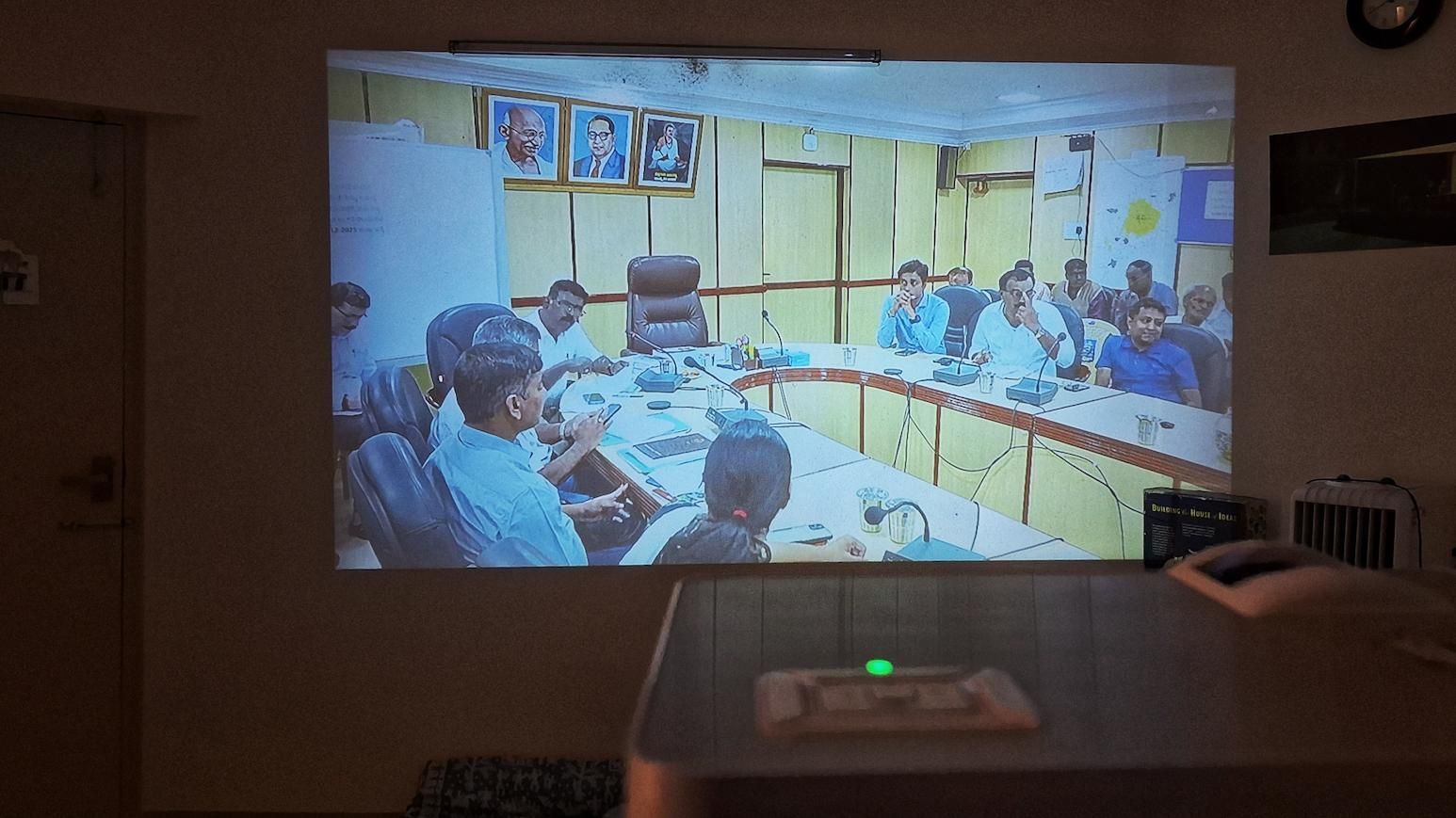
V shared a YouTube livestream of a BDA meeting on our group. A strangely humanising experience to watch these people get annoyed, joke, shout and turn heads in unison as the leader of the meeting makes remarks. I usually only encounter these specific type of government officers at banks or offices or while I am making the case that to get my passbook address updated I must update my Aadhar but to update Aadhar I need bank address updated but to update bank address…(you get it). I watch the proceedings from my home and for once there is no anxiety and I can observe that they are generally annoyed in most cases, and it is not because of me. There are stacks of paper that are sometimes half a foot high, people taking notes, some who are nervous some who are impatient, the main man is signing things left and right, switching between laughs and furrowed brows within seconds; it is a drama. I don’t understand half of it because it is in Kannada but the vibes are enough to sustain my interest.
The projector is an overkill, of course. Some dramatic arguments in the background as I make fried rice.
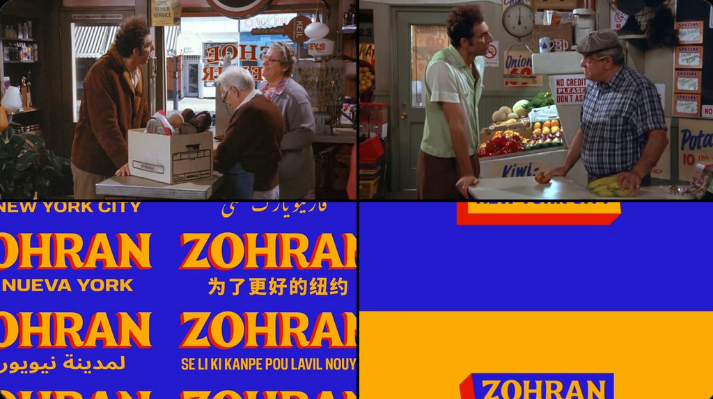
Zohran’s visual campaign is so cool. It feels like it could fit in one of the Seinfeld episodes, and at the same time be in a Bollywood movie for it’s use of a modified version of the Boheld Four font.
Apart from leading an incredibly energetic campaign on the ground, I loved watching Zohran Mamdani’s videos, websites and other visuals. Clearly a lot of work was put into their visual identity. Not since the Obama campaign, which spawned endless tutorials on how to do the same thing in Photoshop and that was how I learnt how to use it many years ago, have the visuals become so memorable to me. This was done by forge.coop. The comparison to Seinfeld is fitting; I have always loved how the sets in Seinfeld looked (bodegas, shopping marts, bakeries, The Soup Nazi) and a large part of that is typography and colors. In comparison, Friends completely fails to capture such emotion despite being set in the same city.
This campaign will also spawn such a fanbase, both because of how he conducted himself throughout it but from the design point-of-view as well.
There is a great reflection on the successes of this campaign in this post by Anil. One hopes that younger leaders in India watch and learn.
Reposted from:
News often treats technology as something that happens to it, like an asteroid — but software is a creative work, just as journalism is. We have the expertise, the values, and the imperative. We can build the platforms that carry us. The future of independent journalism depends not just on what we publish, but on the tools we trust to carry it.
We gave a talk at IndiaFOSS 2025 titled “Making Open Data Useful: Lessons from Diagram Chasing” which was incredibly well received (we’ve been invited to give it at SOTM Kerala 2025 too). I don’t know what specifically resonated with people, but I think Diagram Chasing should dig deeper and articulate it’s ideas and ideals, of which there are many, better and not limited to design or tech but how what we do (anyone) affects the larger ecosystem too. OSS and open-data is opinionated and doesn’t exist in a vaccum.
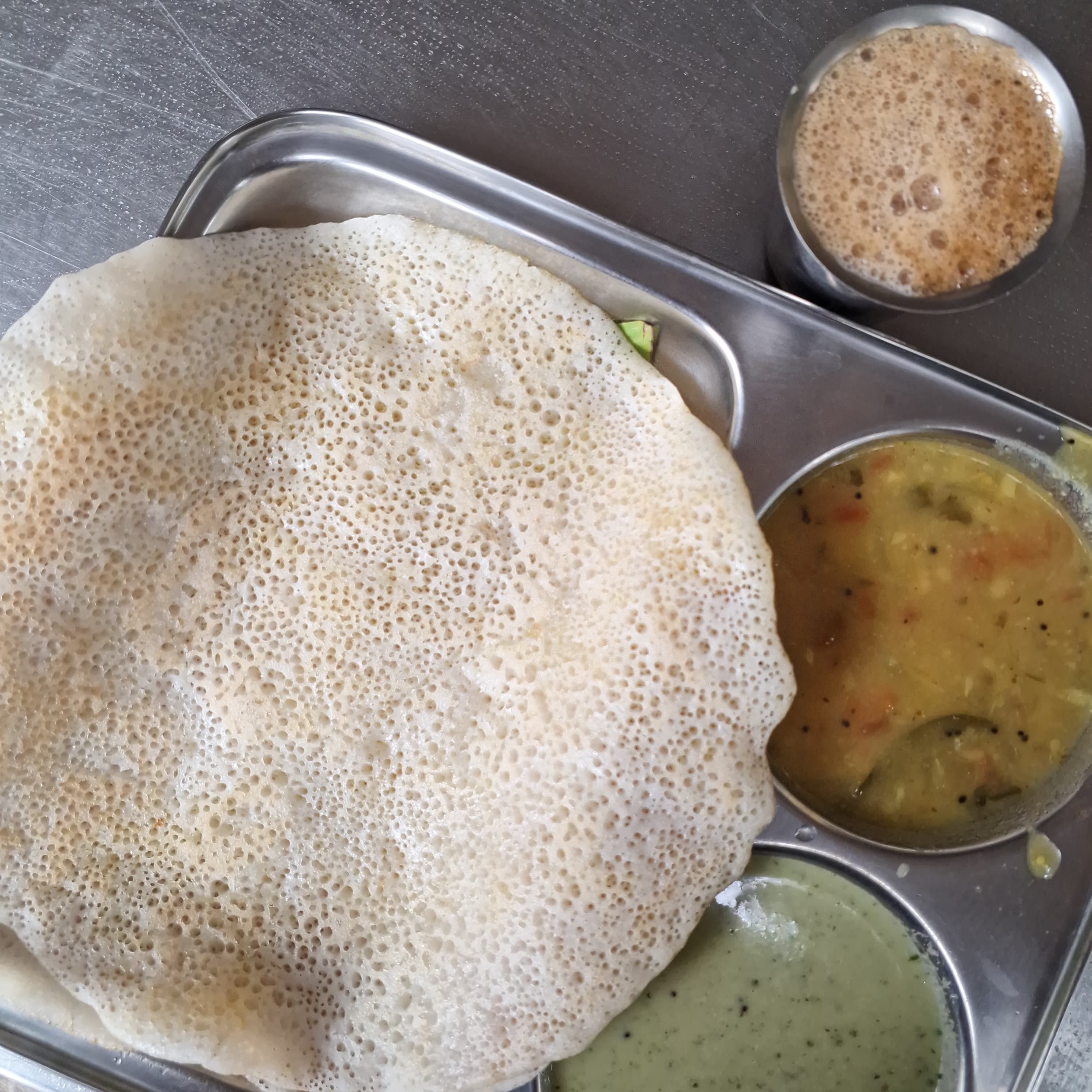
Dosas outside have been reduced to once a week at Gayathri Coffee Kendra. This is my standard order for the last year; one butter khali dosa (with a potato curry sagu, that reminds me of Yelli) and filter coffee.
Reposted from:
Once more with feeling: The functionality of a city, and of its transport system, arises from the sum of everyone’s choices about how to travel, not just the preferences of elites. When elites make pronouncements about what “people” will tolerate, while really speaking only of themselves, they mislead us about how cities actually succeed. They also demean the contributions of the vast majority of people who are in fact tolerating extreme weather to do whatever will give their lives meaning and value.
The human ability to adapt is the key to our spectacular success on this planet. Our problem is that the people who lead our public conversations, our elites of wealth and opinion, are often some of the least adaptable people on earth. And when societies assume that we should listen to those people, we all end up internalizing the message that there’s something wrong with us if we even try to walk in Phoenix in July or Chicago in January.
What you need to be aware of when you are looking at a map is how it lies to you; it is a seductress. You think because it represents reality you can better understand reality, which is true only to a point. But when combined with the power and ambition of Robert Moses the maps seduction warped him and let him think that a line across the map represented far less chaos and destruction than he perceived. Adjusting lines on a map is easy and because a map is a visual design adjusting lines seems like a good way to clean up the map. But the lines on a map hide the fact that they represent something real, a street that needs to be moved, houses that need to be knocked down, families and businesses that need to be kicked out. I’m not saying that Moses wasn’t aware of these things, in fact he was keenly aware. But it was so easy and sexy to clean up the map that he was willing to do whatever it took to draw his maps to be permanent.
In the late 19th century, the miracle device called the telephone had been invented but the simple concept of undergrounding telephone cables had eluded engineers.
Due to technical limitations of the earliest phone lines, every telephone required its own physical line strung between a house or business to a phone exchange where the call was manually connected by a live operator.
The somewhat quixotic result of so many individual lines was the construction of elaborate and unsightly towers that carried hundreds to thousands of phone lines through the air.
I’ve never seen more pictures of the Old Stockholm Telephone Tower. This looks like it could fit perfectly in an Ian Hubert production.
Reposted from:
Reposted from:
In the spirit of PingBacks and TrackBacks before, folks dreamed of everything. You could have comments across blogs, back and forth, with Webmentions copying the comments between sites, imagined A List Apart. “A response can be an RSVP to an event, an indication that someone “likes” another post, a “bookmark” of another post, and many others,” imagined the W3C’s spec.
To speak politely about AI, you put disclaimers before criticism: of course I’m not against it entirely; perhaps in a few years when; maybe for other purposes, but. You are supposed to debate how and when it should be used. You are supposed to take for granted that it must be useful somewhere, to someone, for something, eventually. People who are rich and smart and respected are saying so, and it would be arrogant to disagree with such people.
But I am a hater, which is a kind of integrity.
Added track 51km in Bengaluru on August 31, 2025
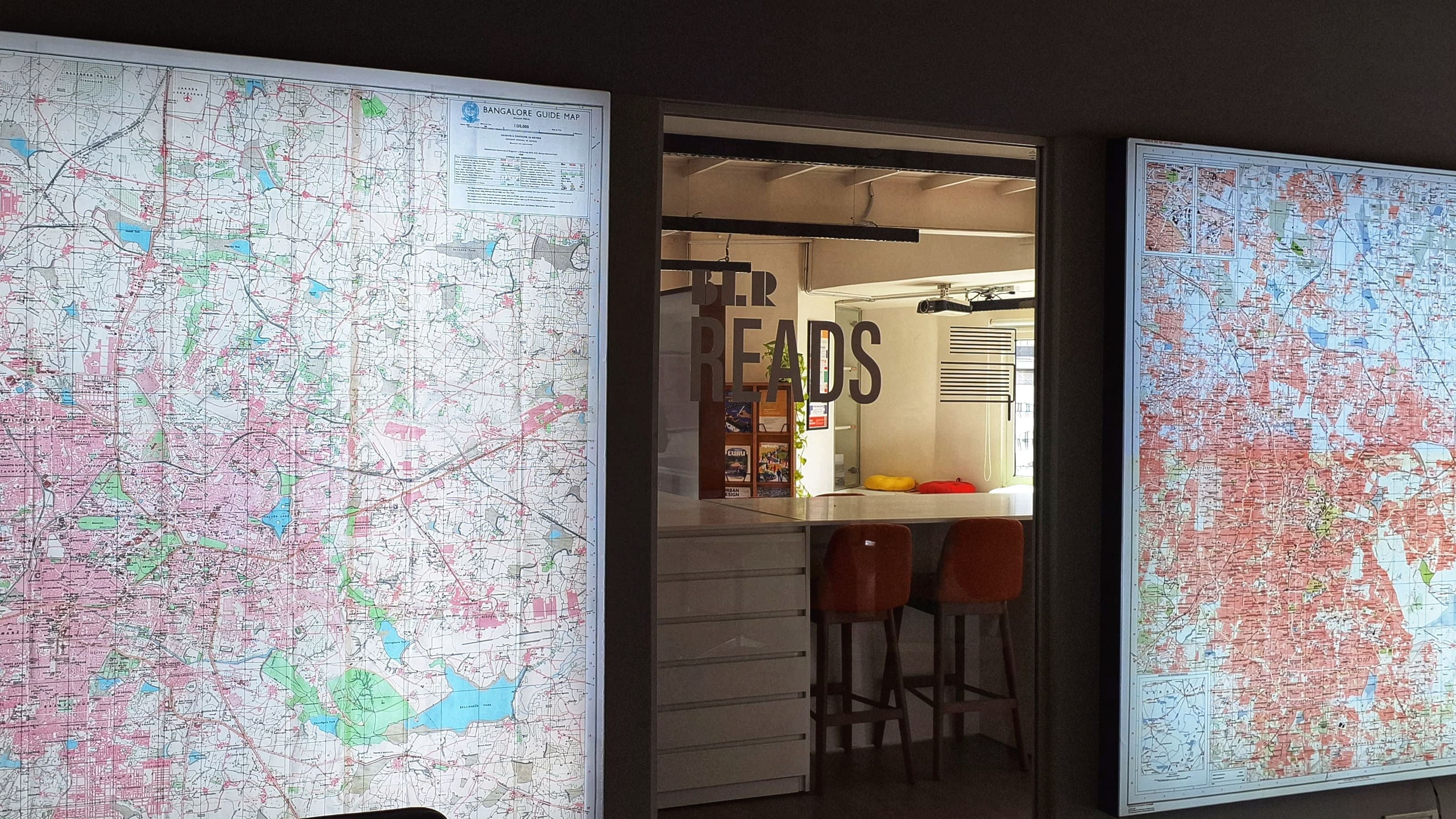
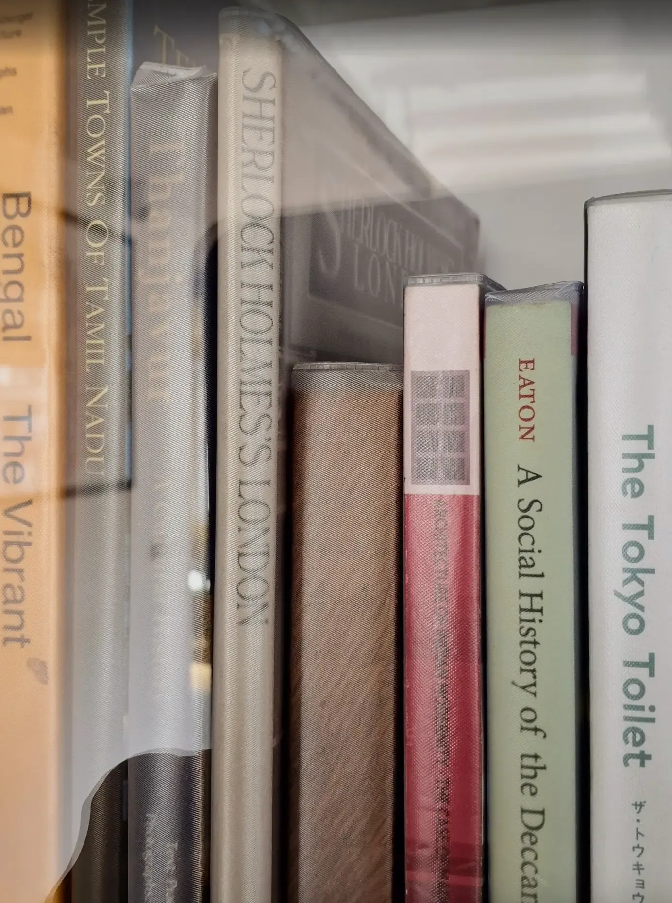
Short day out with Aditya. We visited the BLR Reads exhibition at the MOD Design Foundation office in Church Street, mostly with the intention of introducing him to this new space. To quote him looking out the 6th floor window onto the street corner, a view of this street that we rarely see, he said, “Man, this feels like a city.”
The space is interesting, they have a lot of old maps of the city which are worth seeing physically (there is, of course, https://blryesterday.com by my friend Vonter). The library is nice, it had books beyond those about Bangalore. I was pleasantly surprised to find ‘Sherlock Holmes’ London’ on one of the shelves. The membership is relatively inexpensive and I might consider it for a few months.
Capped the day with some Slay Coffee which reminds me of Yelli.
Reposted from:
In brief, McPhee’s idea is to never face a blank page. Instead, in stage one he accumulates notes; in stage two he selects them; in stage three he structures them; and in stage four he writes. By the time he is crafting sentences the structure of the piece as a whole, and of each section, even paragraph, and the logic connecting them all, is already determined, thanks to the mechanical work done in the first three stages. McPhee is on rails the whole time he writes his first draft. From there it’s all downhill and the standard thing that everybody does: revision, revision again, then refinement—a sculptor with ax, then knife, then scalpel.
Blown away by the search capabilities and how smoothly large datasets rendered here in my quick trials. Comes with React and Svelte packages (rare to find a package that does both). Magic of DuckDB and WASM.
Definitely putting this to use in a future project. h/t Vonter for the share.
The result is a cryptic block of Exif information that, if fed to your favourite LLM and asked to summarize and create a profile of its creator, reveals more information than I’d like it to.
Added track 9km in Bengaluru on August 24, 2025
Best way to travel to Bangalore from Mangalore is on the Ambaari Utsav sleeper bus by KSRTC. Never looked back.