
🔖 Bookmarked:
Zohran Mamdani's visual campaignhttps://xcancel.com/adityafinal_psd/status/1986326607481741401
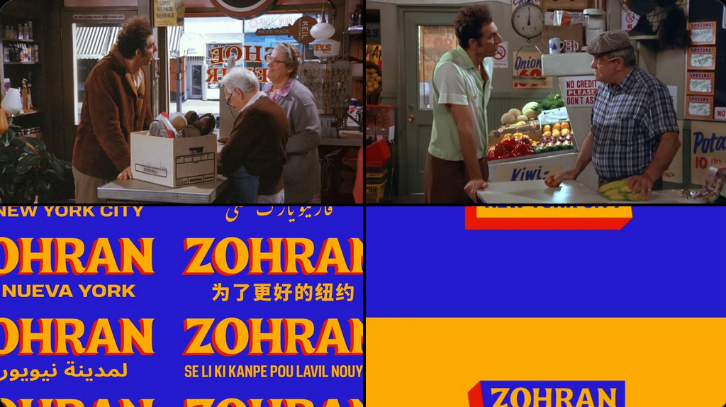
Zohran’s visual campaign is so cool. It feels like it could fit in one of the Seinfeld episodes, and at the same time be in a Bollywood movie for it’s use of a modified version of the Boheld Four font.
Apart from leading an incredibly energetic campaign on the ground, I loved watching Zohran Mamdani’s videos, websites and other visuals. Clearly a lot of work was put into their visual identity. Not since the Obama campaign, which spawned endless tutorials on how to do the same thing in Photoshop and that was how I learnt how to use it many years ago, have the visuals become so memorable to me. This was done by forge.coop. The comparison to Seinfeld is fitting; I have always loved how the sets in Seinfeld looked (bodegas, shopping marts, bakeries, The Soup Nazi) and a large part of that is typography and colors. In comparison, Friends completely fails to capture such emotion despite being set in the same city.
This campaign will also spawn such a fanbase, both because of how he conducted himself throughout it but from the design point-of-view as well.
There is a great reflection on the successes of this campaign in this post by Anil. One hopes that younger leaders in India watch and learn.