Which map looks more inviting?...
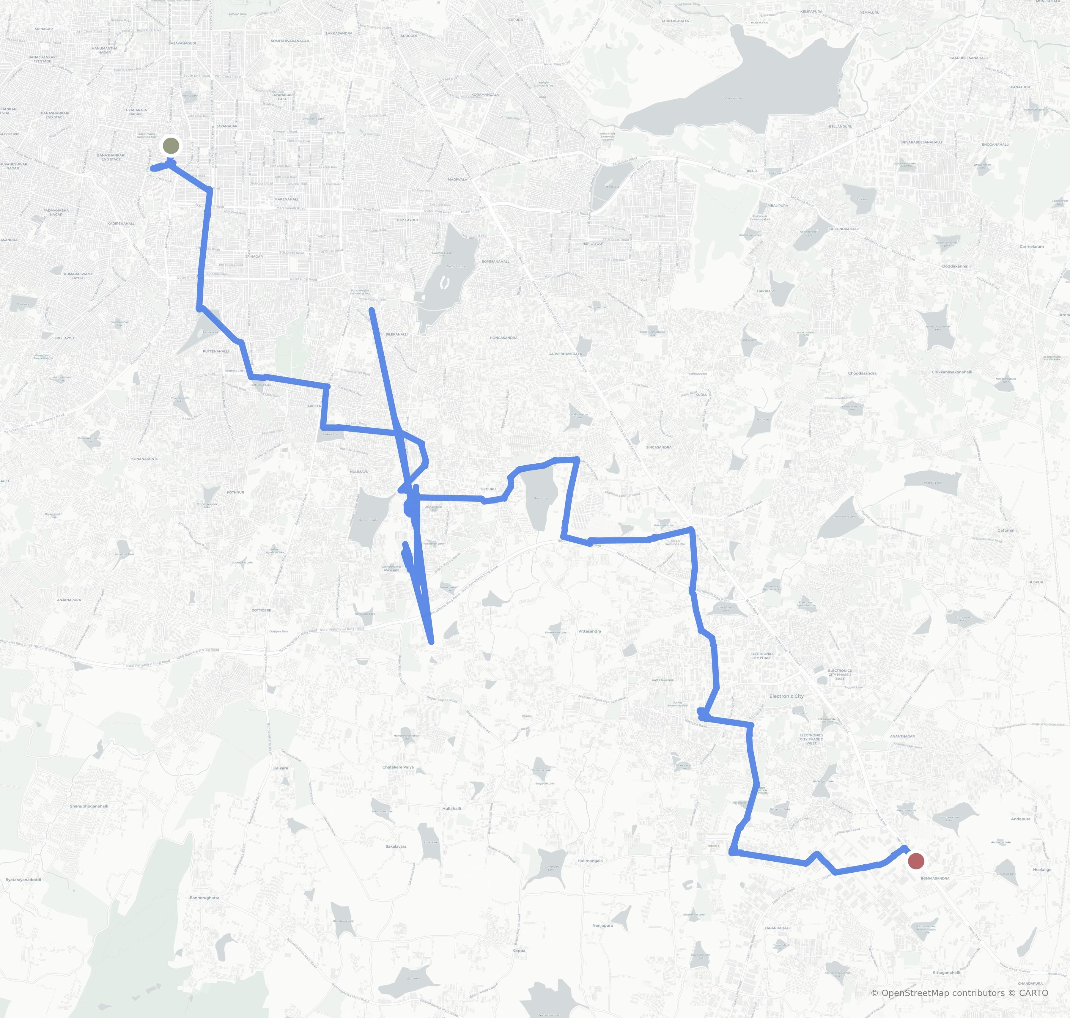
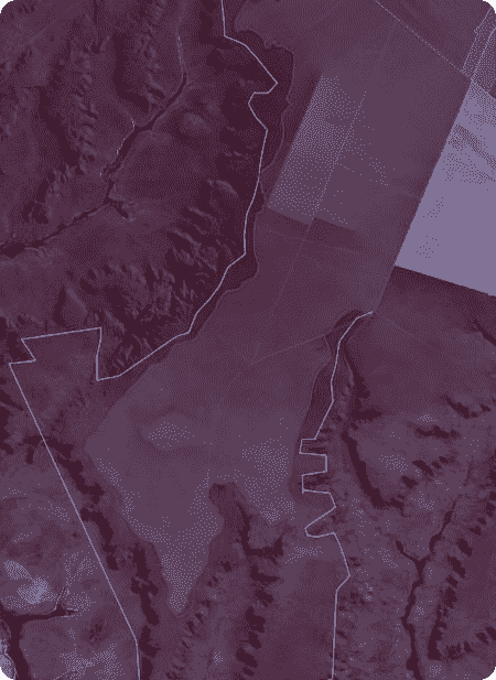
Which map looks more inviting? One is Google Maps, the other is OpenStreetMaps on OSMAnd. You choose.

THE DEFINITE, ILLUSTRATED & ANNOTATED ANTHOLOGY OF MY VARIED PASTIMES


Which map looks more inviting? One is Google Maps, the other is OpenStreetMaps on OSMAnd. You choose.

Over the past few decades, childhood mobility in the West has dropped precipitously. You might think that the change has something to do with the emergence of the Internet. But longitudinal data suggests otherwise.
The important point is that kids want to spend time together, in their own space, away from the tiresome grown-ups.
Adult employment patterns and lifestyle changes have also been slowly trending toward car-dependency, which means that kids often end up living far away from their friends. If children want people to play with, the most efficient solution is for their parents to drive them to an organized sport or other structured activity.
I wish the children of today had a forest. But they don’t. They’re making do with what history has handed them. We can complain about their screen time, lament the anxious generation, scoff at how ‘unnatural’ this brave new world has become. Simultaneously, though, we should do our best to understand why kids are behaving this way. There’s no point in whining about the impulses endowed to them by several hundred thousand years of evolution. Don’t hate the player; hate the game. And if you really hate the game, make a better one.
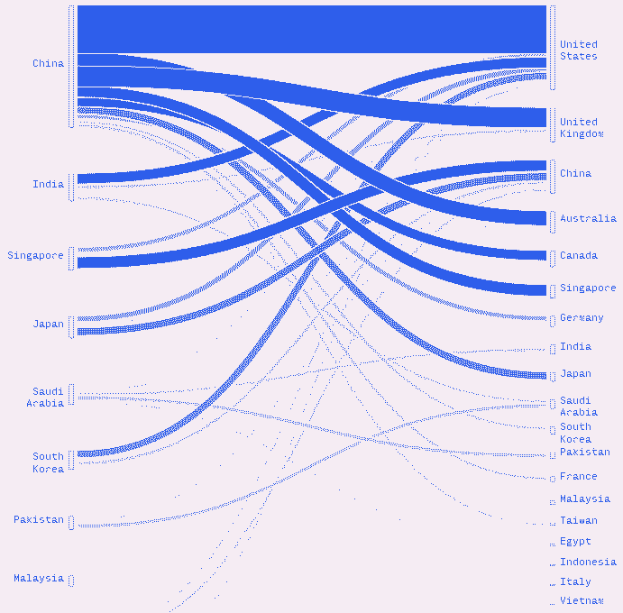
Based on an analysis of the history and current state of migration flow mapping, drawn from very diverse sources – scientific, artistic, activist – and from different geographical contexts at various scales, we propose to analyze some of the main technical, ethical, institutional and political challenges of the cartographic representation of international migrations.
From a critical perspective, we will analyze both the role of mapping in the production of knowledge and understanding in the field of migration, and its potential for social and political transformation.
One of our regular clients at Revisual Labs has been the UN International Organization for Migration (UN IOM). My very first project at RVL was an IOM project and one of my favorite work projects last year was Journeys of Resilience, a story that traced the movements of Ukrainian refugees as a result of the war. Mapping migration is a consistent theme and this article, originally in French, made me think about some of the choices I've been making as well as the standard representations of such a fundamentally human and qualitative subject. Sometimes in dataviz, you kind of go by the "industry defaults" for certain topics. Nearly every story in NYT or Reuters and in other outlets has the same kind of map for migrations, one of which might have big arrows showing the direction of movement from one place to other and while you're making your own map, you go with these defaults in mind. Those defaults may not be bad, but it is worth thinking reflecting on some of those decisions in a larger context, which is what this article offers. Your browser should be able to translate the original text for you.
Update: There is an English translation of this article here.
Mapping migratory movements necessarily involves " freezing " a system that is embedded in space and time, within a complex social and political context. This is a real challenge because not only do people migrating and/or on the path to exile cross paths, but they also take " breaks ," of varying lengths, settling temporarily in a country or place, staying for a few days, a few weeks, or a few years, and sometimes leaving again.
The complexity of these dynamic routes, which defy geography and migration mapping, must then adapt to often very rapid political and temporal changes. This is why mapping always risks being anachronistic even before the map is finished.


Rhea and I play word games daily and we're pretty competitive. Since January 2024, we've tracked every game. These charts show who's been winning more recently.


I was at DA-IICT (Gandhinagar, India) for the three weeks teaching a module on web design to their M.Des students. I love websites and code, but 'making' websites means something different in 2025. Is it all AI? Is it just UI/UX? IDTS. In my course intro, I wrote, "...what does it mean to learn web design in an age where a cat walking across a keyboard might accidentally 'prompt' a website on ChatGPT? What, you might ask, is the point?" So, this course evolved from being one on learning how to code to broader, more interesting things like the small and indieweb, personal digital gardens, open-source philosophies, and making with code for the sake of having fun. I don't know of many design courses anywhere that include learning Git and web frameworks. Everything from this module is open-source and public, from the slides to student submissions. I've put all their handmade, handcoded work on a showcase site.
In this two-week course for design students at Chitkara University (Chandigarh, India), I taught a range of topics that introduced visual and statistical thinking to the students. We worked with our own personal data, analyzed large datasets through a no-code, visual-programming interface called Orange Data Mining, learnt how to quantify qualitative data through movies and produced two print-posters that brought all these learnings together.

Where I've popped up lately; talks, teaching, and other goings-on.
If you're interested in having me for something similar, I'd love to chat!