
data storytelling in lowercase - guest talk at Purdue
February 26, 2026
I recently gave a guest talk to a class at Purdue University about data storytelling. Shobhan was kind enough to invite me, Hannah Zong facilitated things to make it happen, and I love that I was able to do this.
Truthfully, it was a challenging experience for me. Though I studied design, which places a strong emphasis on articulation and documentation, I have never been one to think about making in terms of processes or methods or breaking things down in a way for people to understand. It comes intuitively, from prior exposures and personal tastes and comfort zones, so when Shobhan said this:
one thing to remember is helping a student see a path from where they are to something (1) fun, (2) meaningful, and (3) doable. and if the ‘doable’ seems too difficult or complex, then it helps to simplify or break down the steps to show them how they can also do it in a few steps.
My thoughts were that “oof, that’s hard”. How do I reflect? What do I reflect upon? Do I even story-tell? Do I data? I do data but how to tell people to do data? Then there is the loaded term of ‘Data Storytelling’. I think of it as loaded because there is weight to it, certain expectations and vague minimum thresholds that must be attained before you can call something a ‘Data Story’. At least to me.
I then came across this article by Cole Nussbaumer Knaflic outlining her ideas on the lowercase ‘story’, which lends itself to being more approachable. While this article was instructive, it was also in my conversation with arjun that he brought up a case for writing things in lowercase (which you can see in use throughout his website and notes). He writes about in his blog and links to Shobhan’s note on lowercase writing and Herbert Bayer on ‘why we writing everything in lowercase’ (yes, I aware about the irony of captalizing all their names):
it is inconsistent in language usage to write differently than to speak. we don’t speak big sounds, that’s why we don’t write them either.
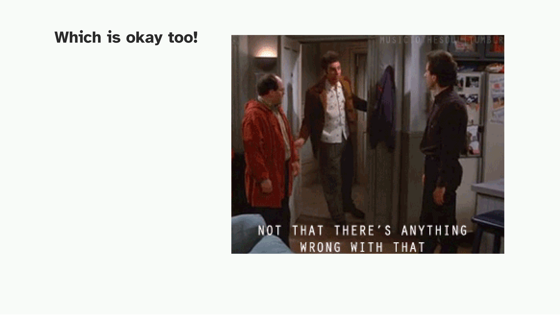
Big sounds are scary sounds. Story vs. story. Data vs. data. I Need To Talk To You About Something vs. i need to talk to you about something.
This sounds simple but when I visualize what a ‘story’ might be, things felt a lot more approachable. I can’t do what The Pudding does on the regular, but ‘stories’? Maybe. This became a helpful base to frame my talk around. To me, what I enjoy most about the storytelling process is that it happens spontaneously, in conversations with friends or arguments online or something noticed while walking in the city. A Story might not come out of it, but a small, understated story (even if it ends in the same conversation) usually does. And this is based around the act of asking questions. Asking questions good enough to interest yourself and then attempting to frame it in a manner that someone else can see it too.
So this talk came together. I want to elaborate on some of the things I touch upon in this more, but for the short 30 minutes I had, this is perhaps a good starting point.
If you’d like a less yappier version of this to flip through, it is available here.
Otherwise, it is reproduced below, along with a transcription of what I spoke under each slide. References and readings attached at the bottom.
Hello, glad to be here! I know online sessions can be something of a drudgery so thank you for being here with me too. I’ll be talking to you about what my process of data storytelling, in lowercase, means. I’ll get to what I mean by that in a bit.
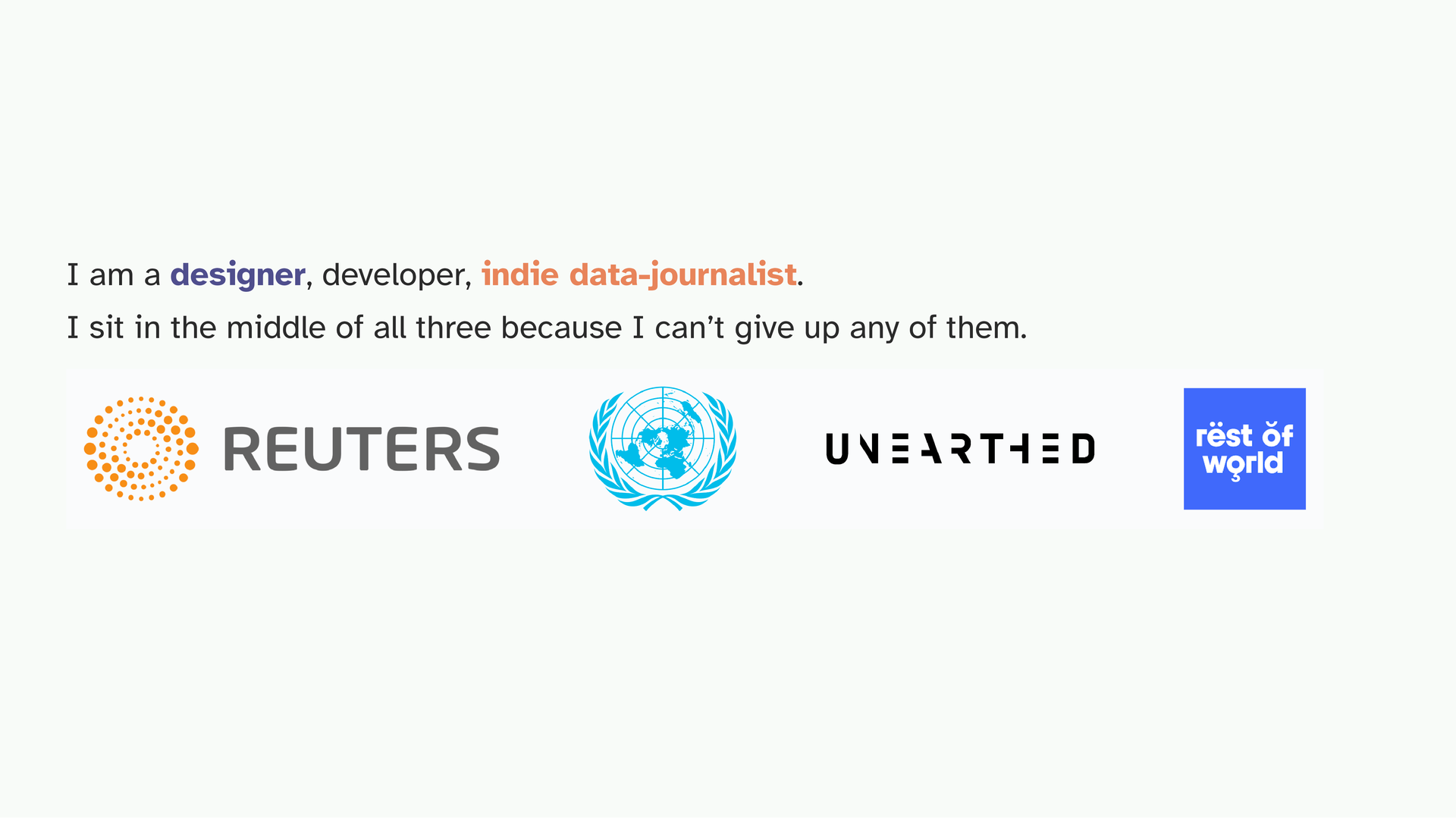
So I’m three things. I’m a designer because technically that’s what I studied. I’m a developer because that’s my hobby and also my day job. And I call myself an indie data journalist, is because no one really pays me to write and publish data stories or applications but I like doing it anyway.
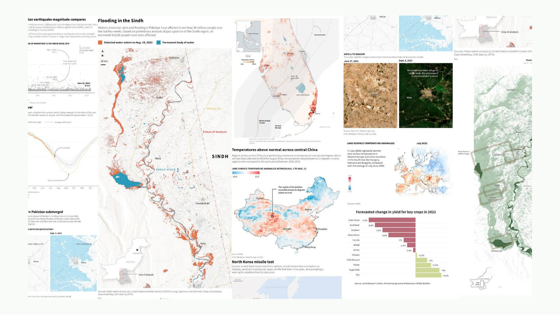
This is work from my time at Reuters as a graphics intern. Hurricanes in Florida, flooding in Pakistan, elections; it was quite an exciting time and a very new and enriching experience for me to be working with reporters to create visuals for their reporting.
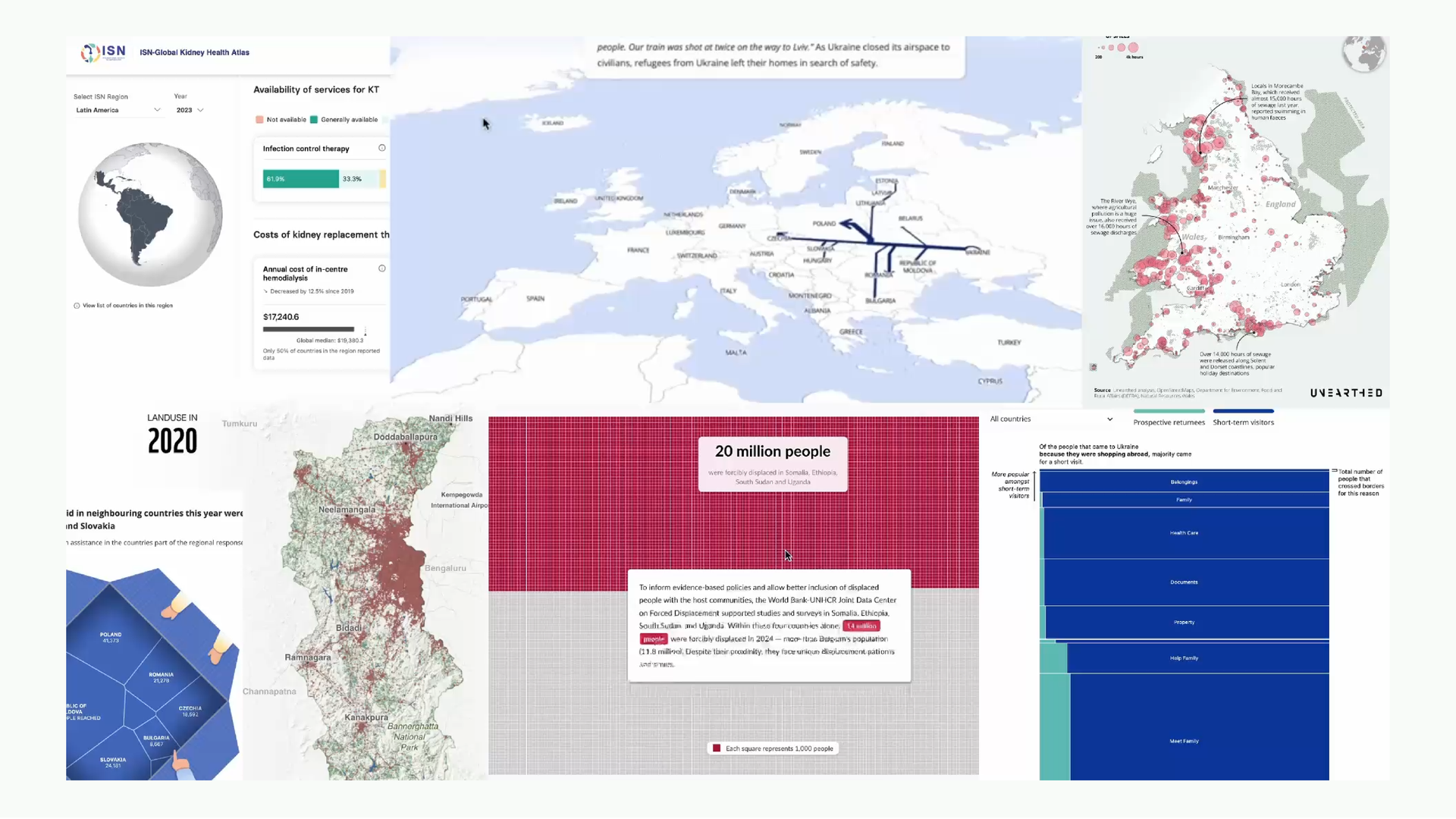
At Revisual Labs it’s similar kind of data-driven work but for clients; interactive stories, maps, dashboards. For projects in India, sometimes in Ukraine, sometimes in East Africa. Hard to peg it down to a specific kind of output, there’s a little bit of everything.
But what really makes me feel alive is when I have no brief, no client, no deadline except me doing my own thing. I find a question I want to understand, figure out what to measure, and follow it to some end until it becomes something a reader can engage with.
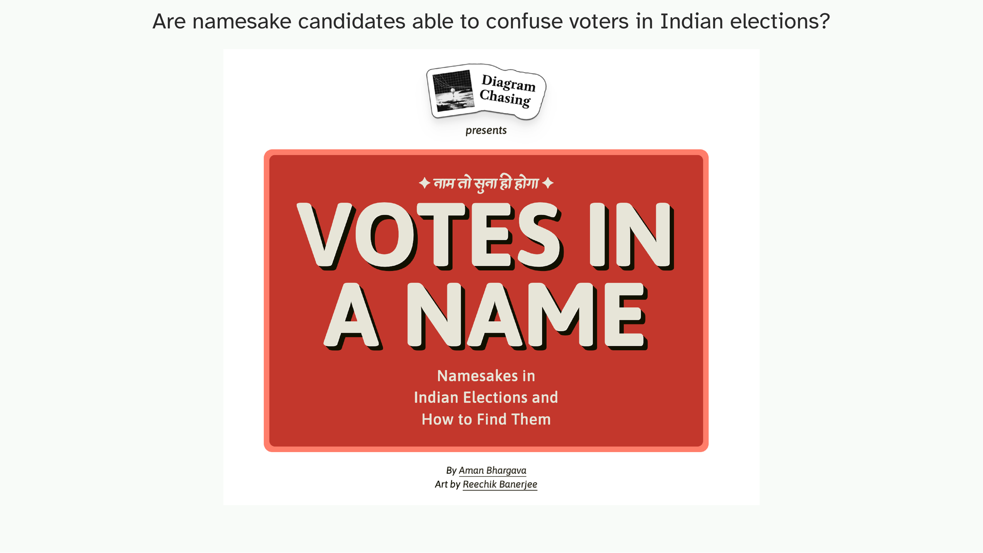
One project I’ll keep coming back to today is called ‘Votes in a Name’. To give you a little bit of context, here’s a gist of the situation.
In India, during elections, parties from both sides try to confuse voters by placing similar-sounding candidates in the same race to split the vote. I didn’t know this was a thing. Then a friend explained it to me, I started reading about it, and I couldn’t find anyone who’d actually measured how often it happens.
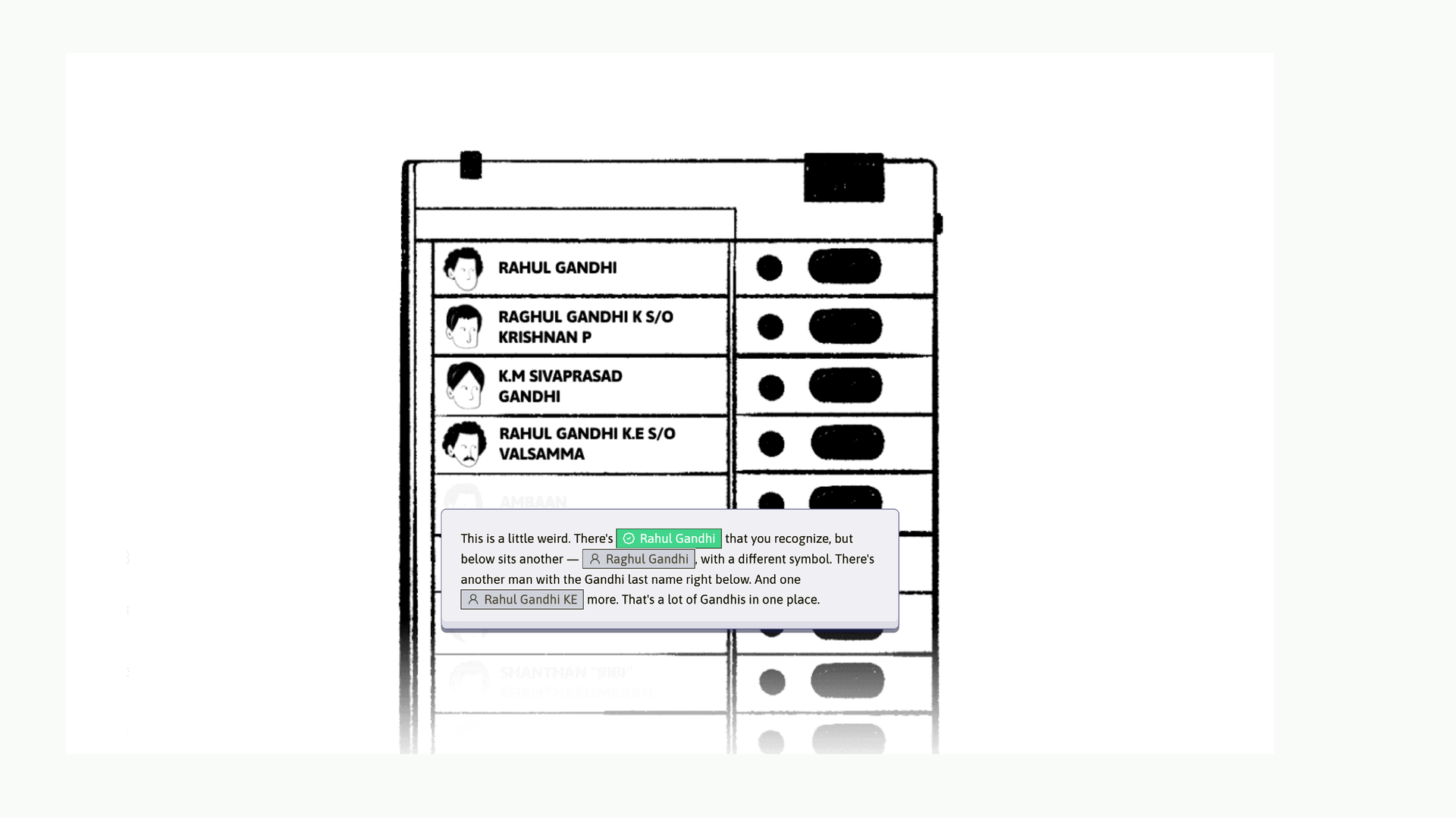
A clear example is this one. There’s a candidate called Rahul Gandhi who is the legitimate candidate. And he’s surrounded by namesakes. Some KM Gandhi, this Gandhi, that Gandhi. Educated people might scoff at this but…
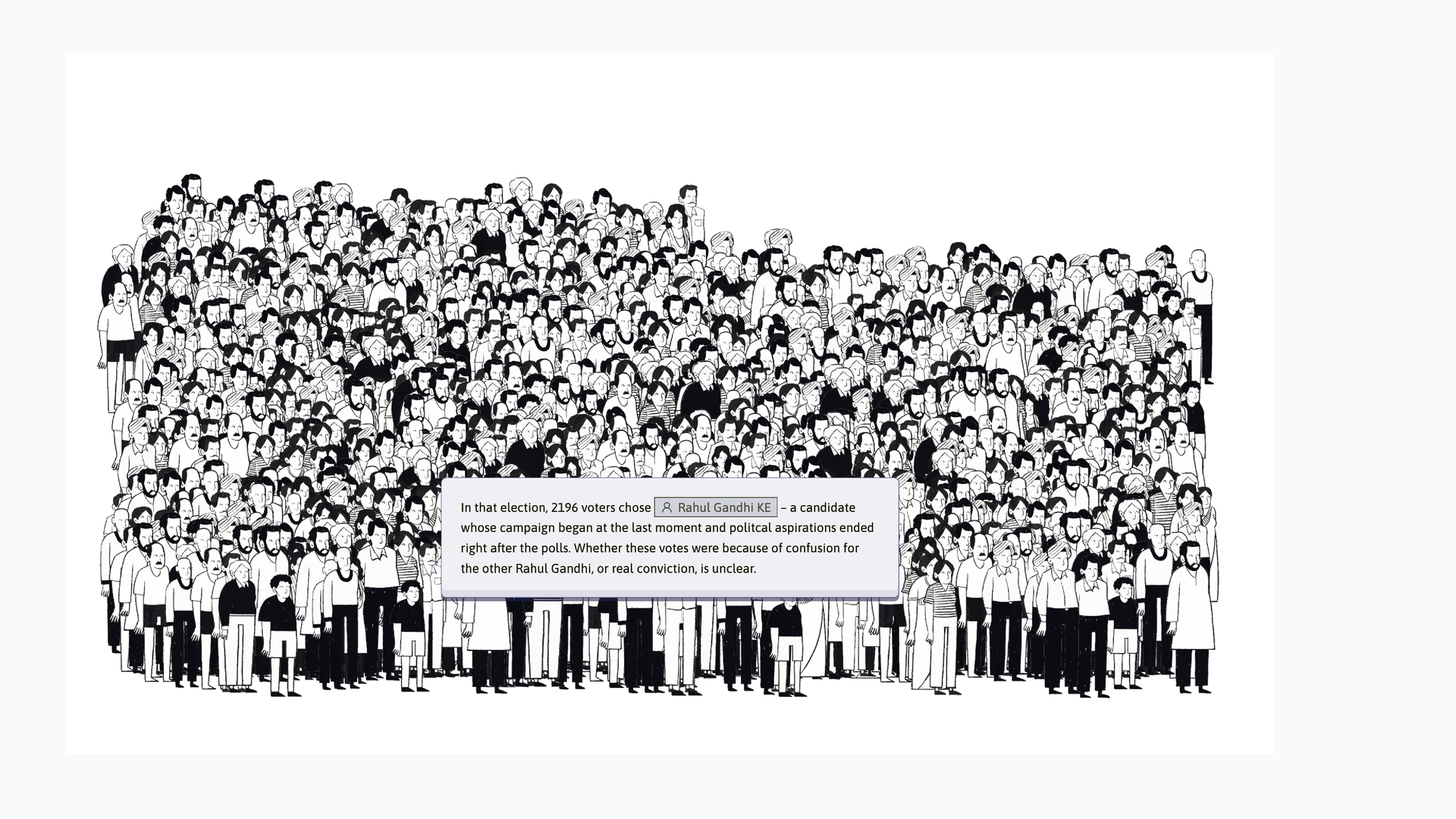
…in that particular election, almost 2,000 people voted for the wrong Rahul Gandhi. So it’s a real problem! And I found it genuinely amusing. These are some of the outputs from that investigation and we’ll come back to how this was made later in the talk.
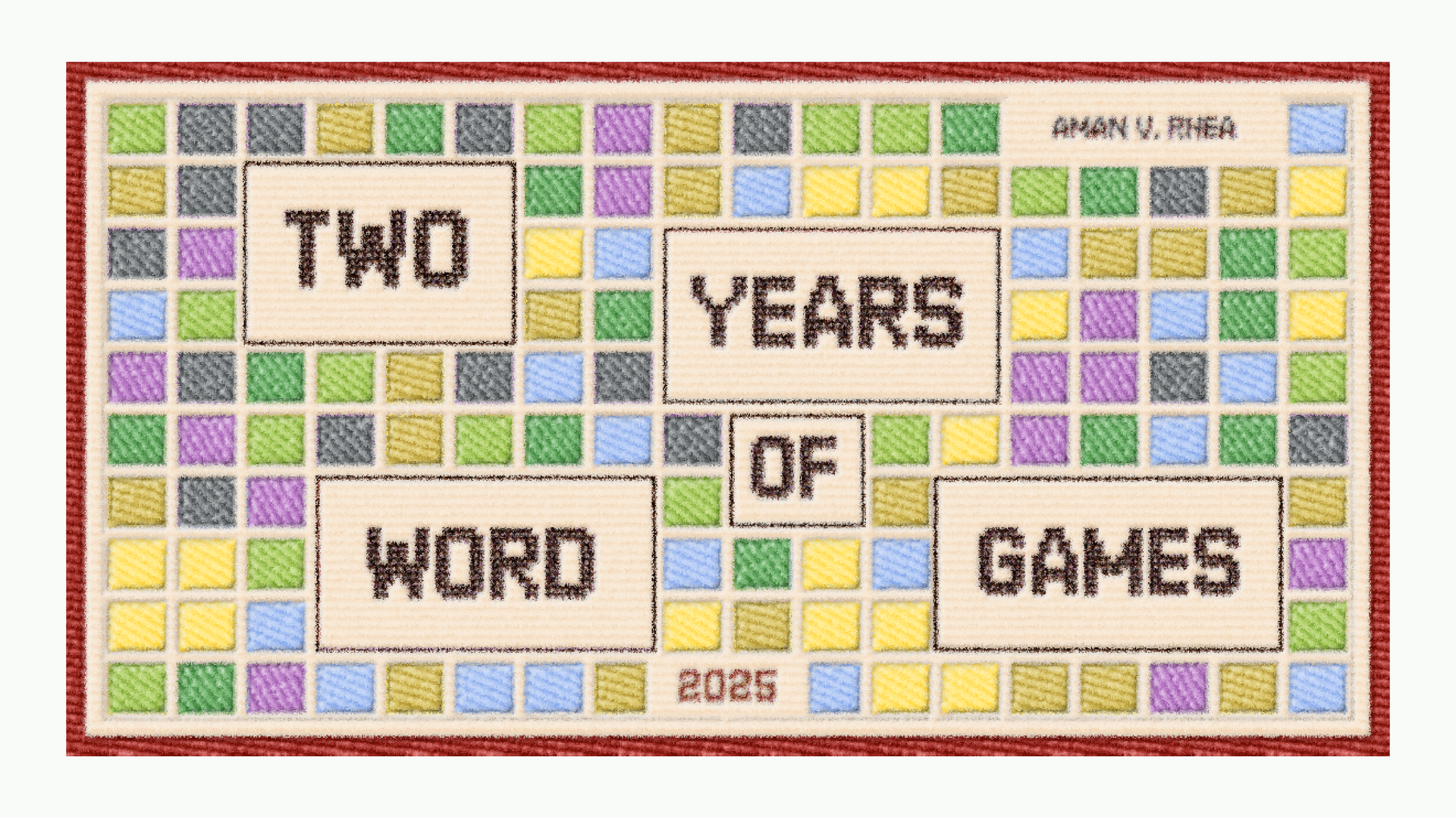
Then I also do this kind of stuff just for fun. Me and Rhea play the NYT word games every single day, Wordle, Connections, the Crossword. For the past two years we’ve been tracking our results.
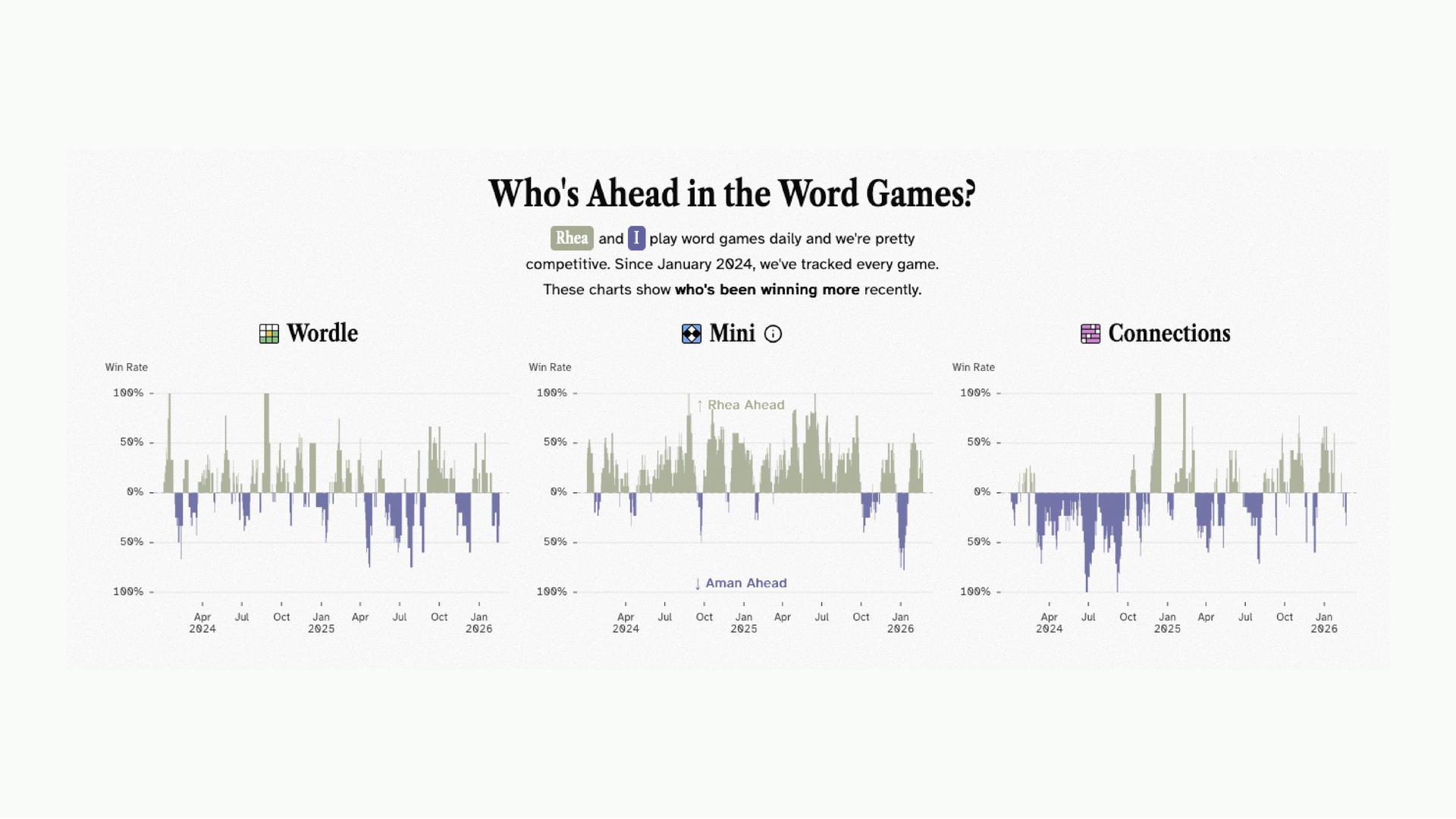
There’s a live tracker on my website that updates daily. Everyone can see she is absolutely whooping my butt and tells the story of how badly I’m losing. But anyway, this is the stuff that I’m doing now, after almost 5 years of doing this everyday in some or the other capacity.
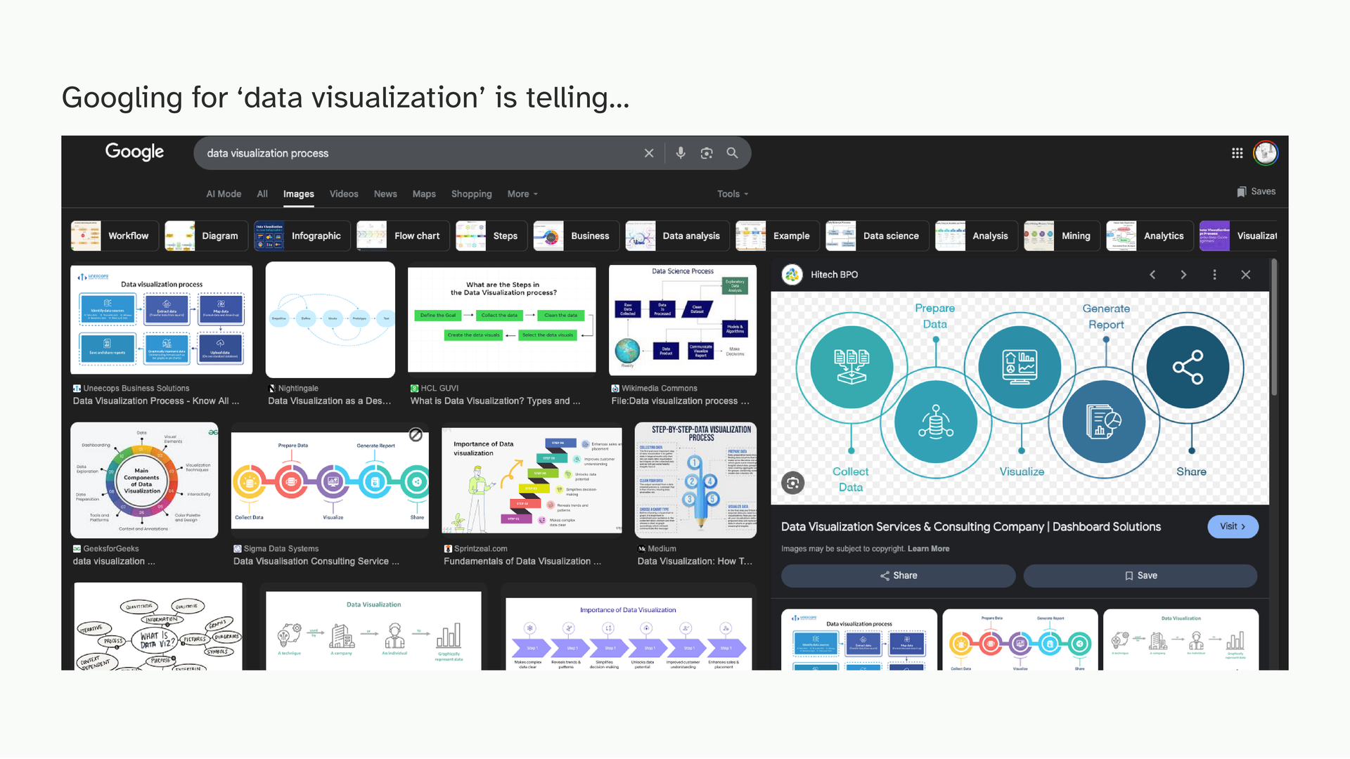
When I was in college and just getting into this, I learnt more or less the same process that you see here: collect data, prepare it, clean it, visualize it, put it in a report or a dashboard. A clean, linear process.
This is not wrong and at that stage, even learning how to make charts is intimidating. This gets you making those quickly.
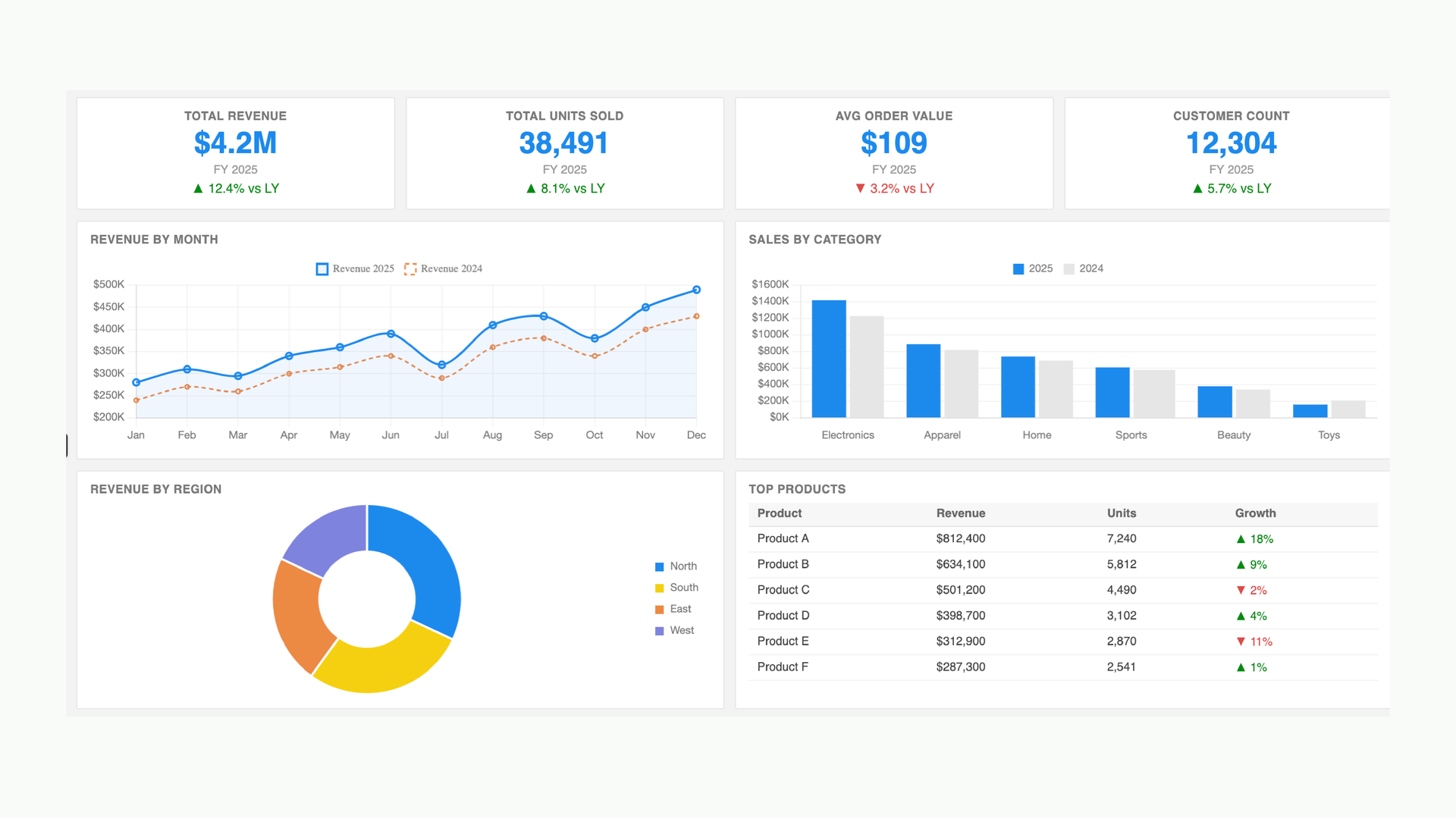
And this is where you end up; a bar chart here, a pie chart there, a fairly decent but somewhat ordinary dashboard. Which is fine. But I think we can do better! We’re designers, we’re creative right-brained people and sometimes this doesn’t sit right.
Although to be clear, I’m not here to make you feel bad about dashboards. They’re genuinely useful where they are used, but for us I don’t think they have to be the endpoint.
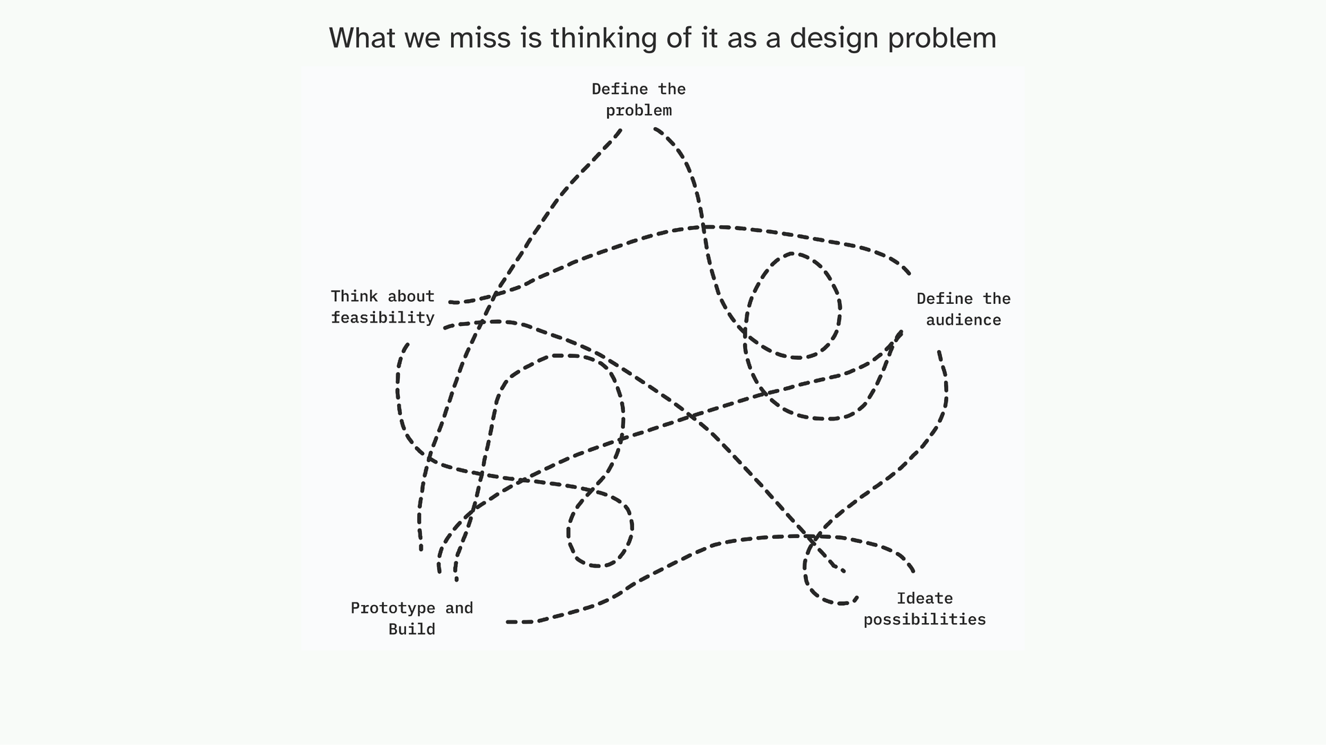
I know a lot of you come from design and other creative disciplines. In design, we’re taught something like this (and this is my very broad, generalized distillation): define the problem, think about who you’re making it for, ideate, prototype, iterate.
Most importantly, it’s not linear. The prototype can change the audience. The feasibility can change the idea. We kind of lose that when we learn data visualization as a sequence of steps.
So my hot take is that when you apply design thinking to data, you get…
Data storytelling! Unfortunately, it’s become something of a buzzword now, like “insights” or “proactive,” you can just throw it around. So I think it’s worth being specific about what kind of storytelling we’re actually talking about. I recently realized that there are two ways to think about a story. And the distinction matters a lot for how intimidating this feels.
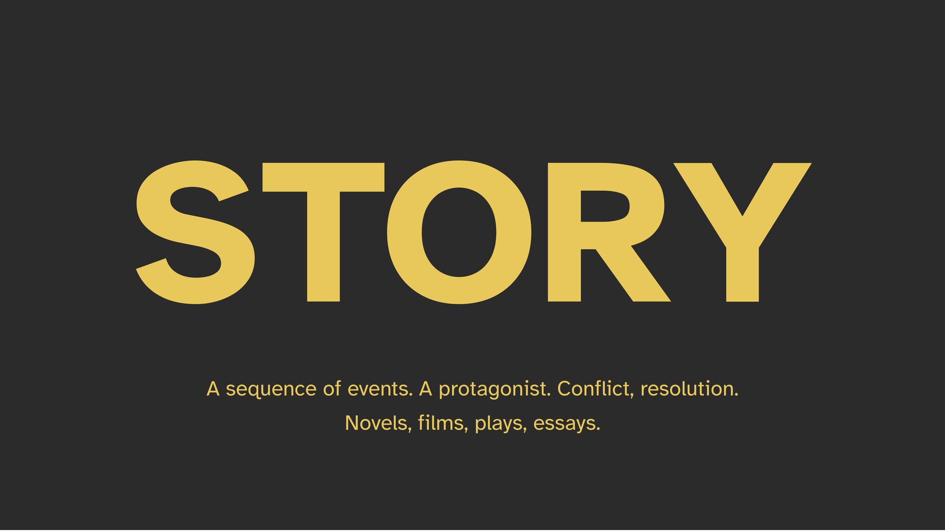
The first is the capital-S Story. If you search for data storytelling online, this is what most frameworks are talking about. A sequence of events, a protagonist, conflict, resolution. Novels, films, essays. A traditional narrative arc.
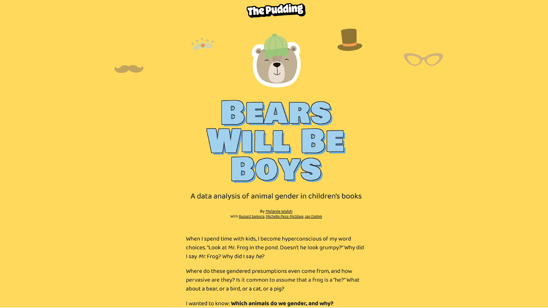
And you’ve probably heard about The Pudding, who do this brilliantly. When I was in college and I looked at their work, I felt completely overwhelmed. How do I get from my small charts to this? It used to scare me. When will I ever start data storytelling?
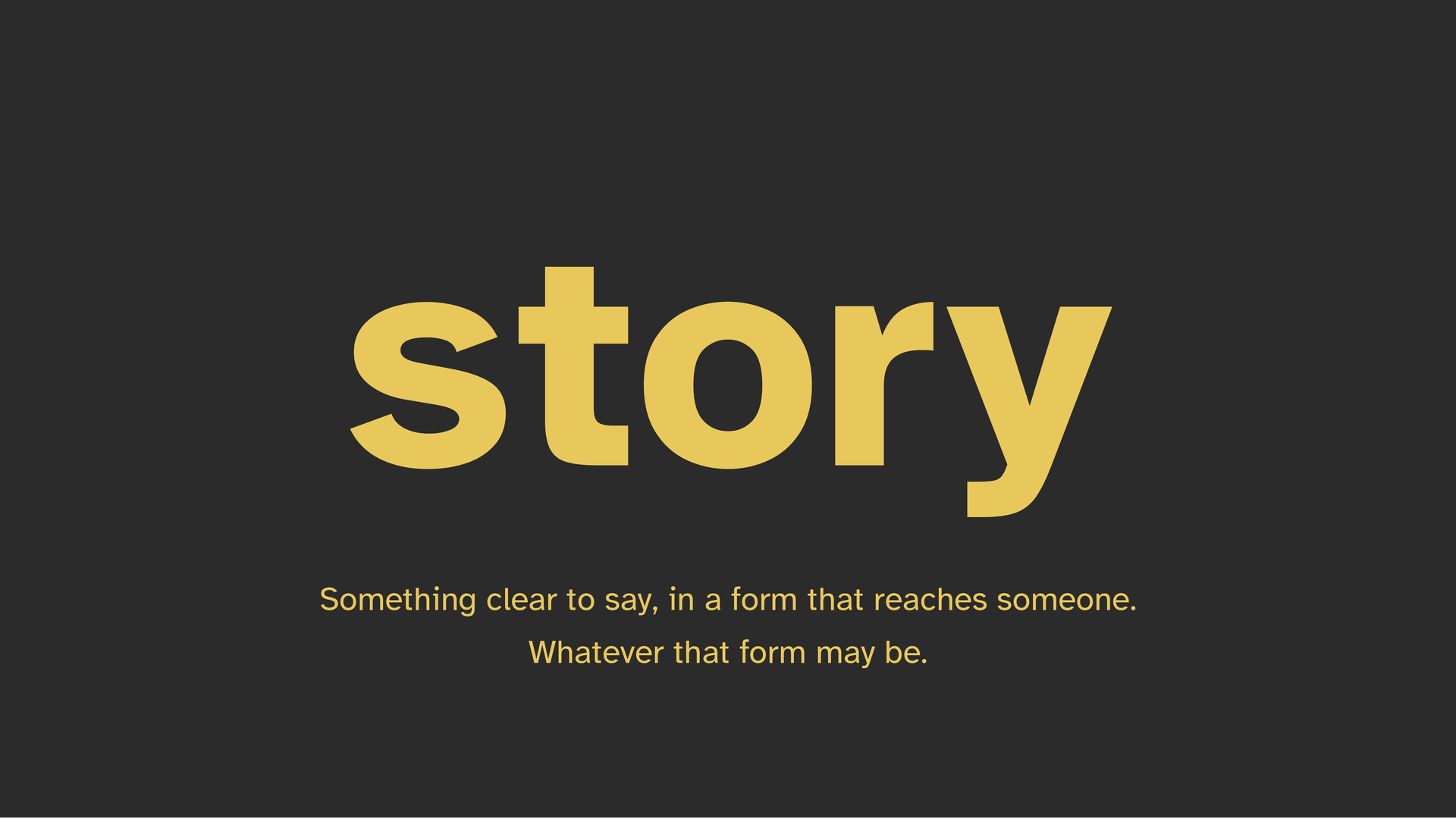
But there’s also the lowercase story. And I think this is where most of us are actually working.
To me, it means having something specific and clear to say, in a form that can reach someone. The output doesn’t need a grand arc but maybe just a solid point of view.
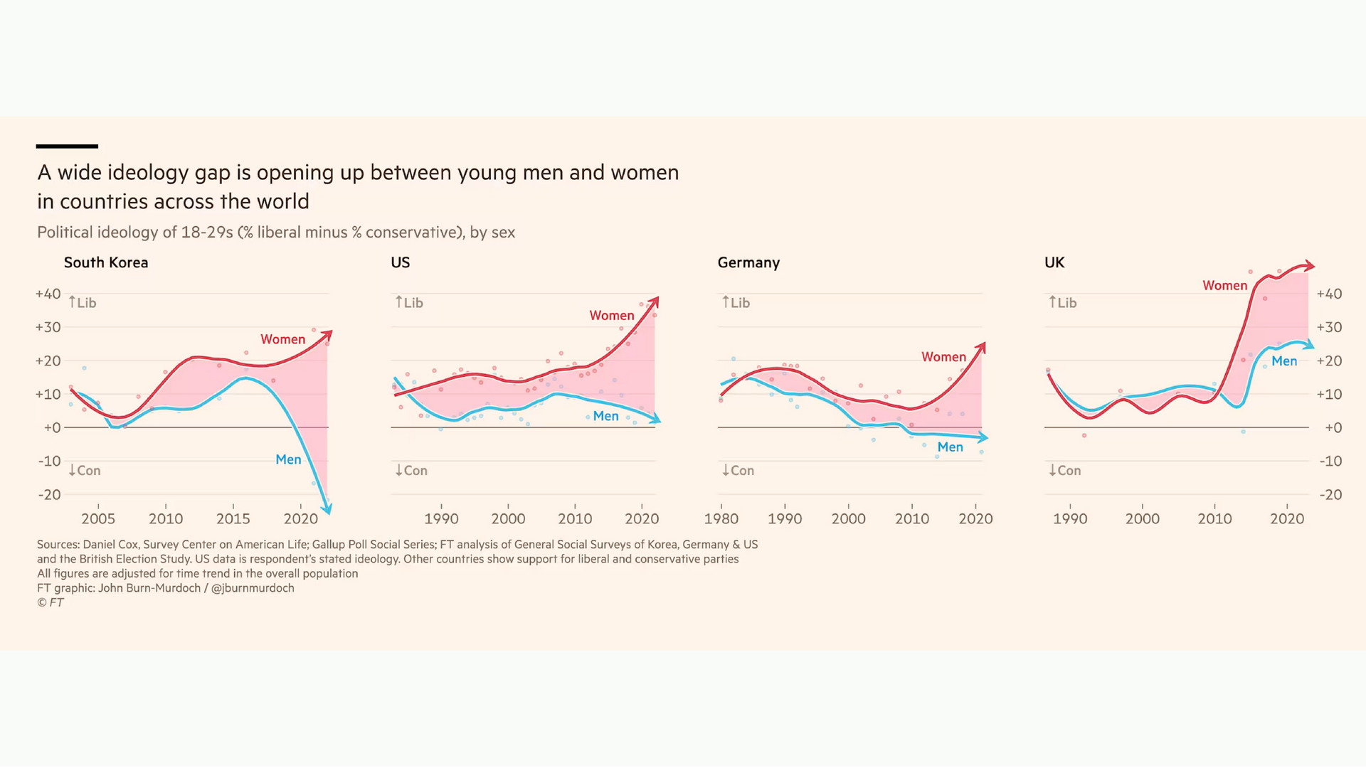
One of my favourite people who do this tremendously well is John Burn-Murdoch, who is a data-journalist at Financial Times. This chart is a good example. It’s about how political ideologies are diverging between men and women across the world. It is a fairly simple set of graphics with just a strong headline feels complete to me. I know what he wants me to see. I know something I didn’t know before. That’s a story.
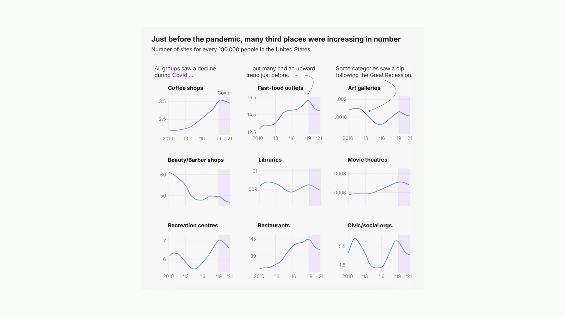
Here’s one more. Someone writing about how third spaces were actually rising before the pandemic, then declined after. Very simple charts. What does the heavy lifting is the annotations and the headline. It contains everything I need to know about what this person wanted me to understand.
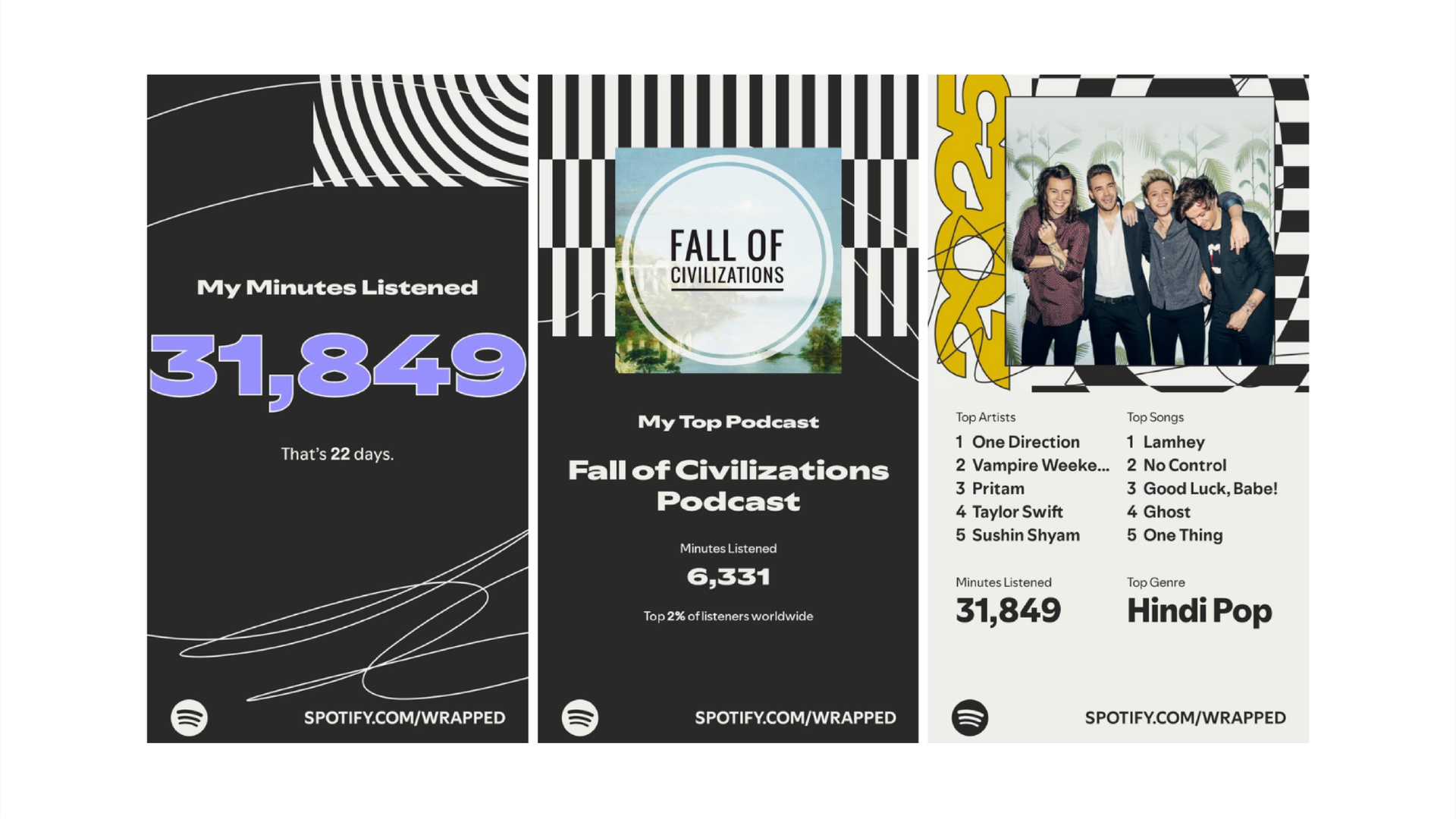
And then there’s this. Spotify Wrapped isn’t even charts! But everybody from my parents to my friends look forward to it. It’s a data experience presented in an incredibly intentional way. This is data storytelling too. And I think it’s worth taking seriously as an example. Is it a capital-S story? Probably not.
When you start thinking in lowercase stories, two things happen.
First, a lot more possibilities open up because the form is your choice.
Second, it actually feels attainable. I can make something like Spotify Wrapped. I might not be able to make essays like The Pudding just yet, but I can curate something intentional and specific. One small visualization done well, in an intentional way.
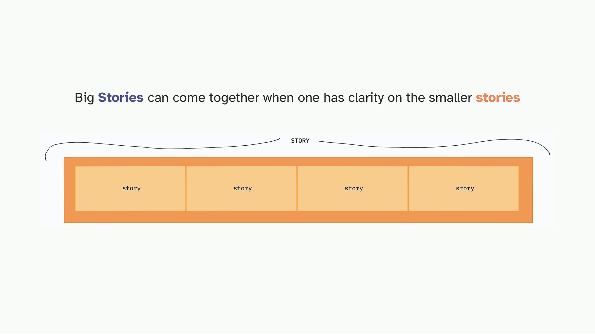
And once you nail your small stories, your small charts with a clear point of view, you can start assembling them into something larger. The lowercase story is not a consolation prize.
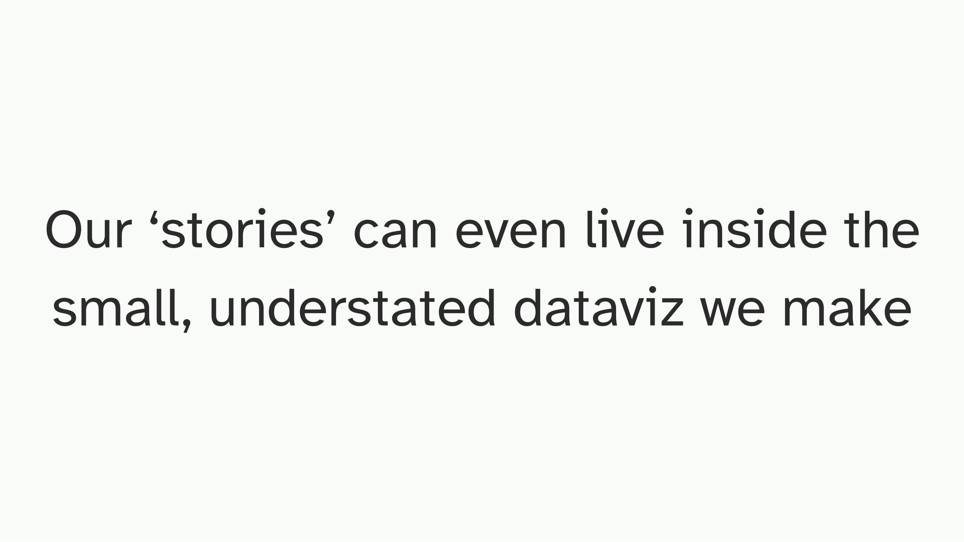
This applies to the small everyday charts we make, for assignments, for clients, for fun. The story can live inside something very simple. But only if you’ve committed to what it’s about.
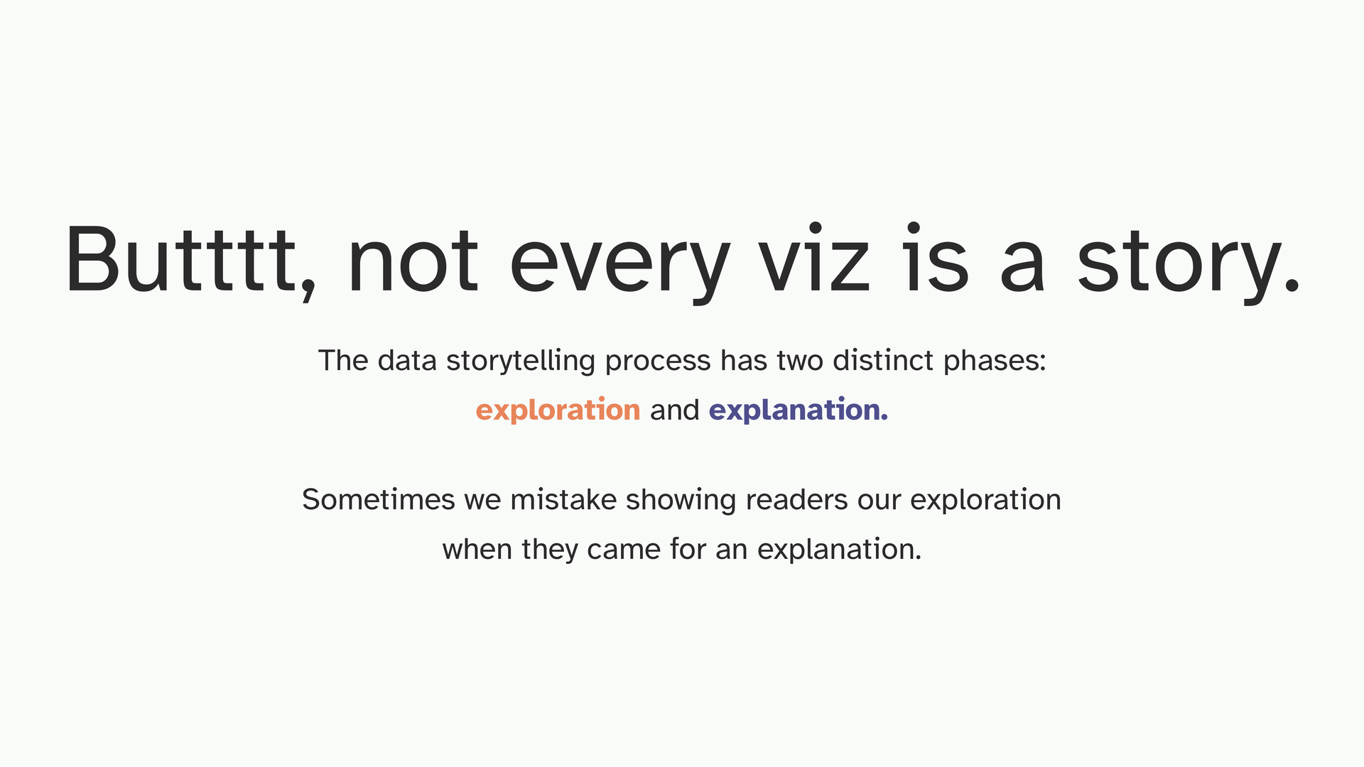
Having said that, not every visualization is a ‘story’.
Again, according to Cole, the data storytelling process has two distinct phases: exploration and explanation. Exploration is what you do for yourself. Explanation is what the reader is expecting when they engage with your work. The mistake I made constantly when I was learning was showing readers my exploration when they came for an explanation. I was proud of the work. I wanted them to see all of it. But it more or less communicated nothing in an ‘intentional’ way.
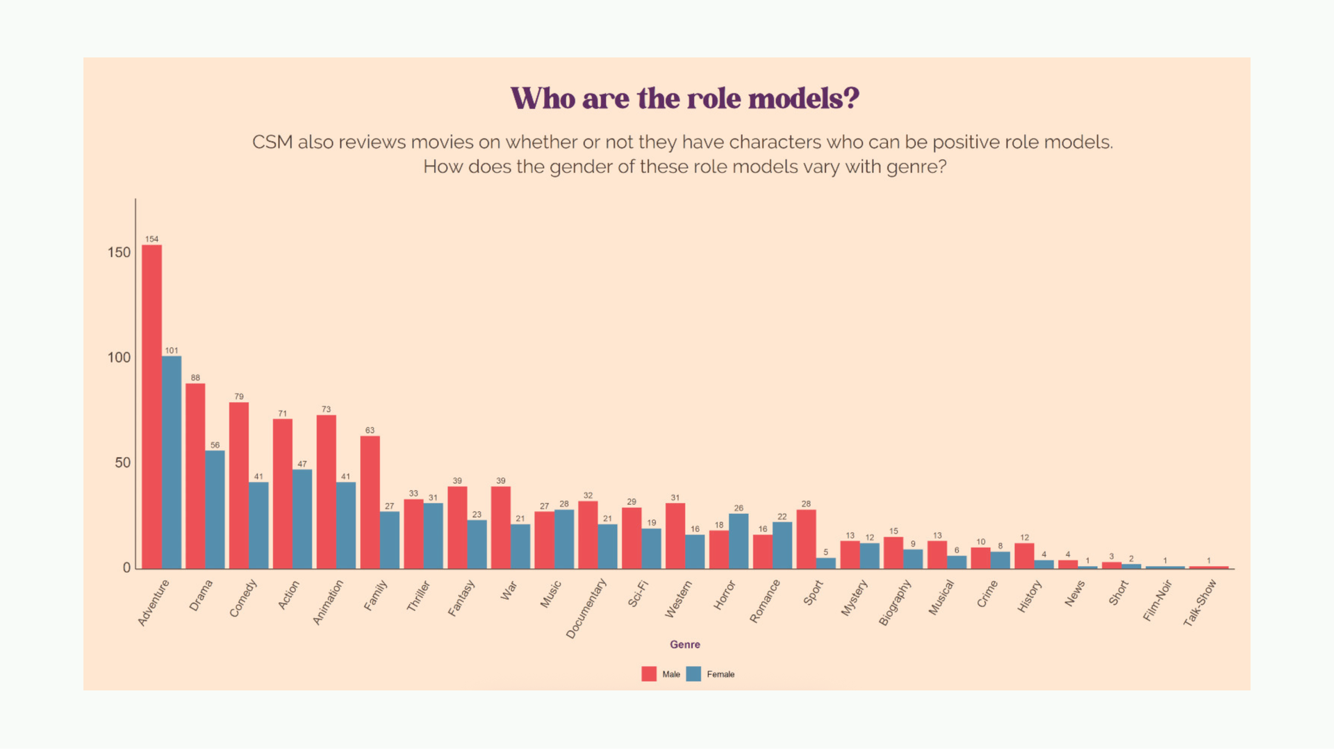
Here’s an early example of mine. This is from Common Sense Media, they review movies for parents and one of the things they do is tag characters as positive or negative role models. I collected that data, I threw it into ggplot. Red is male, blue is female. There are a lot of design problems here but ignore those for a second.
You can clearly see a pattern here; men are over-represented when compared to women. But for whatever reason, the headline and description are phrased in a way that is asking the reader “Who” the role models are and “how” they vary with genre.
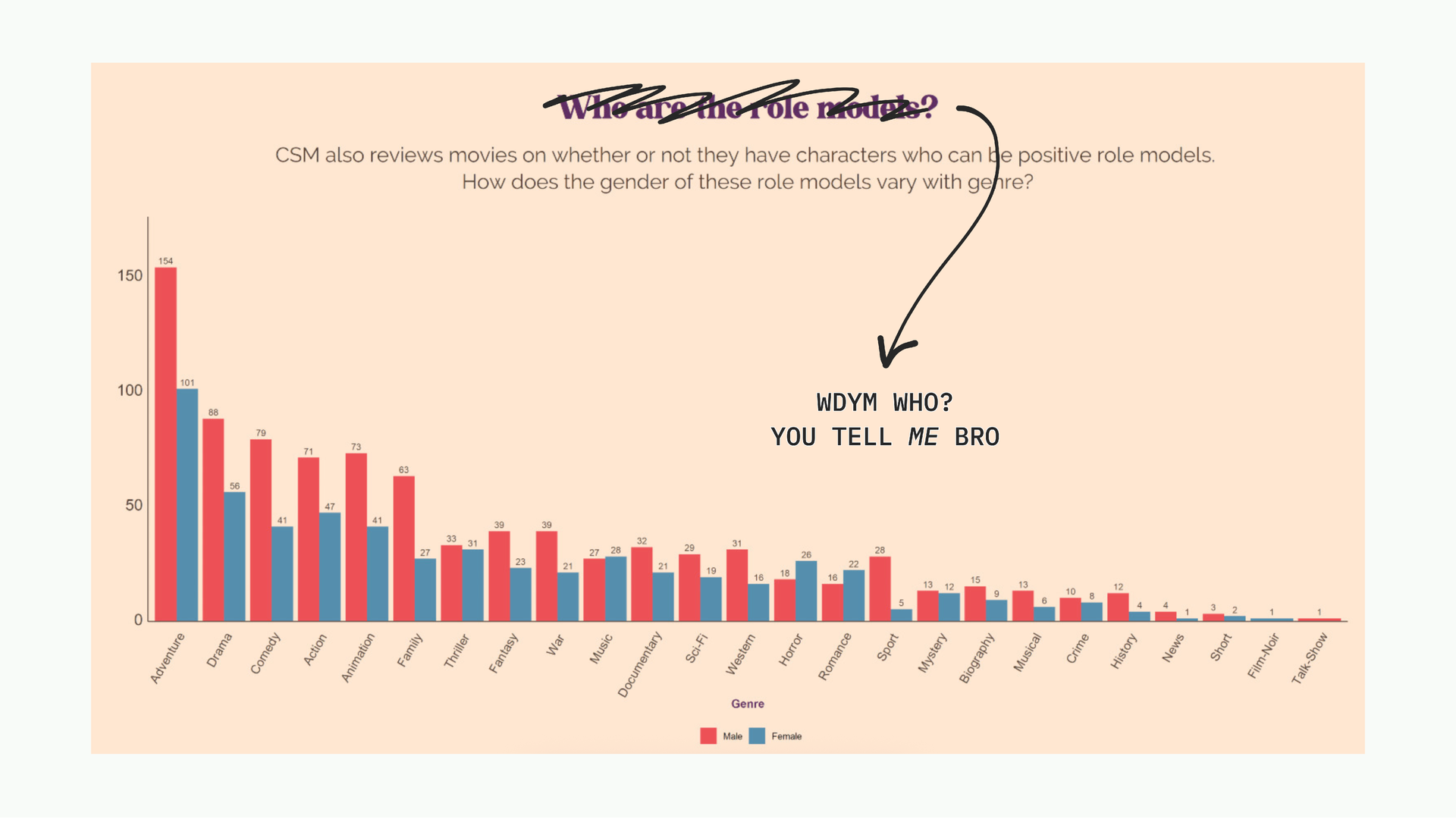
More than the design, the bigger problem is that I never committed to saying what I noticed. There’s a clear pattern, but I asked the reader to find it themselves instead of just telling them. WDYM WHO?
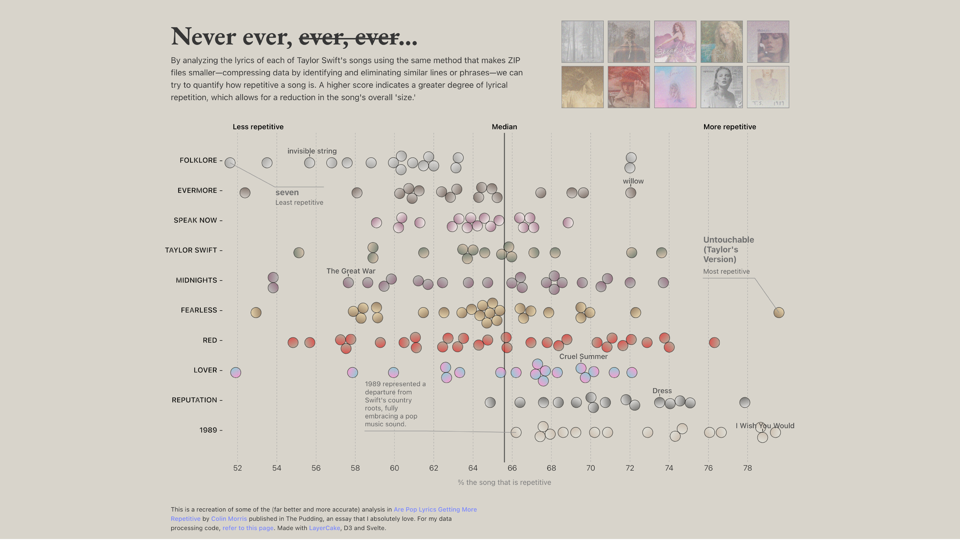
This is more recent where I was analyzing how repetitive each Taylor Swift album is (inspired by The Pudding). Better design, better color, annotations and more polished. But the same problem. If you’re not a Taylor Swift fan, this data is pretty boring to you, your first question is: so what? And the thing is I can answer it! But for some reason I didn’t.
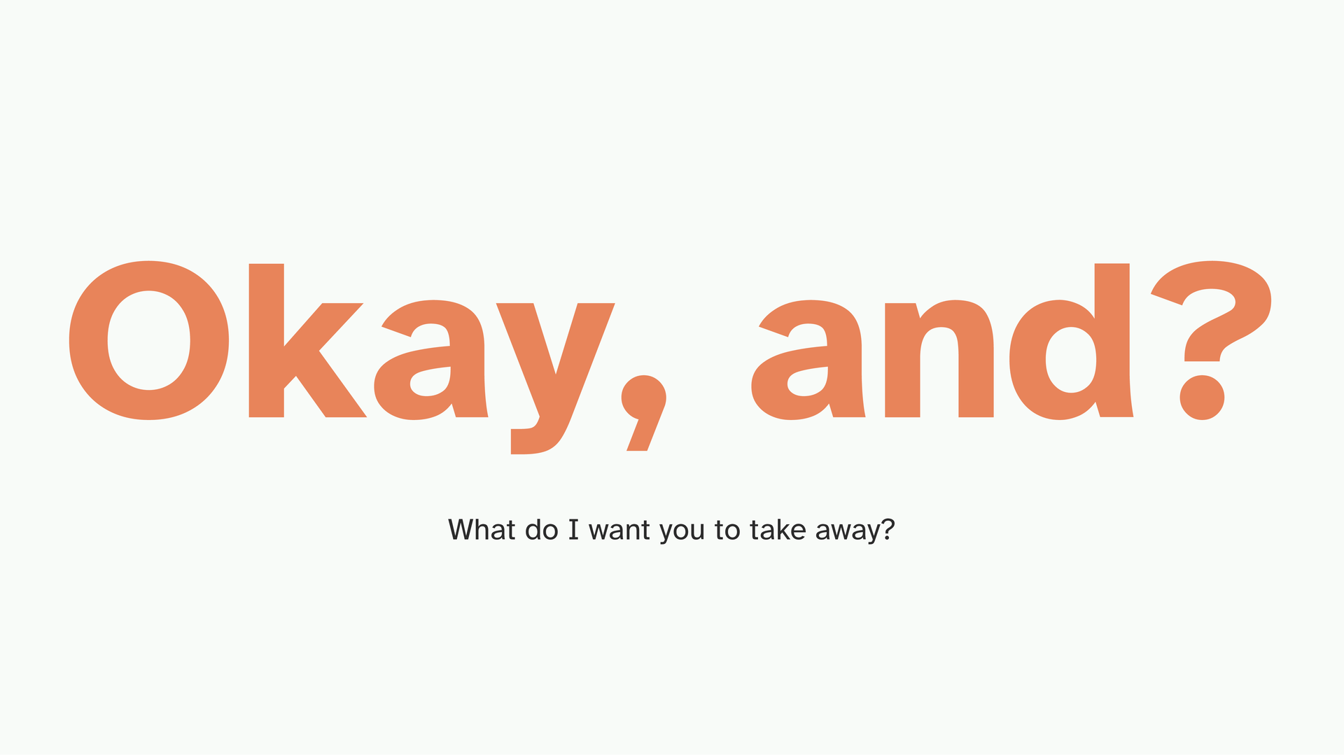
“Okay, and?” is the most useful question you can ask of your own work. If you can’t answer it with a single clear sentence, what is the point of this, what do you want me to take away, you probably have an exploration, not an explanation. The synthesis is converting one into the other. When we have the luxury of an essay, we can elaborate in the text, but here, it should ideally stand on its own.
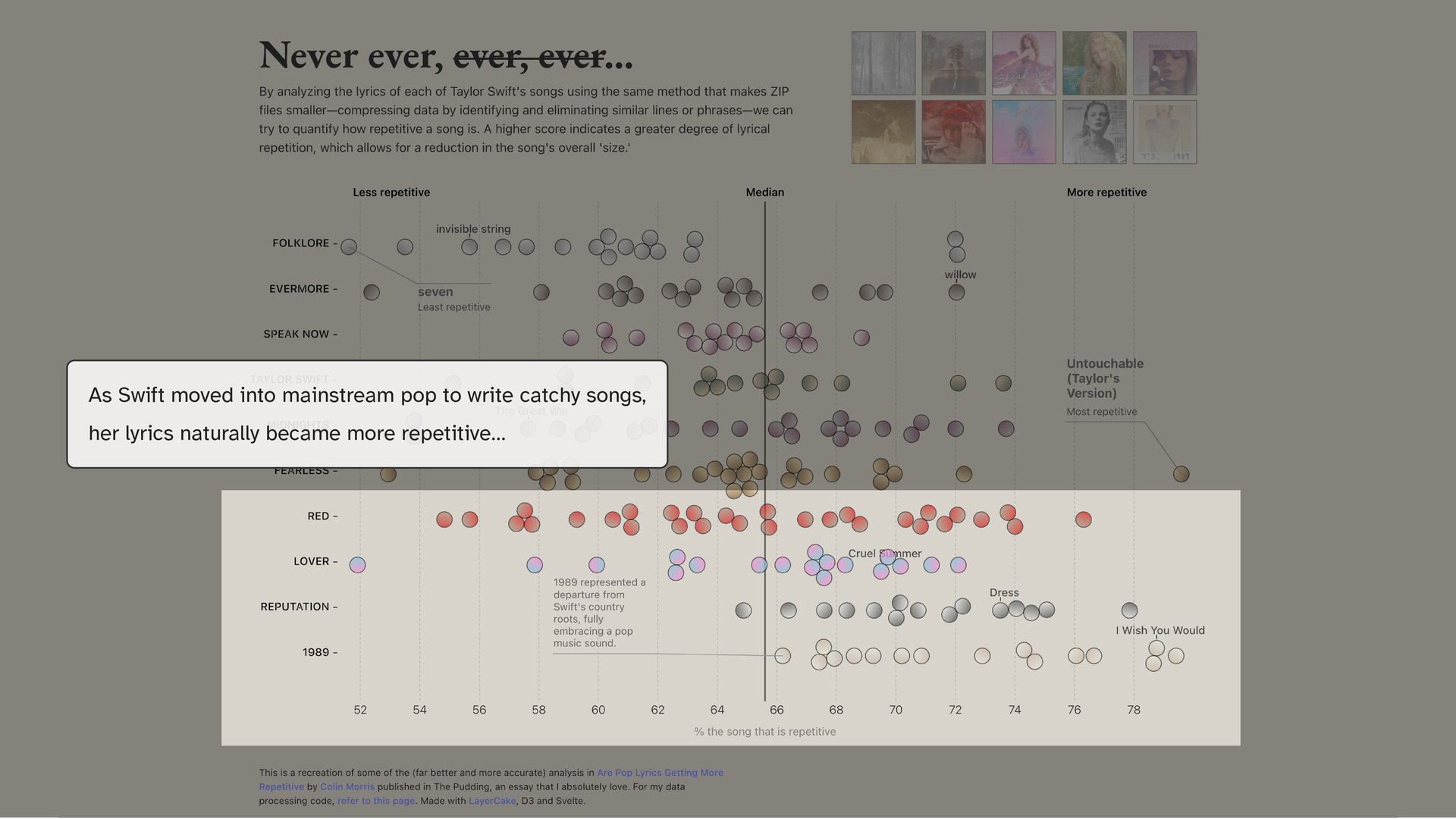
The answer here isn’t complicated. As Taylor Swift moved into more mainstream pop to write catchy songs, her lyrics naturally became more repetitive, that’s just the nature of those songs. That’s it. I just needed to say it. I just didn’t ‘commit’ to it.
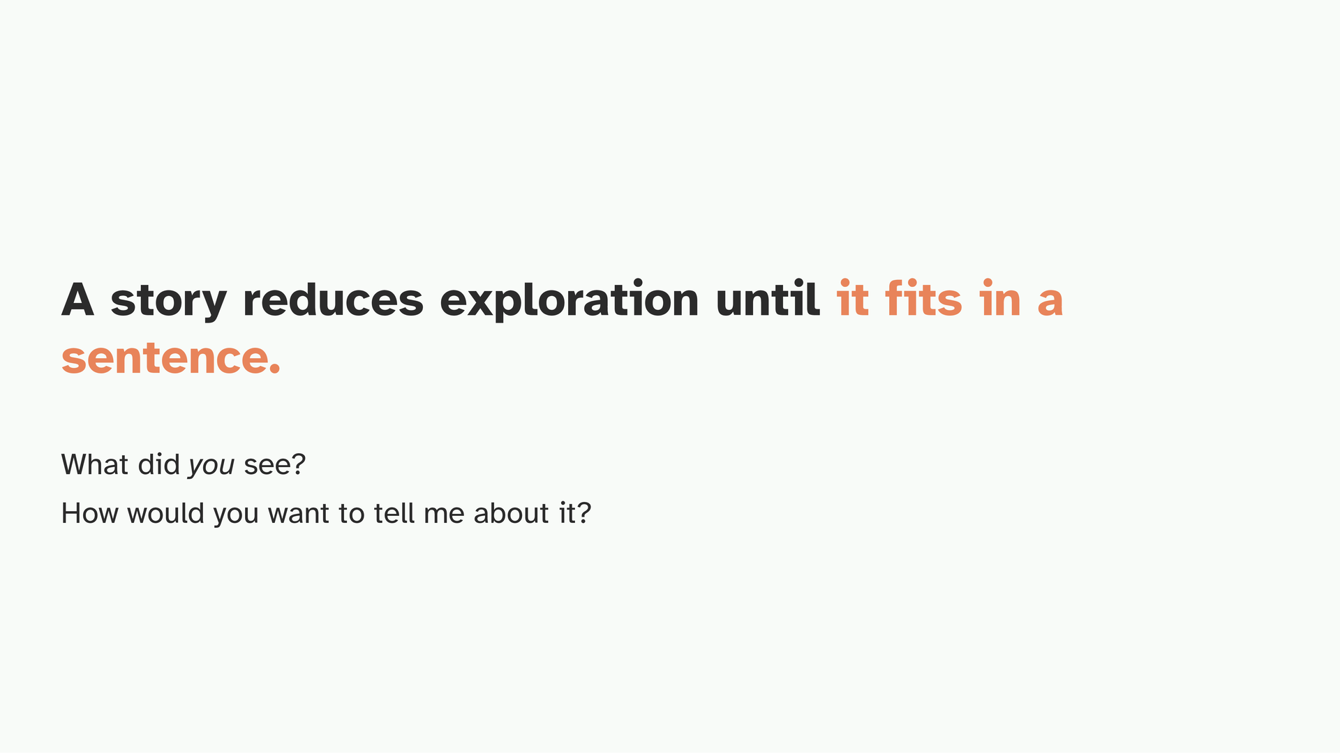
A story becomes an explanation when you can fit it into one sentence. What did you see? How would you want to tell me about it?
So let’s talk about making one such story.
I’ll walk through the process I use, using the election project as the running example. Even though this is an essay, it came together through small, individual explorations which I pieced together.
The first step is finding the thing you want to know badly enough to spend a week thinking about. What’s the itch?
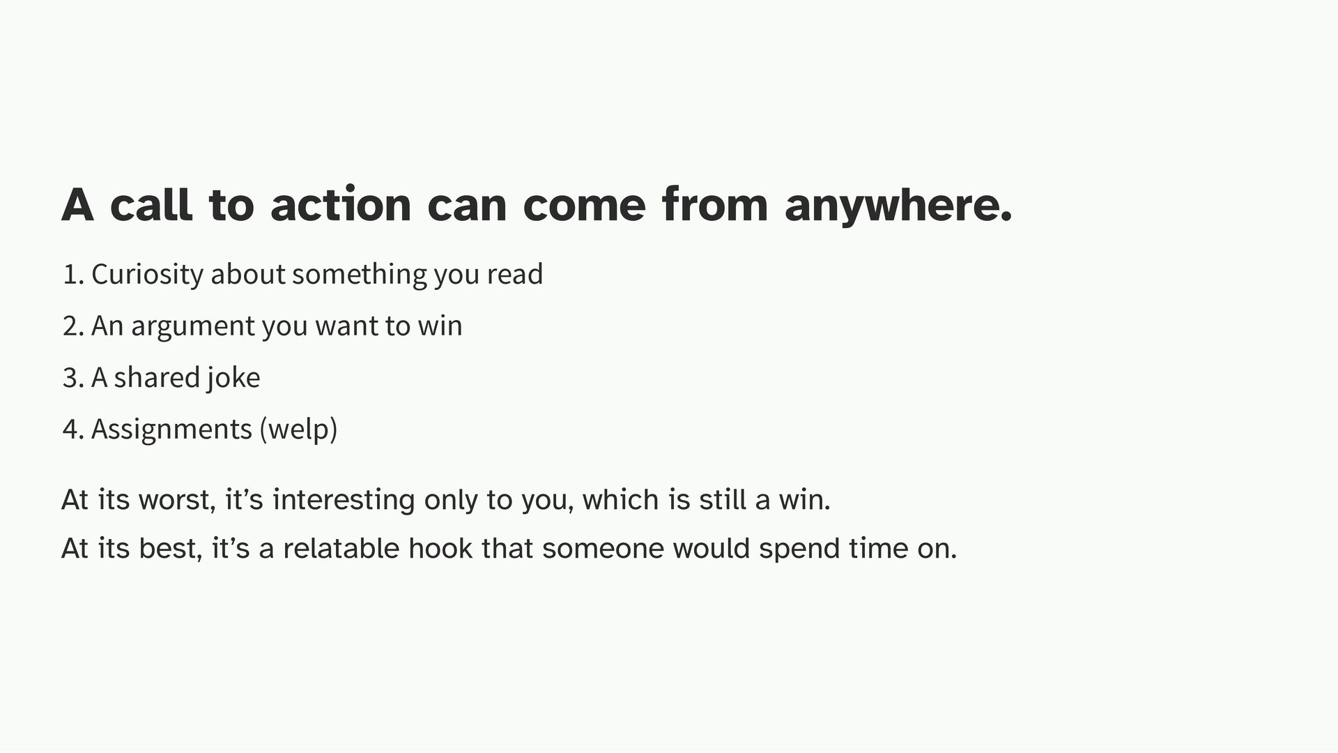
It can come from something you read, an argument you want to win, a shared joke, or what is more likely for you right now, an assignment. I truly think that even out of the most boring datasets, there is ONE question that you can ask which will be of interest to you. You matter here.
Because at its worst, it’s interesting only to you, which is still a win, because if you care about what you’re visualizing, you’ll have something to say about it. At its best, it’s a hook someone else would spend time on. It’s worth thinking about this phase intentionally because everything after this is based on what it is that you want to ask.
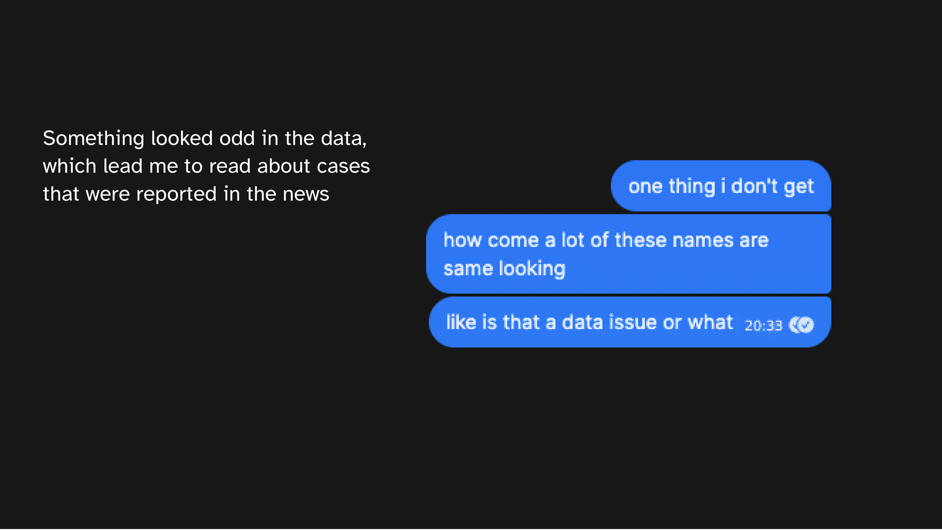
For the election project, it started with a conversation with my friend. We were working on a completely unrelated project and I noticed names looking similar in some data I was poking at. My friend said, yeah, this is actually a known thing and sent me a bunch of news reports on it. But look as I might, I could not find anyone who’d measured how often it happens! That gap became the call to action because I wanted to know.
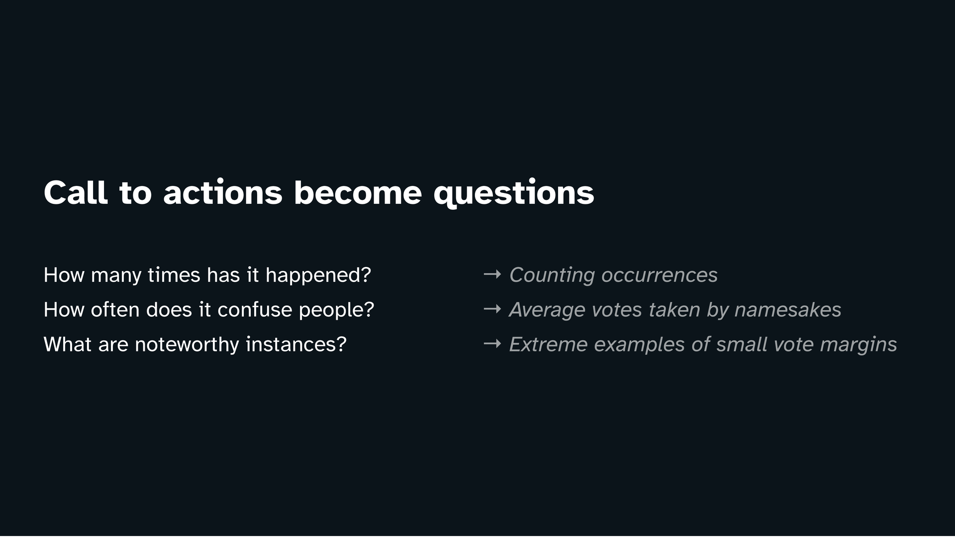
A call to action then becomes a set of measurable questions.
How many times has this happened? That’s countable. How often does it confuse people? That’s vague, so I translate it into something I can measure, like the average number of votes taken by namesake candidates. What are the noteworthy instances? Subjective, but if we filter for the extreme cases where the margin was the smallest maybe we’ll find something.
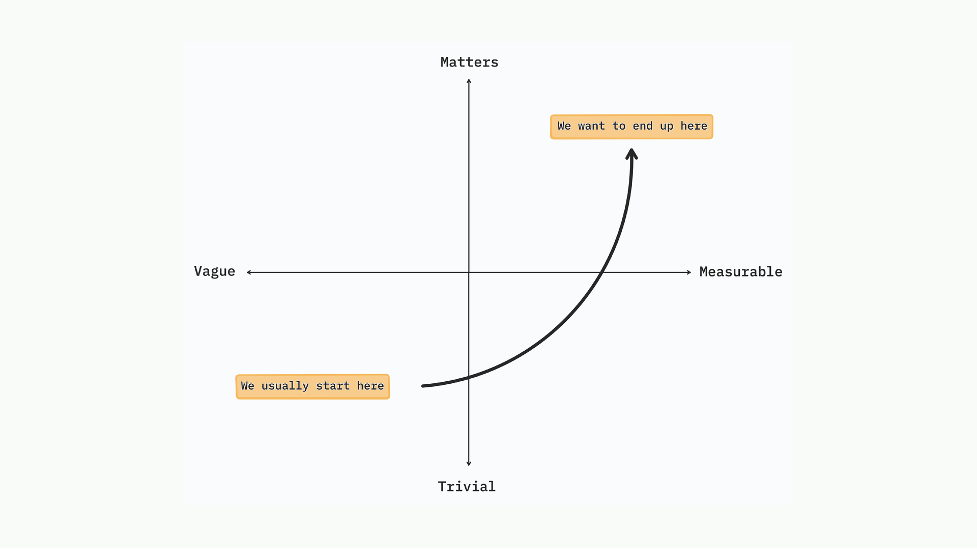
When we’re starting out, we tend to ask questions that are both vague and trivial. That’s fine because it’s the starting point. The goal is to move to questions that ‘matter’ and are measurable.
You can ask questions that matter but are vague (in the top-left quadrant), and that won’t do anything for you because how would you even answer that? So the direction is: make it specific enough to count first, then ask the deeper layer of why.
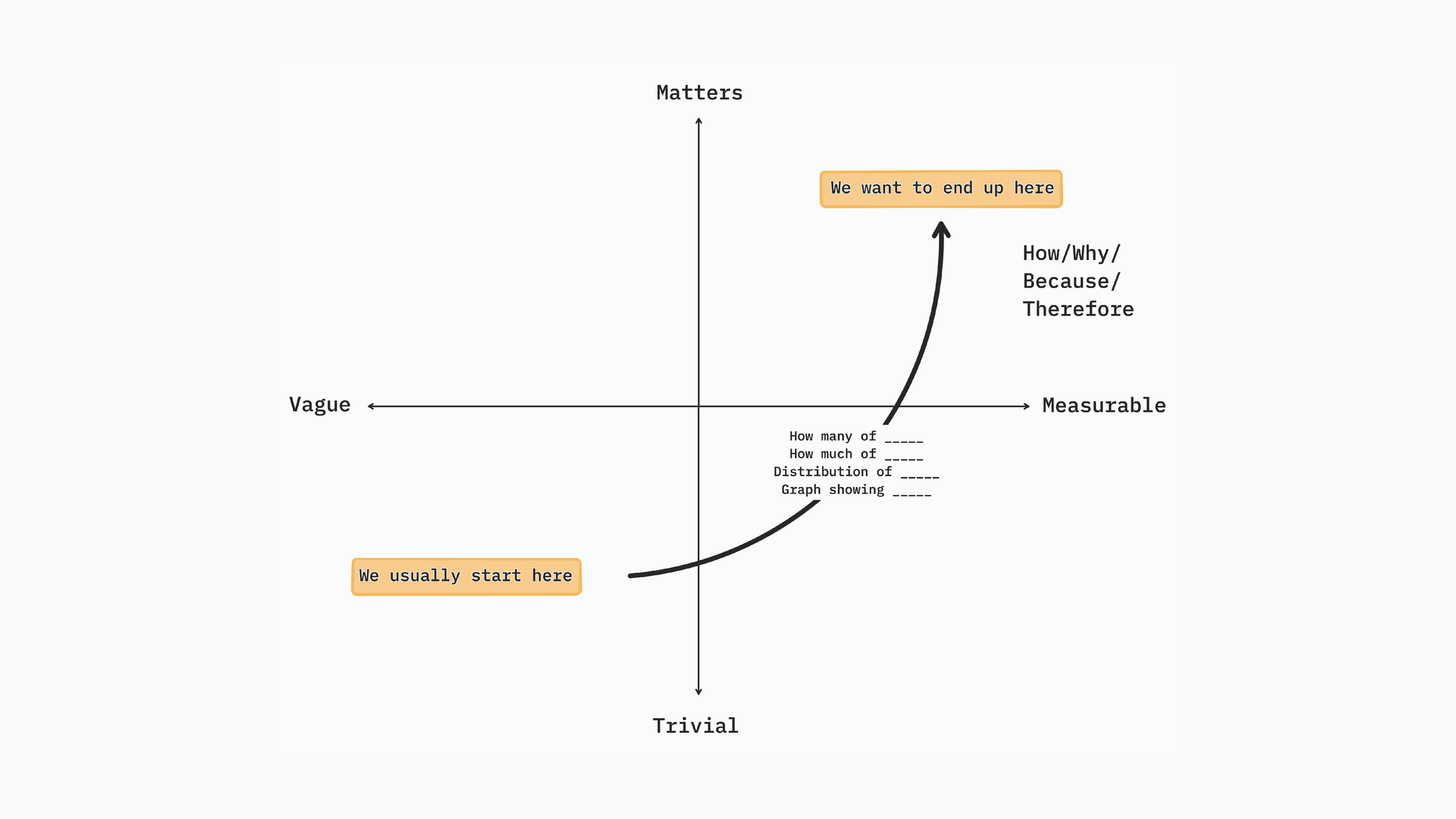
Simple questions, how many, what’s the distribution, what’s the comparison, open the door to deeper questions. Why does it happen? What’s the consequence? Because this happened, therefore this happened. You start with something trivial and countable, and it leads you somewhere interesting.
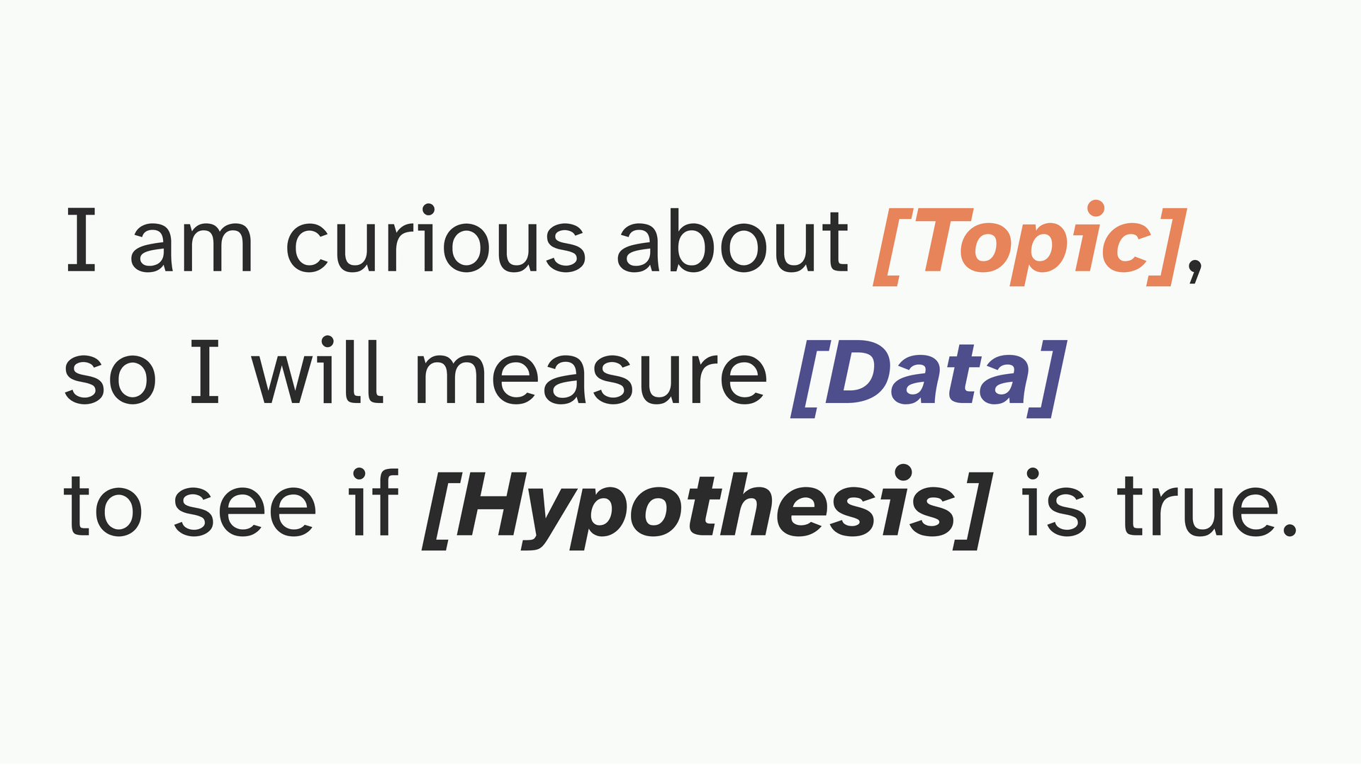
A simple test: if you can finish this sentence, you have a good question. “I am curious about X, so I will measure Y to see if Z is true.” For mine: I’m curious about namesake candidates, so I will count the votes they receive to see if this actually affects an election result.
If you can fill that in, you’re ready to start.
Analysis used to scare me because I’m not trained in statistics. What I eventually learned is that most interesting findings come from four very simple operations that can take you a significant part of the way.
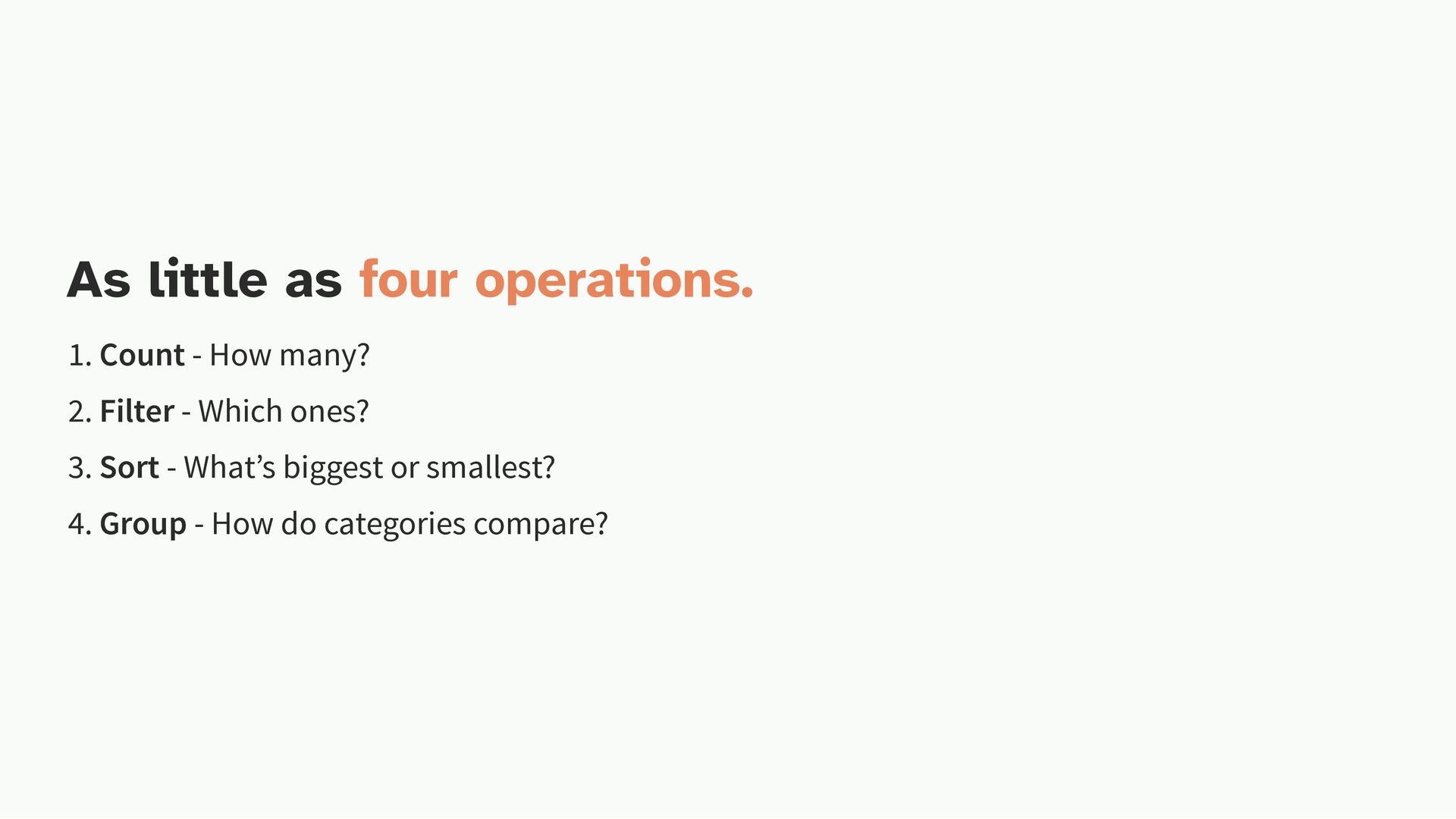
How many? Which ones? What’s the biggest or smallest? How do categories compare? These four, in combination, will get you almost everything you need. Or at least what is bare minimum of interest to a reader.
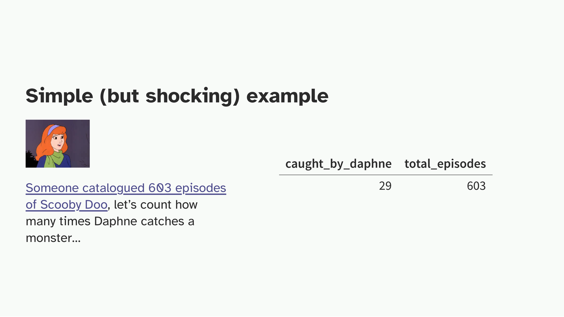
Simple example. Someone watched all 603 episodes of Scooby-Doo and catalogued variables, including who catches the monster in each episode. Daphne is famously the damsel in distress.
So I just counted: how many episodes does she actually catch the monster? 29! Think about it. In almost 95% of episodes, Daphne is not the one catching anything. That single count, by itself, tells me a story about how the show is written. We could then compare with Velma, compare male and female characters overall. But it started with just counting.
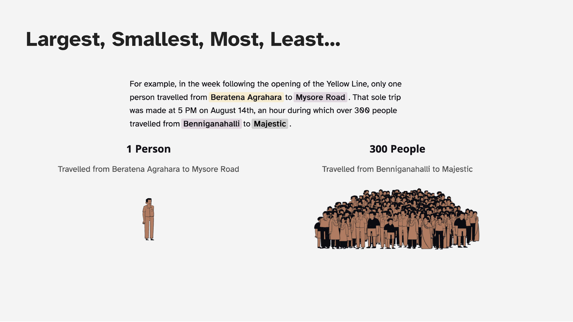
Filtering for extremes is also very useful. In this story about Bangalore’s metro, I was looking at average ridership on any given route. And I found that on one specific route, station A to station B to station D, there was only one person traveling that unique path every day. Versus 300 people on any average pair of stations. It’s an amusing finding that came from just sorting to find the bottom of a list.
When analysis returns nothing interesting, that usually means the question wasn’t specific enough, or the proxy wasn’t right. At this point it is better to back to the question.
So now at this point you’ve asked a question, gotten a measurement, run your operations. Now you have a finding. Synthesis is two moves: declare what you found, and choose the form that reveals it.
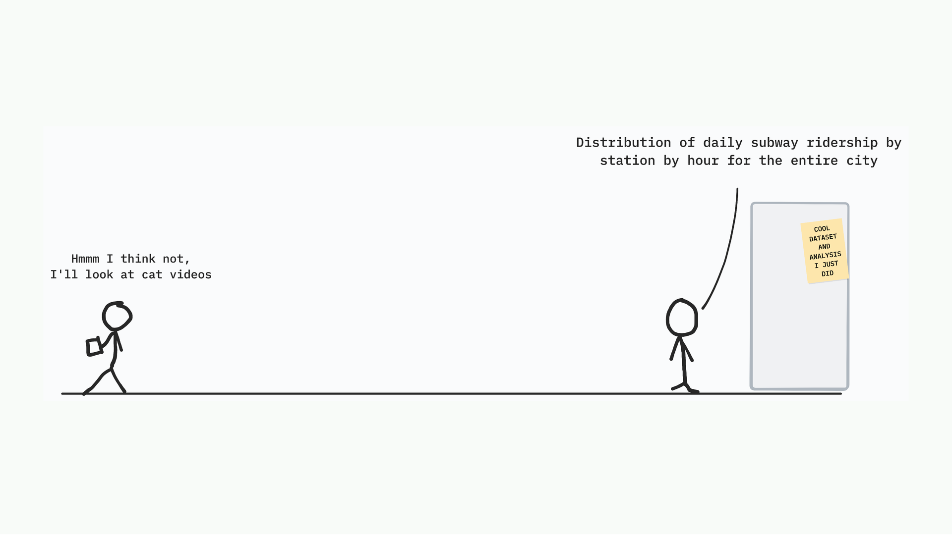
Take the metro data. I could present it as: “distribution of daily subway ridership by station by hour for the entire city.” That’s accurate and yes that’s what I found but it interests approximately no one outside of a transport planning meeting.
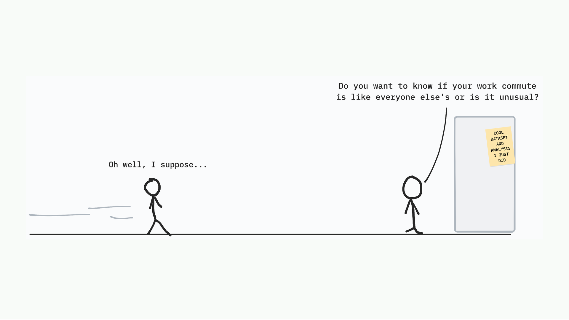
Or I could ask: do you want to know if your work commute is like everyone else’s? Are you that one person on a unique route, or are you one of the 300? Now it’s personal. Now the reader has a reason to care. The data is the same but the framing becomes a little more personal.
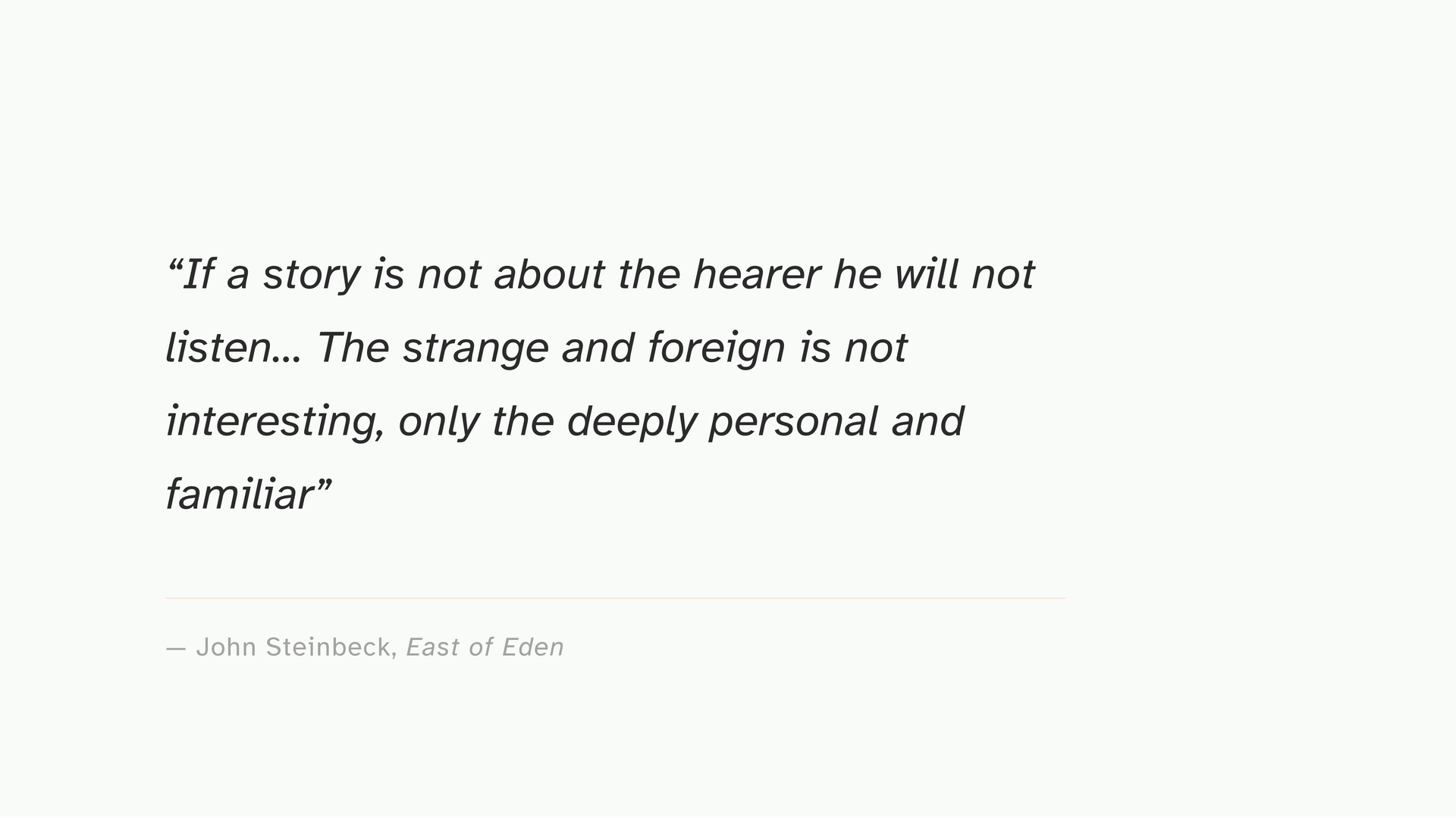
Steinbeck said, in the context of fiction, that if a story is not about the hearer, they will not listen. I think this applies completely to data. The reader is the point. How can you put this “count” in a way that makes sense to them to understand?
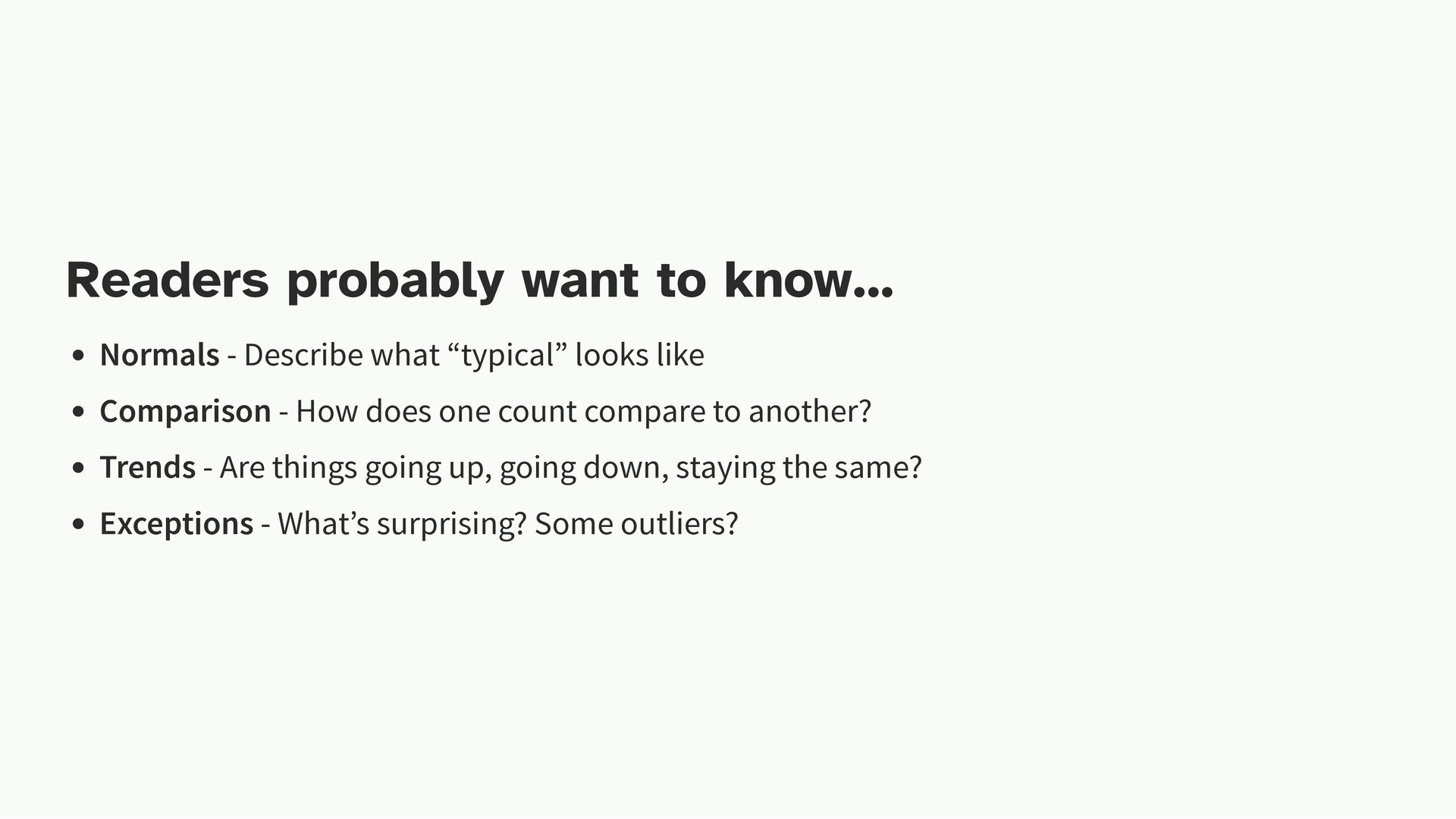
Synthesis is also you talking about what is happening. Your readers probably want to know one of four things, which you can describe to them. Did something change? How much did it change from what is normal? Are there any extremes and outliers? How does one group compare to the other?
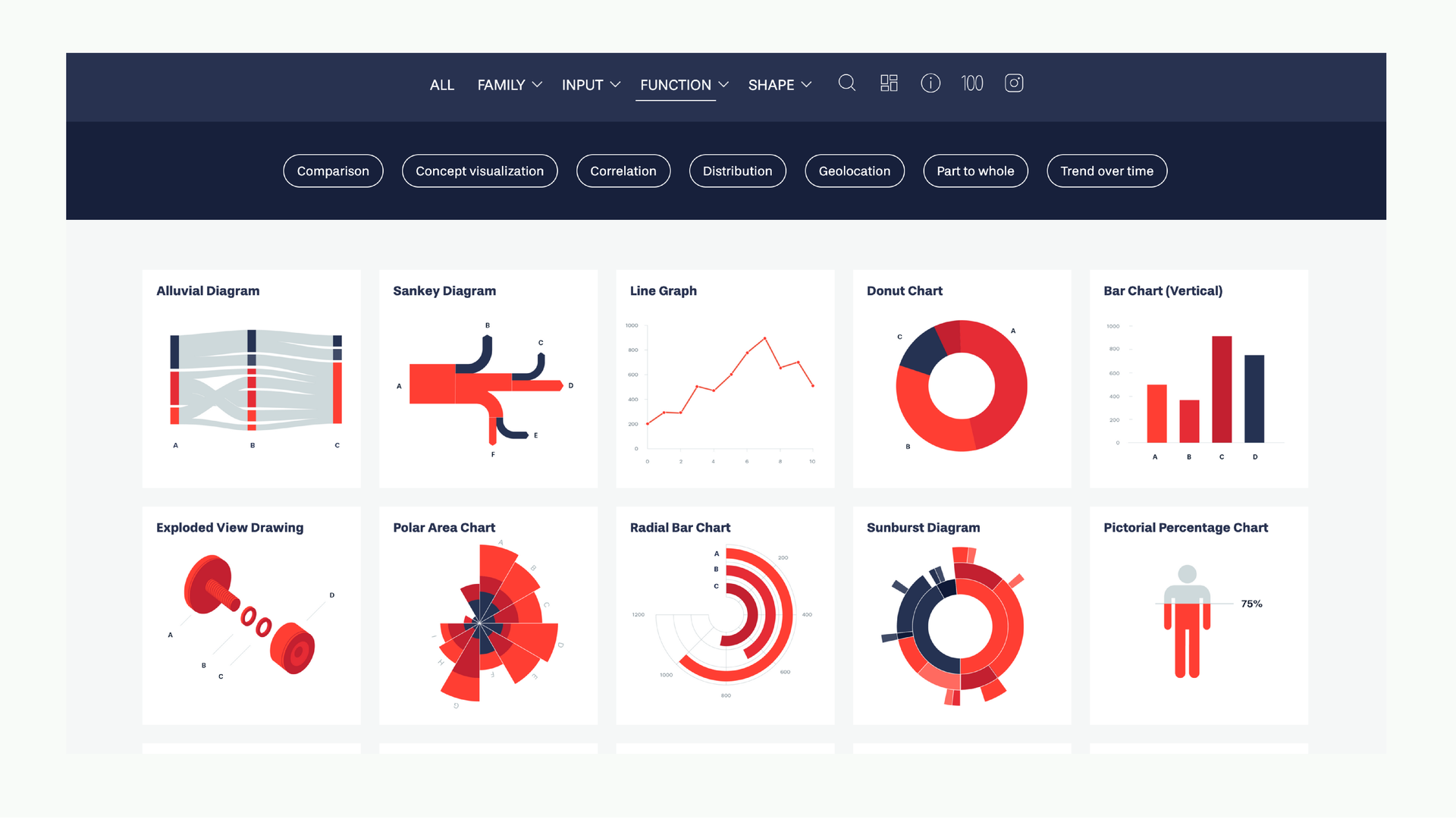
If you’re stuck on what chart to use, the Dataviz Project is a useful reference it catalogs chart types by what kind of relationship they show. Anyway, this is something you’re probably used to doing by this point.
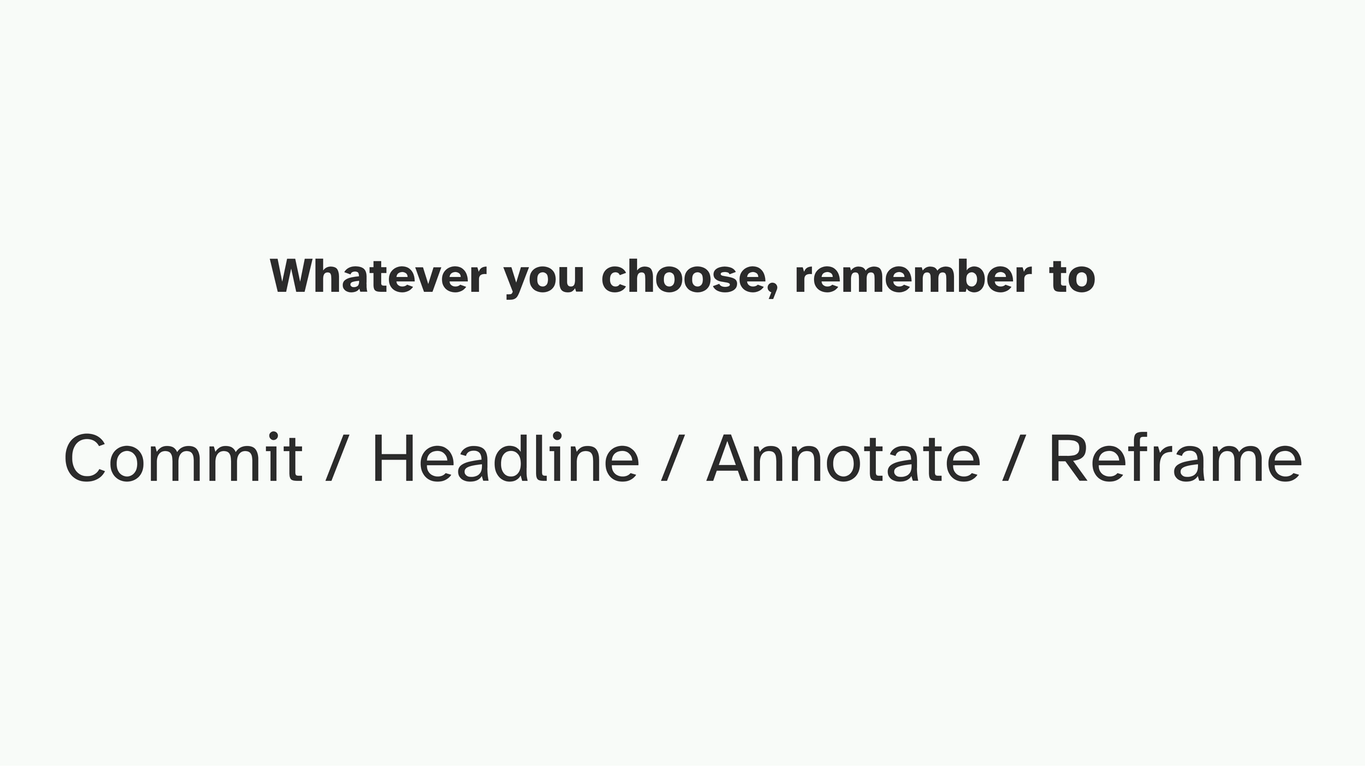
But whenever you slap the chart onto the data, pause for a moment and consider this checklist again. Did you commit to a finding? Did you headline it? Are there any things that should be explained and annotated?
And lastly, is there any creative way to reframe the situation? One thing I like to try and do is try and connect the finding to something the reader already knows or feels.
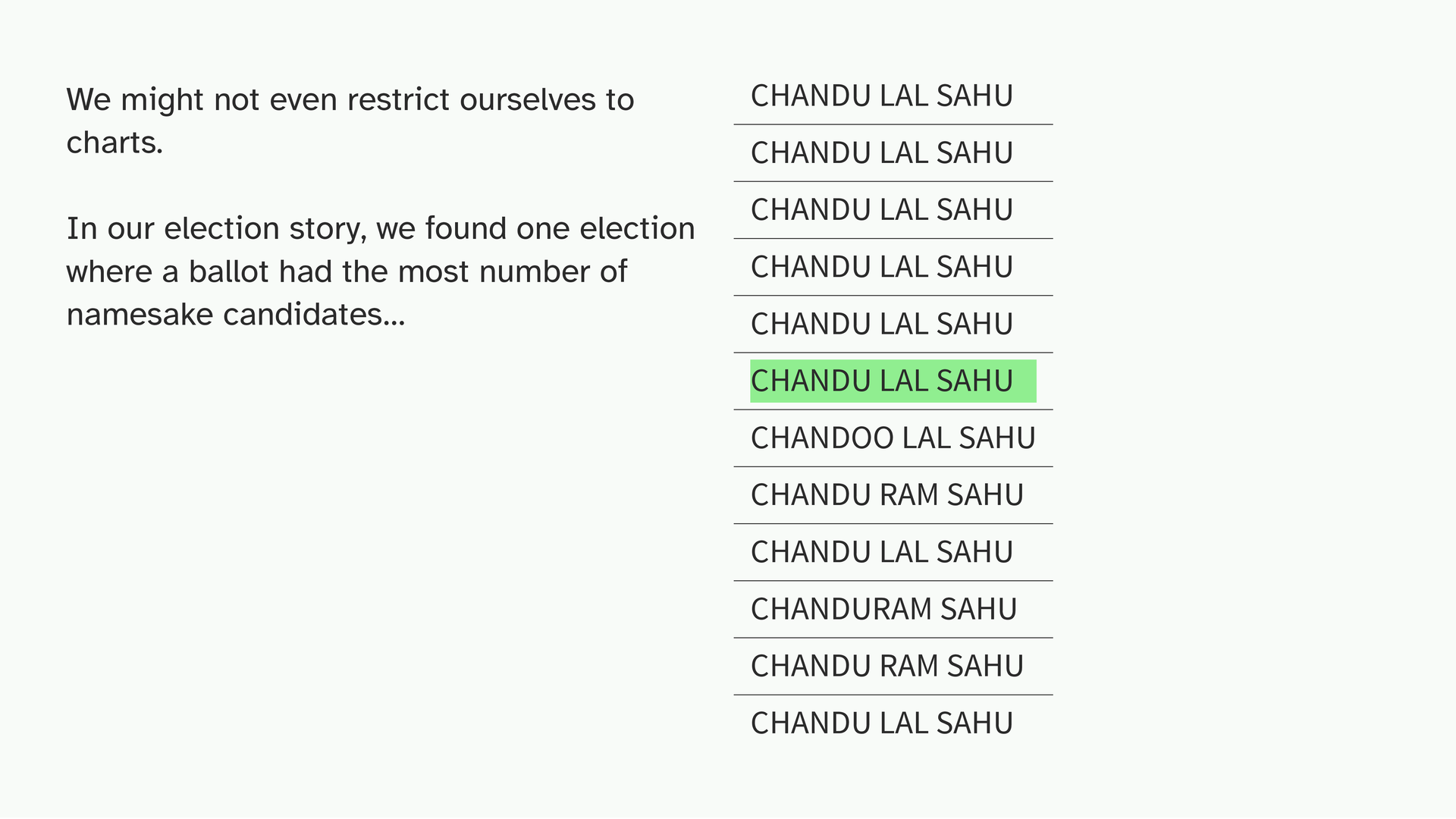
Sometimes we don’t even have to use a chart at all. In the election story, I found one election with the most extreme case of namesake candidates a ballot where one candidate was facing ten other people with nearly the same name. Chandu Lal Sahu facing ten or so other Chandu Lal Sahus. When I found this in the data, I was genuinely amused. I told my illustrator friend (Reechik shoutout) about it and said I don’t want to show this with a chart. And he came back with ideas.
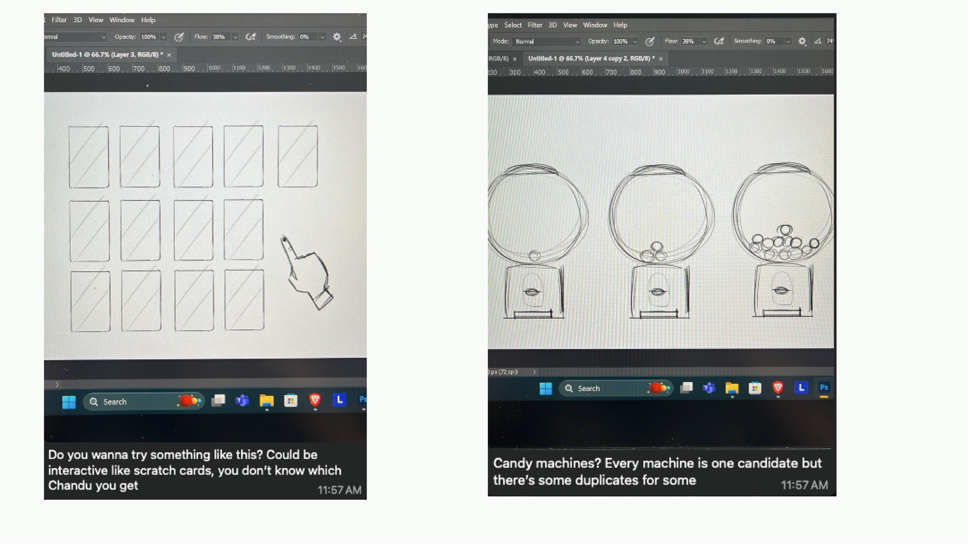
He drew stuff out and sent it to me over WhatsApp. What if it was like a scratch card, where you shuffle and you don’t know which Chandu you’re going to get? Or like a candy machine where there are duplicates? I loved the scratch card idea because it captured exactly what it would feel like to not know who the real candidate is especially if you’re a voter who can’t ready trying to recognize a name on a ballot.

So we built this interaction where the cards shuffle and we ask you to keep track of who you think the real one is. It’s not proving anything analytically. It’s trying to let someone feel, for a moment, how confusing this could actually be.
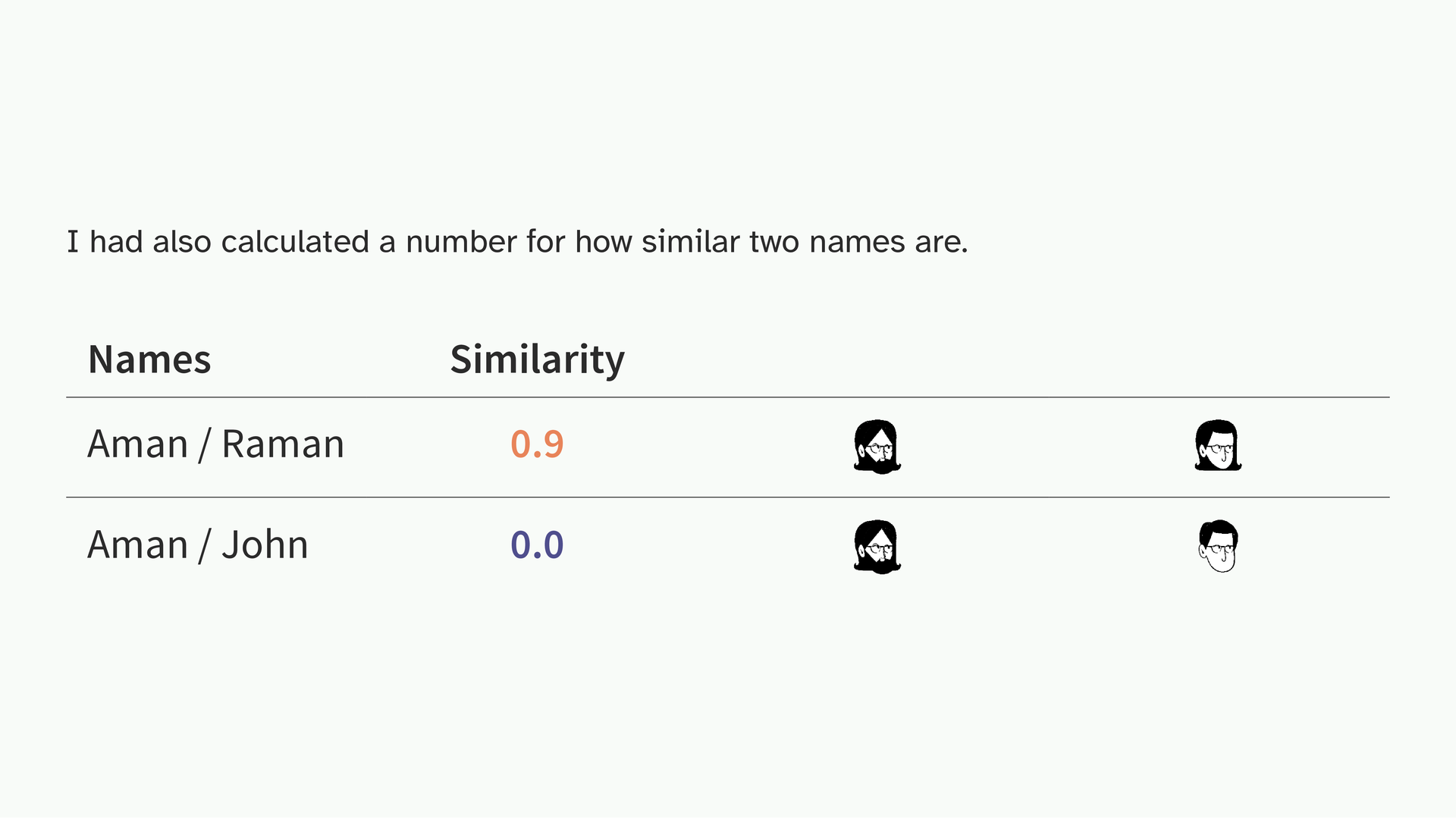
I had also calculated a similarity score for how alike two names are, as part of the analysis. I was trying to figure out how to turn that number into a visual. Rhea, who’s also an illustrator suggested: what if names that score high generate faces that look similar, and names that score low generate faces that look different? Aman and Raman, very similar names, very similar faces. Aman and John, very different.
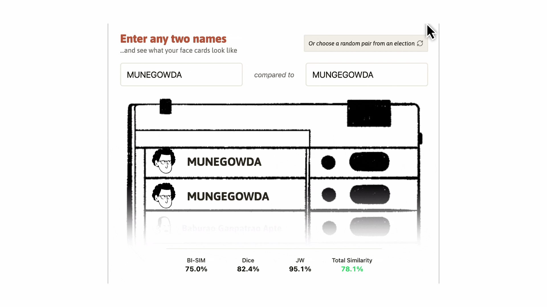
So that’s what we built! A small interactive that just generates these faces. It’s one form of encoding but it came from having a specific finding and asking what form would make it feel real to someone.
Animation, illustration, interactive experiences, scrollytelling, sound these are all available to you. The form is the last decision, and it is entirely yours. What matters is that you’ve asked a good question, done the analysis, and synthesized what you found. After that, the visual is genuinely up to you.
The tool is not the point. The question is the point. Pick whatever gets you to an answer fastest even if it’s not the most powerful tool available. Upgrade when the question demands it, not before.
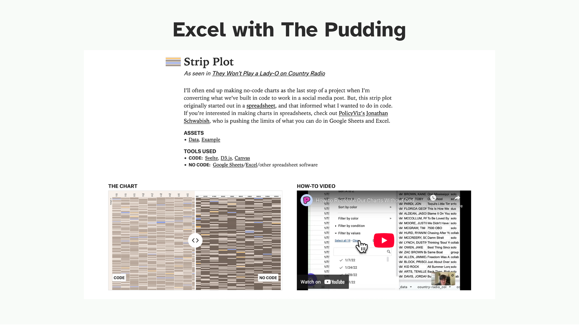
The Pudding has a series of tutorials where they recreate their analyses entirely in Excel no code. These are excellent. They show you what those four operations look like on real data from projects you’ve probably already read.
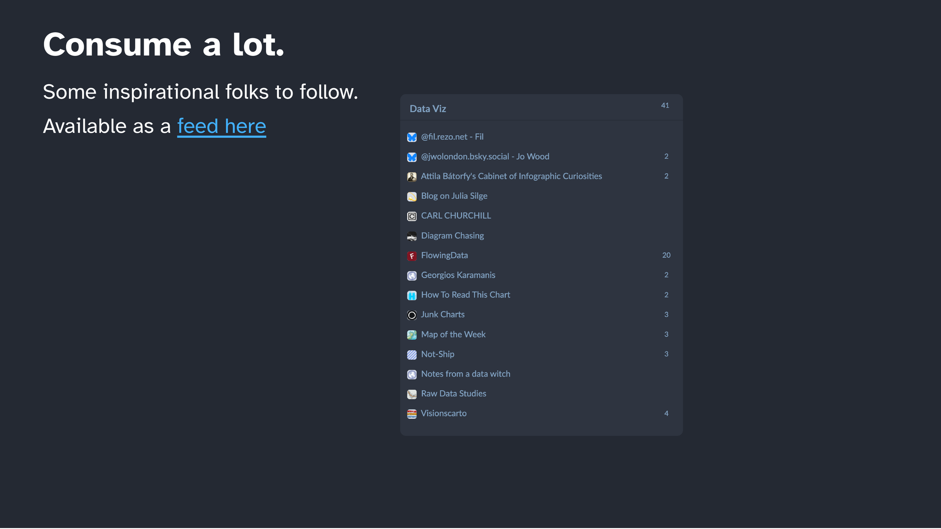
On a daily basis I read a lot, specifically so I can pick up what other people are doing and bring it into my own work. I’ll send the slide deck after this it has a list of people to follow and a feed you can subscribe to.
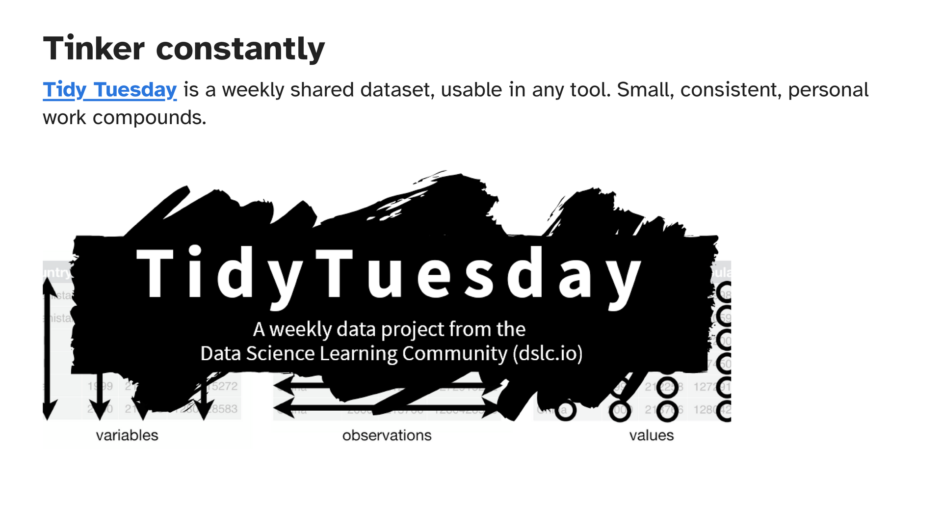
And then Tidy Tuesday it’s a weekly shared dataset, everyone is working on the same data, and you can see what everybody else made from it. Small, consistent work like this compounds. You don’t have to make something great every week. You just have to make something. It’s genuinely the most useful practice I know of.
I want to end with this. There is no specific kind of data person, and no specific kind of Story that counts. We’re creative people and we don’t need to restrict ourselves, and sometimes the best way to share something is show it in a way that you understood it. And practice asking questions while we’re at it.
That’s me. Thank you so much for listening.
Some other things I read while I was exploring perspectives:
Amit Kapoor. Storytelling with Data. 2016. 1:17:29. https://www.youtube.com/watch?v=0LlGbFqHdRA.
Bradshaw, Paul. Data Journalism Heist. 2025. https://leanpub.com/DataJournalismHeist.
buffalo7. ‘Storytelling with Data: How to Appeal to Logic and Emotion.’ Buffalo 7, 2 July 2025. https://buffalo7.co.uk/blog/storytelling-with-data/.
Callahan, Shawn. ‘How to Spot a Story – a Simple Story Framework: Infographic’. Anecdote, 26 September 2014. https://www.anecdote.com/2014/09/story-framework-infographic.
Denham, Jess. ‘Tips from News:Rewired on Developing Data-Driven Stories’. Passionately Curious, 20 April 2013. https://jessdenham.wordpress.com/2013/04/20/tips-on-data-inspired-stories-from-newsrewired/.
‘Columbia University · Storytelling with Data: 2. Slides’. Accessed 24 February 2026. https://ssp3nc3r.github.io/comm-course-ds/slides-02.html.
‘Fundamental Principal of Analytical Design - Compared with What’. Accessed 23 February 2026. https://simplexct.com/analytical-principles-compared-with-what.
Hitner, Nicole. ‘The Anatomy of a Data Story’. LightsOnData, 20 March 2019. https://www.lightsondata.com/data-story-anatomy/.
‘How to Answer Your Biggest Questions—with Data (w/ Mona Chalabi) (Transcript)’. Accessed 18 February 2026. https://www.ted.com/podcasts/how-to-be-a-better-human/how-to-answer-your-biggest-questions-with-data-w-mona-chalabi-transcript.
‘”If It\’s about Farts, Draw a Butt for God\’s Sakes”: Mona Chalabi Tells Us How to Illustrate Data’. Accessed 18 February 2026. https://www.itsnicethat.com/articles/mona-chalabi-illustration-internationalwomensday-080318.
Kissane, Erin. ‘The NYT\’s Amanda Cox on Winning the Internet’. 17 May 2013. https://source.opennews.org/articles/nyts-amanda-cox-wins-internet/.
‘Knight Foundation Grant to Support ProPublica\’s News Applications Desk’. ProPublica, 18 July 2012. https://www.propublica.org/nerds/knight-foundation-makes-grant-to-support-propublicas-news-applications-desk.
‘ONS - April 11, 2014’. Accessed 14 February 2026. https://www.martinstabe.com/slides/ons/#/31.
Oremus, Will. ‘The First News Report on the L.A. Earthquake Was Written by a Robot’. Slate, 17 March 2014. https://slate.com/technology/2014/03/quakebot-los-angeles-times-robot-journalist-writes-article-on-la-earthquake.html.
Ravishankar. ‘Brent Dykes Wrote THE Book on Data Storytelling’. Story Rules, 4 September 2021. https://www.storyrules.com/brent-dykes-wrote-the-book-on-data-storytelling/.
Remington, Alex. ‘”Social Science Done on Deadline”: Research Chat with ASU\’s Steve Doig on Data Journalism’. The Journalist\’s Resource, 21 August 2012. https://journalistsresource.org/home/research-chat-steve-doig-data-journalism-social-science-deadline/.
Sabrinas.Space. n.d. Accessed 23 February 2026. https://sabrinas.space.
‘Javascript Journalism’. Digital by Default, 18 April 2014. https://digitalbydefault.com/2014/04/18/javascript-journalism/.
Schwabish, Jon. ‘Visualized Part 7: Is “Data Storytelling” a Buzzword?’ PolicyViz, 22 February 2014. https://policyviz.com/2014/02/22/visualized-part-7-is-data-storytelling-a-buzzword/.
Storytelling with Data. ‘A Quick Presentation Makeover’. Accessed 24 February 2026. https://www.storytellingwithdata.com/blog/a-quick-presentation-makeover.
Storytelling with Data. ‘So What?’ Accessed 23 February 2026. https://www.storytellingwithdata.com/blog/2017/3/22/so-what.
Willis, Derek. ‘The Canvas for CAR – Derek Willis’. 13 January 2007. https://thescoop.org/thefix/the-canvas-for-car/.


